Create a Svelte Reusable Tab Component Without Complicated CSS
Learn how to create a reusable tab component in Svelte without complicated CSS.
 CORE
·
CORE
·
Join the DZone community and get the full member experience.
Join For FreeTabs are a key feature in any application. They are needed for effective navigation between the various parts of the application and switching between different views. We can easily create and manage tabs in Svelte. However, the question is whether we can create a Svelte Reusable Tab Component.
We can definitely create a reusable tab component in Svelte very easily. All we have to use is basic Javascript logic, some rudimentary CSS, and a custom event dispatcher. We don’t need to use complicated routing solutions. By simply using these basic building blocks, we can create a working tab solution that also keeps track of the active tab. Such an approach is very suitable for small applications.
In this post, we will look at the various steps involved in creating this reusable component with code snippets.
Why Reusable Tabs?
The functionality of tabs is pretty simple. It provides an option for users to switch between different views such as Home and About pages. These views could be at the application level like a navigation bar at the top of a website. It could also be on a component level where we have multiple sections within a component.
Reusable tabs help us build once and use many times.
We can build a basic reusable tab component with some customization options. The advantage of the reusable tab component is to avoid repetitive logic. Also, we can easily maintain similar styles across all the tabs within our application. This provides our application with a coherent design approach.
Create Reusable Tab Component
Let us first create a reusable tab component as below:
Tab.svelte<script>
    import { createEventDispatcher } from 'svelte';
    const dispatch = createEventDispatcher();

    export let tabItems;
    export let activeItem;

</script>

<div class="tabs">
    <ul>
        {#each tabItems as item}
            <li on:click={() => dispatch('tabChange', item)}>
                <div class:active={item===activeItem}>{item}</div>
            </li>
        {/each}
    </ul>
</div>

<style>
    .tabs {
        margin-bottom: 40px
    }
    ul {
        display: flex;
        justify-content: center;
        padding: 0;
        list-style-type: none;
    }
    li {
        margin: 0 16px;
        font-size: 18px;
        color: #555;
        cursor: pointer;
    }
    .active {
        color: #d91b42;
        border-bottom: 2px solid #d91b42;
        padding-bottom: 8px;
    }

</style>
This component requires two inputs. One is the list of tab options. The second is the currently active item. Using each block in Svelte, the tab options are rendered.
We also apply a special CSS class to the tab option when it is currently an active item. Lastly, we use the Svelte custom event dispatcher to dispatch an event in case the user changes the active tab option. Basically, this makes sure that the active class is applied to the correct option.
Using the Reusable Tab Component
We can now use the tab component in another component.
See the below example:
App.svelte<script>
    import Tabs from './shared/Tabs.svelte'

    let tabItems = ['Home', 'Books', 'About']
    let activeItem = 'Home'

    const triggerTabChange = (event) => {
        activeItem = event.detail;
    }

</script>

<main>
    <Tabs tabItems = {tabItems} activeItem = {activeItem} on:tabChange={triggerTabChange} />
    {#if activeItem === 'Home'}
       <p>Welcome to the Library Management System</p>
    {:else if activeItem === 'Books'}
       <p>List of available books</p>
    {:else}
       <p>This is a demo project to show the capabilities of Svelte</p>
    {/if}
</main>

<style>
    main {
        max-width: 960px;
        margin: 40px auto
    }
</style>
Here, we create an array tabItems. Basically, this array contains the items for the tab component. Also, we have the activeItem that is initially hard-coded to Home.
While using the Tabs component, we pass tabItems and activeItem as props. Also, we handle the tabChange event and modify the activeItem accordingly. This is done using the triggerTabChange() function. We also have some basic logic using Svelte conditional blocks to show different text for different tab options selected by the users.
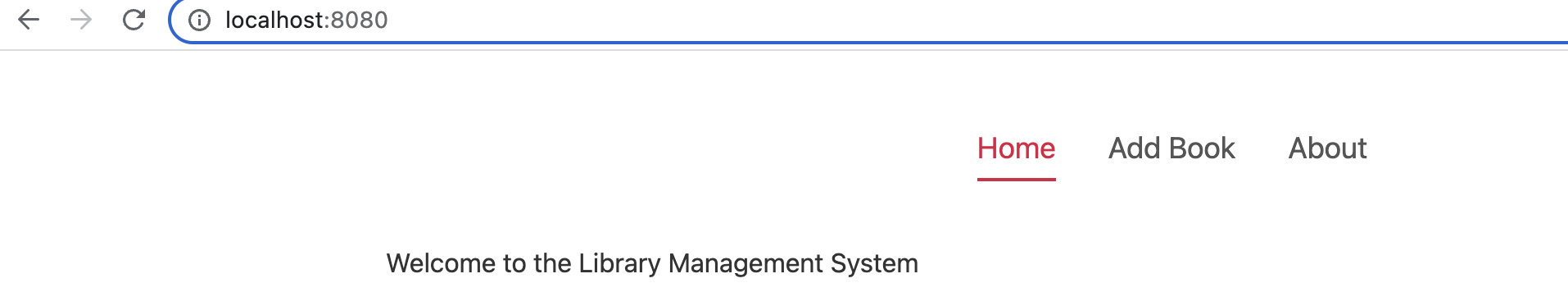
See the below screenshot where we can see the tab options rendered along with special styling for the currently active option.
Conclusion
Svelte is great for building reusable components. The Reusable Tab is one of the examples of the same. If you have any comments or queries about this post, please feel free to mention them in the comments section below.
Published at DZone with permission of Saurabh Dashora. See the original article here.
Opinions expressed by DZone contributors are their own.
Comments