Next.js Theming: CSS Variables for Adaptive Data Visualization
CSS variables revolutionize the theming of apps by allowing theme changes in real time. This makes them suitable for modern apps having features like data visualization.
 CORE
·
CORE
·
Join the DZone community and get the full member experience.
Join For FreeTheming is not just a choice but an important feature in modern web and mobile applications, as it allows for a more personalized, seamless, and tailored user experience. Theming becomes a must-have feature for SaaS applications integrating into other applications. Traditional theming techniques often involve hardcoded styles and rigid code configurations. This creates issues in the maintenance and scaling of applications.
Furthermore, complexity grows even more when an application supports multiple themes across web and mobile devices. Modern CSS frameworks come with built-in theming support, but often, the themes they provide are fixed and don’t fit the needs of enterprise applications.
The Shift Towards CSS Variables for Theming
In recent years, CSS variables have emerged as a front-runner choice for dynamic theming. Unlike CSS preprocessors such as SASS, which compile at build time, CSS variables are applied at runtime. This makes them ideal for handling real-time updates to styles — a necessary prerequisite for responsive theming.
Furthermore, they enhance code maintenance by centralizing theme definitions and provide the flexibility of applying themes based on user preference or system settings.
In this article, you will learn to create dynamic themes using CSS variables in a Next.js-based data visualization application. You will learn to:
- Create a dynamic theme switcher between dark and light modes
- Save user theme preferences
- Create dynamic data visualizations based on the user-selected theme
Note on Prerequisites
The code developed throughout the article is available at this GitHub repo. However, you are encouraged to follow along for a deeper understanding. To develop code locally, you will need the below prerequisites:
- Node.js and NPM are installed on your machine. You can verify this by running the following commands in your terminal
node --vandnpm --v. - A code editor of your choice. This application was developed using Visual Studio Code, which is the recommended editor.
- Experience with JavaScript, CSS, and React.
Setting Up a New Next.js Application
You will be creating an expense tracker application. This application will have two pages — a login page and an expense tracker dashboard page with data visualization of your expenses for the last month. You will leverage the Next.js ecosystem to build this application. Next.js uses React under the hood and provides clean route management, server-side rendering, and other cool features.
- Run the following commands to create a new Next.js application and install the necessary dependencies.
npx create-next-app@latest theme-visualization-app
cd theme-visualization-app
npm install chart.js react-chartjs-2 js-cookie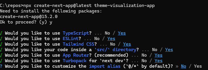
npm install --save-dev @types/js-cookie- During the creation of the Next.js app, please ensure to select presets as shown in the illustration below.
- You will notice that additional packages were installed during the setup process. These packages will allow you to build chart data visualizations and access application cookies, which will be useful during actual application development. You will learn more about these in detail soon.
- On your terminal, use the command
npm run devto start the development server, then navigate to http://localhost:3000 in your browser. You will see the default Next.js application displayed.
Implementing the Expense Tracker in Next.js
Now, you are ready to add theming logic using CSS variables and build the expense tracker functionality. In the first part of this section, you will set up the theming logic.
- Set up CSS variables, which will define the look and feel of the user interface (UI) under dark and light themes. Update the
src\app\globals.cssfile under the project root with the following code.
/* src\app\globals.css */
@import "tailwindcss";

@layer base {
  :root {
    /* Light theme variables */
    --background-color: #ffffff;
    --text-color: #0f172a;
    --card-bg: #ffffff;
    --card-text: #0f172a;
    --border-color: #e2e8f0;
    --primary-color: #3b82f6;
    --primary-text: #ffffff;
    --secondary-color: #f1f5f9;
    --secondary-text: #1e293b;
    --muted-color: #f1f5f9;
    --muted-text: #64748b;
    --accent-color: #f1f5f9;
    --accent-text: #1e293b;
    --destructive-color: #ef4444;
    --destructive-text: #ffffff;
    --input-border: #e2e8f0;
    --ring-color: #3b82f6;

    /* Chart Colors - Light Theme */
    --chart-color-1: #3b82f6;
    --chart-color-2: #8b5cf6;
    --chart-color-3: #d946ef;
    --chart-color-4: #ec4899;
    --chart-color-5: #f59e0b;
    --chart-color-6: #10b981;
    --chart-text: #0f172a;
    --chart-grid: #e2e8f0;
  }

  [data-theme="dark"] {
    --background-color: #0f172a;
    --text-color: #f8fafc;
    --card-bg: #0f172a;
    --card-text: #f8fafc;
    --border-color: #1e293b;
    --primary-color: #3b82f6;
    --primary-text: #0f172a;
    --secondary-color: #1e293b;
    --secondary-text: #f8fafc;
    --muted-color: #1e293b;
    --muted-text: #94a3b8;
    --accent-color: #1e293b;
    --accent-text: #f8fafc;
    --destructive-color: #7f1d1d;
    --destructive-text: #f8fafc;
    --input-border: #1e293b;
    --ring-color: #3b82f6;

    /* Chart Colors - Dark Theme */
    --chart-color-1: #60a5fa;
    --chart-color-2: #a78bfa;
    --chart-color-3: #e879f9;
    --chart-color-4: #f472b6;
    --chart-color-5: #fbbf24;
    --chart-color-6: #34d399;
    --chart-text: #f8fafc;
    --chart-grid: #1e293b;
  }
}

@layer components {
  body {
    background-color: var(--background-color);
    color: var(--text-color);
    transition: background-color 0.3s ease-in-out, color 0.3s ease-in-out;
  }

  .app-header {
    border-bottom: 1px solid var(--border-color);
  }

  .app-footer {
    border-top: 1px solid var(--border-color);
  }

  .theme-toggle {
    background-color: var(--secondary-color);
    color: var(--secondary-text);
    border-radius: 0.375rem;
    cursor: pointer;
    transition: opacity 0.2s;
  }

  .theme-toggle:hover {
    opacity: 0.9;
  }

  .text-muted {
    color: var(--muted-text);
  }

  .text-primary {
    color: var(--primary-color);
  }

  .themed-card {
    background-color: var(--card-bg);
    color: var(--card-text);
    border: 1px solid var(--border-color);
    border-radius: 0.5rem;
    box-shadow: 0 4px 6px -1px rgba(0, 0, 0, 0.1), 0 2px 4px -1px rgba(0, 0, 0, 0.06);
  }

  .themed-table {
    width: 100%;
    text-align: left;
  }

  .themed-table th {
    color: var(--muted-text);
    border-bottom: 1px solid var(--border-color);
    padding-bottom: 0.5rem;
  }

  .themed-table td {
    border-bottom: 1px solid var(--border-color);
    padding: 0.75rem 0;
  }

  .themed-table tr:last-child td {
    border-bottom: none;
  }

  .themed-input {
    background-color: var(--background-color);
    color: var(--text-color);
    border: 1px solid var(--input-border);
    border-radius: 0.375rem;
    padding: 0.5rem;
    width: 100%;
    transition: all 0.2s;
  }

  .themed-input:focus {
    outline: none;
    border-color: var(--primary-color);
    box-shadow: 0 0 0 2px var(--ring-color);
  }

  .themed-label {
    color: var(--muted-text);
    display: block;
    font-size: 0.875rem;
    font-weight: 500;
    margin-bottom: 0.25rem;
  }

  .themed-button {
    background-color: var(--primary-color);
    color: var(--primary-text);
    border: none;
    border-radius: 0.375rem;
    padding: 0.5rem 1rem;
    cursor: pointer;
    transition: opacity 0.2s;
  }

  .themed-button:hover {
    opacity: 0.9;
  }

  .themed-button-secondary {
    background-color: var(--secondary-color);
    color: var(--secondary-text);
  }
}- This file defines various CSS properties, for example, background color and text color for both themes. The theme style is applied based on the
data-themecustom property, which will be applied to thebodytag. The theme setup also includes styling for UI components such as cards, buttons, tables, etc. Finally, the file also importsTailwindCSS, which will be leveraged for layout and spacing between components. - Next, set up a theme context and theme toggler for the application. Create two files:
-
src\context\ThemeContext.tsx -
src\components\ThemeToggle.tsx
-
- These files will allow setting up the context and the toggle button. Update them with the following code.
// src\context\ThemeContext.tsx
'use client';

import React, { createContext, useContext, useState, useEffect, ReactNode } from 'react';
import Cookies from 'js-cookie';

type Theme = 'light' | 'dark';

interface ThemeContextType {
  theme: Theme;
  toggleTheme: () => void;
}

const ThemeContext = createContext<ThemeContextType | undefined>(undefined);

export const ThemeProvider = ({ children }: { children: ReactNode }) => {
  const [theme, setTheme] = useState<Theme>('light');

  useEffect(() => {
    const savedTheme = Cookies.get('theme') as Theme;
    if (savedTheme) {
      setTheme(savedTheme);
    } else if (window.matchMedia && window.matchMedia('(prefers-color-scheme: dark)').matches) {
      setTheme('dark');
    }
  }, []);

  useEffect(() => {
    document.body.dataset.theme = theme;
    Cookies.set('theme', theme, { expires: 365 });
  }, [theme]);

  const toggleTheme = () => {
    setTheme((prevTheme) => (prevTheme === 'light' ? 'dark' : 'light'));
  };

  return (
    <ThemeContext.Provider value={{ theme, toggleTheme }}>
      {children}
    </ThemeContext.Provider>
  );
};

export const useTheme = () => {
  const context = useContext(ThemeContext);
  if (context === undefined) {
    throw new Error('useTheme must be used within a ThemeProvider');
  }
  return context;
};
// src\components\ThemeToggle.tsx
import React from 'react';
import { useTheme } from '@/context/ThemeContext';

export const ThemeToggle = () => {
  const { theme, toggleTheme } = useTheme();

  return (
    <button
      onClick={toggleTheme}
      className="theme-toggle p-2"
      aria-label={`Switch to ${theme === 'light' ? 'dark' : 'light'} mode`}
    >
      {theme === 'light' ? (
        <svg
          xmlns="http://www.w3.org/2000/svg"
          fill="none"
          viewBox="0 0 24 24"
          strokeWidth={1.5}
          stroke="currentColor"
          className="w-5 h-5"
        >
          <path
            strokeLinecap="round"
            strokeLinejoin="round"
            d="M21.752 15.002A9.718 9.718 0 0118 15.75c-5.385 0-9.75-4.365-9.75-9.75 0-1.33.266-2.597.748-3.752A9.753 9.753 0 003 11.25C3 16.635 7.365 21 12.75 21a9.753 9.753 0 009.002-5.998z"
          />
        </svg>
      ) : (
        <svg
          xmlns="http://www.w3.org/2000/svg"
          fill="none"
          viewBox="0 0 24 24"
          strokeWidth={1.5}
          stroke="currentColor"
          className="w-5 h-5"
        >
          <path
            strokeLinecap="round"
            strokeLinejoin="round"
            d="M12 3v2.25m6.364.386l-1.591 1.591M21 12h-2.25m-.386 6.364l-1.591-1.591M12 18.75V21m-4.773-4.227l-1.591 1.591M5.25 12H3m4.227-4.773L5.636 5.636M15.75 12a3.75 3.75 0 11-7.5 0 3.75 3.75 0 017.5 0z"
          />
        </svg>
      )}
    </button>
  );
};ThemeContextleverages React Context hook to pass theme values down the component tree of the application without the need for explicit sharing. It uses a state variable conveniently named asthemeto save the applied theme. On the load of the application, this context provider also reads the cookie and checks for any previously applied theme or system defaults. This is where the previously installed dependencyjs-domcomes in handy.ThemeToggleprovides a button for toggling between the light and dark themes, switching between them using the export provided byThemeContext.- The next step is to build the layout. Create a new component
ClientWrapperand add the following code to it.
// src\components\ClientWrapper.tsx
'use client';

import React, { useEffect, useState } from 'react';
import { useTheme } from '@/context/ThemeContext';
import { ThemeToggle } from './ThemeToggle';

export const ClientWrapper = ({ children }: { children: React.ReactNode }) => {
  const { theme } = useTheme();
  const [mounted, setMounted] = useState(false);

  useEffect(() => {
    setMounted(true);
  }, []);

  if (!mounted) {
    return null;
  }

  return (
    <div className="min-h-screen flex flex-col">
      <header className="app-header p-4">
        <div className="container mx-auto flex justify-between items-center">
          <h1 className="text-xl font-bold">Expense Tracker</h1>
          <div className="flex items-center gap-4">
            <div className="text-sm text-muted">
              Current theme: {theme}
            </div>
            <ThemeToggle />
          </div>
        </div>
      </header>
      <main className="flex-grow container mx-auto p-4">
        {children}
      </main>
      <footer className="app-footer p-4">
        <div className="container mx-auto text-center text-sm text-muted">
          © {new Date().getFullYear()} Expense Tracker - Dynamic Themes Demo
        </div>
      </footer>
    </div>
  );
};ClientWrapperwraps the page components that you will implement soon. Having this component ensures consistent styling across the entire application. The component also provides a nice footer for your application.- You are ready to build the login page. Add the code below to the
src\app\page.tsxfile.
// src\app\page.tsx
'use client';

import React, { useState } from 'react';
import { useRouter } from 'next/navigation';
import { ClientWrapper } from '@/components/ClientWrapper';

export default function Login() {
  const [username, setUsername] = useState('');
  const [password, setPassword] = useState('');
  const router = useRouter();

  const handleSubmit = (e: React.FormEvent) => {
    e.preventDefault();
    router.push('/dashboard');
  };

  return (
    <ClientWrapper>
      <div className="flex justify-center items-center min-h-[80vh]">
        <div className="themed-card w-full max-w-md p-6">
          <h2 className="text-2xl font-bold mb-6 text-center">Login</h2>
          <form onSubmit={handleSubmit}>
            <div className="mb-4">
              <label htmlFor="username" className="themed-label">
                Username
              </label>
              <input
                type="text"
                id="username"
                className="themed-input"
                value={username}
                onChange={(e) => setUsername(e.target.value)}
                required
              />
            </div>
            <div className="mb-6">
              <label htmlFor="password" className="themed-label">
                Password
              </label>
              <input
                type="password"
                id="password"
                className="themed-input"
                value={password}
                onChange={(e) => setPassword(e.target.value)}
                required
              />
            </div>
            <button
              type="submit"
              className="themed-button w-full py-2"
            >
              Login
            </button>
          </form>
        </div>
      </div>
    </ClientWrapper>
  );
}- The
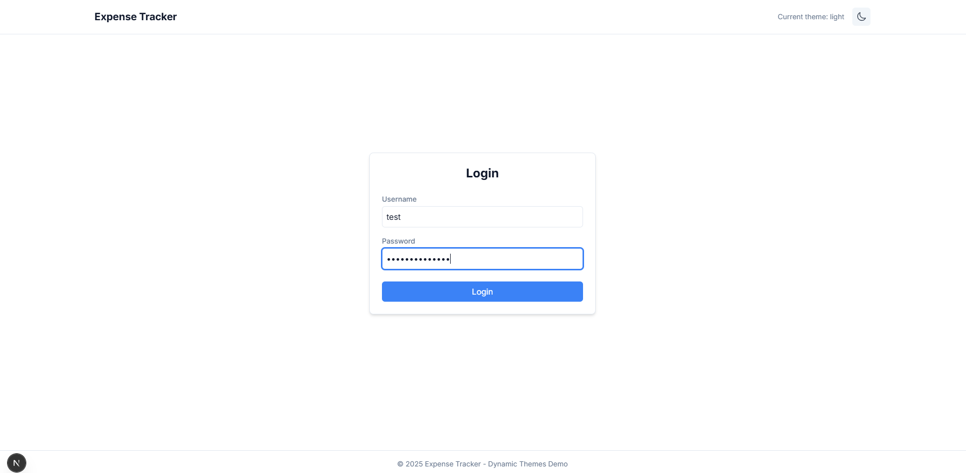
Loginpage provides a simple login form, and upon entering username and password, it redirects the user to thedashboardpage. - Next in the journey, create the
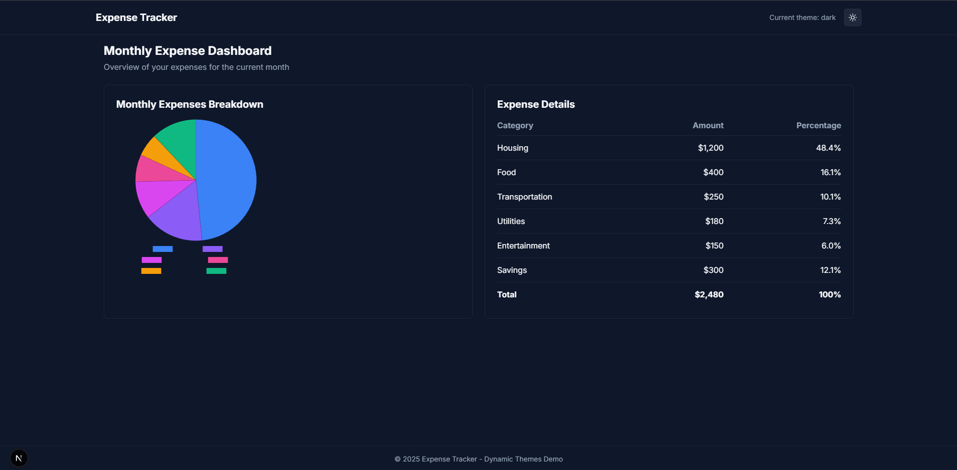
dashboardpage to display the expense tracker. The page will need two additional components,ExpenseChartandExpenseTable. Here, you will see the use of the previously installedChart.jsdependency. Additionally, dummy data to show expenses have been added. Create these three files in their respective locations and augment them with the following code.
// src\app\dashboard\page.tsx
'use client';

import React from 'react';
import { ClientWrapper } from '@/components/ClientWrapper';
import { ExpenseChart } from '@/components/ExpenseChart';
import { ExpenseTable } from '@/components/ExpenseTable';

const expenseData = [
  { category: 'Housing', amount: 1200 },
  { category: 'Food', amount: 400 },
  { category: 'Transportation', amount: 250 },
  { category: 'Utilities', amount: 180 },
  { category: 'Entertainment', amount: 150 },
  { category: 'Savings', amount: 300 },
];

export default function Dashboard() {
  return (
    <ClientWrapper>
      <div className="mb-6">
        <h1 className="text-2xl font-bold">Monthly Expense Dashboard</h1>
        <p className="text-muted mt-1">
          Overview of your expenses for the current month
        </p>
      </div>

      <div className="grid md:grid-cols-2 gap-6">
        <ExpenseChart data={expenseData} />
        <ExpenseTable data={expenseData} />
      </div>
    </ClientWrapper>
  );
}// src\components\ExpenseChart.tsx
'use client';
import React, { useEffect, useState } from 'react';
import { Chart as ChartJS, ArcElement, Tooltip, Legend } from 'chart.js';
import { Pie } from 'react-chartjs-2';
import { useTheme } from '@/context/ThemeContext';
ChartJS.register(ArcElement, Tooltip, Legend);
export type ExpenseData = {
category: string;
amount: number;
};
interface ExpenseChartProps {
data: ExpenseData[];
}
export const ExpenseChart: React.FC<ExpenseChartProps> = ({ data }) => {
const { theme } = useTheme();
const [chartData, setChartData] = useState<any>(null);
const [chartOptions, setChartOptions] = useState<any>(null);
useEffect(() => {
const getThemeColor = (variable: string) => {
const computedStyle = getComputedStyle(document.body);
return computedStyle.getPropertyValue(variable).trim();
};
const chartColors = [
getThemeColor('--chart-color-1'),
getThemeColor('--chart-color-2'),
getThemeColor('--chart-color-3'),
getThemeColor('--chart-color-4'),
getThemeColor('--chart-color-5'),
getThemeColor('--chart-color-6'),
];
setChartData({
labels: data.map(item => item.category),
datasets: [
{
data: data.map(item => item.amount),
backgroundColor: chartColors,
borderColor: theme === 'dark' ? 'rgba(0, 0, 0, 0.1)' : 'rgba(255, 255, 255, 0.1)',
borderWidth: 1,
},
],
});
setChartOptions({
responsive: true,
plugins: {
legend: {
position: 'bottom' as const,
labels: {
color: getThemeColor('--chart-text'),
font: {
size: 12,
},
},
},
tooltip: {
backgroundColor: getThemeColor('--card-bg'),
titleColor: getThemeColor('--card-text'),
bodyColor: getThemeColor('--card-text'),
borderColor: getThemeColor('--border-color'),
borderWidth: 1,
padding: 12,
displayColors: true,
callbacks: {
label: function(context: any) {
const label = context.label || '';
const value = context.raw || 0;
const total = context.dataset.data.reduce((a: number, b: number) => a + b, 0);
const percentage = Math.round((value / total) * 100);
return `${label}: $${value} (${percentage}%)`;
}
}
},
},
});
}, [data, theme]);
if (!chartData || !chartOptions) {
return <div className="themed-card p-6 flex items-center justify-center h-full">Loading chart...</div>;
}
return (
<div className="themed-card p-6">
<h2 className="text-xl font-bold mb-4">Monthly Expenses Breakdown</h2>
<div className="h-80">
<Pie data={chartData} options={chartOptions} />
</div>
</div>
);
};// src\components\ExpenseTable.tsx
import React from 'react';
import { ExpenseData } from './ExpenseChart';
interface ExpenseTableProps {
data: ExpenseData[];
}
export const ExpenseTable: React.FC<ExpenseTableProps> = ({ data }) => {
const totalExpenses = data.reduce((sum, item) => sum + item.amount, 0);
return (
<div className="themed-card p-6">
<h2 className="text-xl font-bold mb-4">Expense Details</h2>
<div className="overflow-x-auto">
<table className="themed-table">
<thead>
<tr>
<th>Category</th>
<th className="text-right">Amount</th>
<th className="text-right">Percentage</th>
</tr>
</thead>
<tbody>
{data.map((item, index) => {
const percentage = ((item.amount / totalExpenses) * 100).toFixed(1);
return (
<tr key={index}>
<td>{item.category}</td>
<td className="text-right">${item.amount.toLocaleString()}</td>
<td className="text-right">{percentage}%</td>
</tr>
);
})}
<tr className="font-bold">
<td>Total</td>
<td className="text-right">${totalExpenses.toLocaleString()}</td>
<td className="text-right">100%</td>
</tr>
</tbody>
</table>
</div>
</div>
);
};- Now, putting everything together, update the root layout component with the
ThemeContextso the entire application is aware of the theming. Update thelayoutcomponent as per below.
// src\app\layout.tsx
import type { Metadata } from 'next';
import { Inter } from 'next/font/google';
import './globals.css';
import { ThemeProvider } from '@/context/ThemeContext';

const inter = Inter({ subsets: ['latin'] });

export const metadata: Metadata = {
  title: 'Expense Tracker with Dynamic Themes',
  description: 'A Next.js application with dynamic theming for data visualizations',
};

export default function RootLayout({
  children,
}: {
  children: React.ReactNode;
}) {
  return (
    <html lang="en">
      <body className={inter.className}>
        <ThemeProvider>
          {children}
        </ThemeProvider>
      </body>
    </html>
  );
}- Start the application with
npm run devif it is not already running, and navigate to http://localhost:3000/. You should see the application loaded as given in the illustration below. Notice the theme value in the upper right corner.![Login page]()
![Dashboard Page Dark Theme]()
Conclusion
Congratulations on learning about the importance of CSS variables, theming in applications, and building an entire application to use them. You are now fully equipped with the knowledge to leverage CSS variables for theming.
Using them in enterprise applications requires some special considerations, like modularity, consistent variable naming, defining base variables, and more for scalability and maintainability. Following these best practices ensures that theming remains flexible for large applications.
Opinions expressed by DZone contributors are their own.
Comments