Data Visualizations With InfluxDB and Plotly.js
Walk through creating data visualizations with InfluxDB and plotly.js, a JavaScript graphing library built on top of d3.js and stack.gl.
Join the DZone community and get the full member experience.
Join For FreeOne of the great features of the InfluxData Time Series Platform is that users have the option to use the different stack components- Telegraf, InfluxDB, Kapacitor, and Chronograf-all together, or customize their usage by integrating InfluxDB with other libraries and technologies. Therefore, although Chronograf supplies a plethora of quick and easy visualizations and dashboards, users can also build and share their own custom visualizations. Here, we'll walk through creating data visualizations with InfluxDB and plotly.js, a JavaScript graphing library built on top of d3.js and stack.gl.
Getting Started
Before we start visualizing, we need to set up an instance of InfluxDB on our local machines. If you don't have the TICK Stack set up and running yet, it's best to go through the most recent Getting Started guide on the InfluxData website, which will walk you through installing and running all four packages of the stack. Or if you would prefer, you can experiment in sandbox mode.
Querying Data From InfluxDB
Once you're all set up, and InfluxDB is running, you can set up a file to query the database and grab some data. I'm going to do this with Node/Express using the Node-influx client library. For this example, I'll be querying for data that Telegraf is already collecting for my computer. If you have the full TICK Stack installed and running, you should be able to do the same.
In my server.js file, I have the following:
const Influx = require('influx');
const express = require('express');
const path = require('path');
const os = require('os');
const bodyParser = require('body-parser');
const app = express();
const influx = new Influx.InfluxDB('http://127.0.0.1:8086/telegraf');
Also, in your shell, don't forget to run:
npm install influx express body-parser --save This will install the appropriate dependencies and require them into the server file so you can set up your server. You'll see I am connecting to my local instance of InfluxDB; specifically, the Telegraf database that is already collecting statistics about my computer. Let's add the following:
app.use(bodyParser.json());
app.use(bodyParser.urlencoded({
  extended: true
}));
app.use(express.static(path.join(__dirname, 'public')));
app.set('port', 3000);

influx.getMeasurements()
  .then(names => console.log('My measurement names are: ' + names.join(', ')))
  .then(() => {
    app.listen(app.get('port'), () => {
      console.log(`Listening on ${app.get('port')}.`);
    });
  })
  .catch(error => console.log({ error }));

app.get('/api/v1/usage', (request, response) => {
  influx.query(`
    select mean("usage_user") as "mean_usage_user",
    mean("usage_system") as "mean_usage_system" from cpu
    where time > now() - 1h and
    host = ${Influx.escape.stringLit(os.hostname())}
    group by time(10s)
    order by time desc
    limit 200
    `)
    .then(result => response.status(200).json(result))
    .catch(error => response.status(500).json({ error }));
});
Here, I'm adding appropriate middleware to parse our responses (body-parser), setting the port to 3000, and defining the path which will serve up my index.html file. I use getMeasurements() to check what measurements are tracked in the database and set up the server to listen on port 3000. The last section of code queries the database for data, specifically, the mean CPU usage of user and system.
Setting Up HTML and CSS
Let's create a public directory and index.html, styles.css, and scripts.js files within that directory. We will be using these files to display the plotly graphs. Go ahead and add the following to your index.html file:
<!DOCTYPE html>
<html>
  <head>
    <meta charset="utf-8">
    <meta name="viewport" content="width=device-width, initial-scale=1.0">
    <meta http-equiv="X-UA-Compatible" content="ie=edge">
    <link rel="stylesheet" type="text/css" href="styles.css">
    <title>Visualizing Data from InfluxDB with Plotly</title>
  </head>
  <body>
    <header>
      <h1 class="title">Visualizing Data from InfluxDB with Plotly.js, a JavaScript Graphing Library</h1>
    </header>
    <main>
      <h2 class="graphs-title">My Time Series Graphs</h2>
      <div id="graphs-container">
        <!-- Append graph here -->
      </div>
    </main>
    <script src="https://cdn.plot.ly/plotly-latest.min.js"></script>
    <script src="https://ajax.googleapis.com/ajax/libs/jquery/3.2.1/jquery.min.js"></script>
    <script src="scripts.js"></script>
  </body>
</html>
Aside from incorporating JQuery and your script file, you'll need to incorporate the plotly CDN. Alternatively, you can install the plotly.js library as an npm module. For more information on that, please visit the Getting Started guide on the plotly.js website.
Let's add the following CSS to our styles.css file for a bit of flair:
*,
*::before,
*::after {
  margin: 0;
  padding: 0;
  box-sizing: border-box;
}

body {
  width: 100%;
  height: 100%;
  background: #f8f8f8;
  color: #666;
  font-family: sans-serif;
}

header {
  display: flex;
  flex-direction: column;
  align-items: center;
  justify-content: center;
  height: 20vh;
  background: #666;
  color: #f8f8f8;
}

.title {
  font-size: 60px;
}

main {
  height: 80vh;
  display: flex;
  flex-direction: column;
  align-items: center;
}

.graphs-title {
  margin: 30px auto;
}

#graphs-container {
  height: 60%;
  width: 80%;
}
Moving to our scripts.js file, this is where we can add functionality to visualize our data. Add the following:
const loadData = () => {
  fetch('/api/v1/usage')
    .then( response => {
      if (response.status !== 200) {
        console.log(response);
      }
      return response;
    })
    .then(response => response.json())
    .then(parsedResponse => {
      const unpackData = (arr, key) => {
        return arr.map(obj => obj[key])
      }
      const firstTrace = {
        type: 'scatter',
        mode: 'lines',
        name: 'Mean User Usage',
        x: unpackData(parsedResponse, 'time'),
        y: unpackData(parsedResponse, 'mean_usage_user'),
        line: {color: '#17BECF'}
      }
      const secondTrace = {
        type: "scatter",
        mode: "lines",
        name: 'Mean System Usage',
        x: unpackData(parsedResponse, 'time'),
        y: unpackData(parsedResponse, 'mean_usage_system'),
        line: {color: '#7F7F7F'}
      }
      const data = [firstTrace, secondTrace];
      const layout = {
        title: 'Local CPU Usage',
      };
      return Plotly.newPlot('graphs-container', data, layout);
    })
    .catch( error => console.log(error) );
}

$(window).on('load', loadData);
If you restart your server at this point and navigate to localhost:3000, you should see something similar to this:
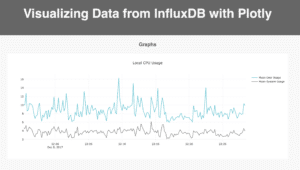
And voila! You've got yourself a custom time series visualization using InfluxDB and plotly.js! You can check out the source code on GitHub here.
Published at DZone with permission of Margo Schaedel. See the original article here.
Opinions expressed by DZone contributors are their own.
Comments