Drag and Drop Visualization in R
Explore drag and drop visualization in R and look at how to install esquisse in R.
Join the DZone community and get the full member experience.
Join For FreeData Visualization is a crucial component of any data related task. If you are a Business Analyst or Data Analyst, you need visualization to understand the data. If you are a Data Scientist, visualization is a critical component in your day-to-day tasks. R has been one of the go-to tools for visualizing data and creating machine learning models for Data Scientists. ggplot2 is one of the best and reliable tools in R to create great graphs. However, you need to remember ggplot2 commands to generate graphs, and it has a lot of syntaxes!
So, most of us prefer Tableau to do quick data analysis before creating models in R. It was amazing to discover a tableau-like package Esquisse in R that provides the same flexibility of drag and drop functionality to create graphs. You can also export the chart to a PNG or Powerpoint format and even copy the ggplot2 code from the tool and embed it in the R code. Sounds incredible, doesn't it? The credit for creating such an incredible package goes to DreamR, who has also developed other shiny-based R applications that might benefit you as well. Check them out from this link.
Installing esquisse in R is simple and is available in CRAN. You can run the following command in R:
install.packages("esquisse")Next, load the library and initialize the application as shown in the below code snippet.
library(esquisse)
esquisse::esquisser()
Once it is initialized successfully, it will pop up the app, which looks similar to the following screen:
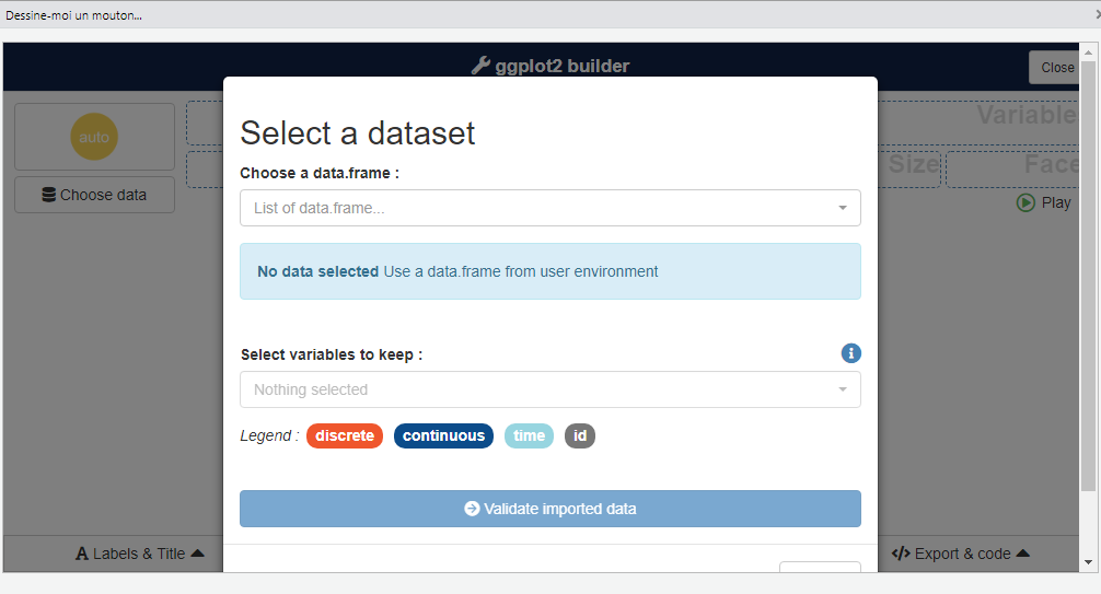
Next, you can select the data frame from the list of active data frames in the R session.
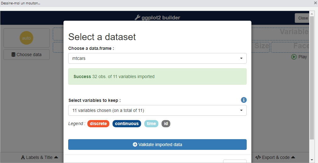
Alternatively, one can also directly pass the data frame as an input while invoking the application.
library(esquisse)
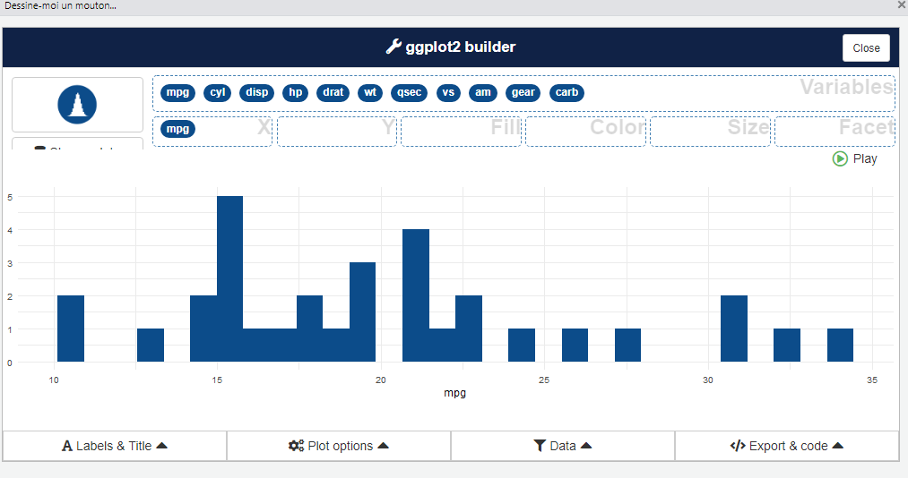
esquisse::esquisser(mtcars)Once, the data is uploaded and validated successfully; the attribute names appear in the list of variables. If this list of variables appears, we are all set to try out different graphs for the uploaded dataset. One can try creating a univariate graph by dragging only a single variable to X field.
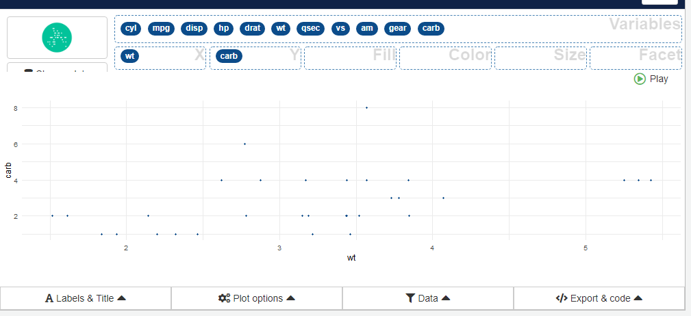
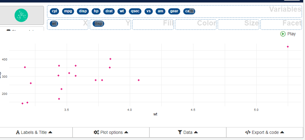
Also, we can create bivariate graphs by selecting variable for X and Y fields easily.
There are also various other options to add labels and titles, choosing colors and selecting a subset of data for plotting in the applications. Overall, it has got all the possibilities that ggplot2 provides to make a graph better and visually appealing. If you are not sure about the functionality of ggplot, check this article out.
Next, we can export the R ggplot2 code from the "Export & code" section as shown below. This code is fully functional and can be used in your R scripts directly.
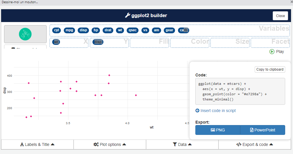
If you want the graph to be part of a presentation or a report you are preparing, you can directly export the graph as PNG or PowerPoint.
Using esquisse, it becomes easy to create impressive graphs in R and use it any way we like it. However, it is just a tool that enables us to make plots easily, but it is up to us to choose what graph suits our needs well along with reflecting visualization best practices. If you want to know more about this, then check out our previous article on Demystifying Data Visualization.
Opinions expressed by DZone contributors are their own.
Comments