GTFS Transit Data Visualization in R
Learn how to use R with ggplot2 and ggmap to visualize GTFS (General Transit Feed Specification) route and schedule information on a map.
Join the DZone community and get the full member experience.
Join For FreeGTFS (General Transit Feed Specification) is a specification that defines a data format for public transportation routes, stop, schedules, and associated geographic information.
In this post, we’ll use R with ggplot2 and ggmap to visualize GTFS route and schedule information on a map.
This post uses a GTFS feed from CARRIS, which is a bus public transport operator from the city of Lisbon.
Plot the Transport Network
Plot the whole network on a map:
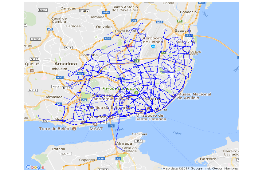
The code looks like this:
library(ggmap)
library(ggplot2)
library(ggthemes)
library(dplyr)

#read GTFS data
shapes <- read.csv("shapes.txt")
# fetch the map
lx_map <- get_map(location = c(-9.157513,38.73466), maptype = "roadmap", zoom = 12)
# plot the map with a line for each group of shapes (route)
ggmap(lx_map, extent = "device") +
  geom_path(data = shapes, aes(shape_pt_lon, shape_pt_lat, group = shape_id), size = .1, alpha = .5, color='blue') +
  coord_equal() + theme_map()
Heatmap of Stops With Most Trips
Plot a heatmap of the regions with least and most number of trips. You can see in dark blue the areas with the greater number of trips.
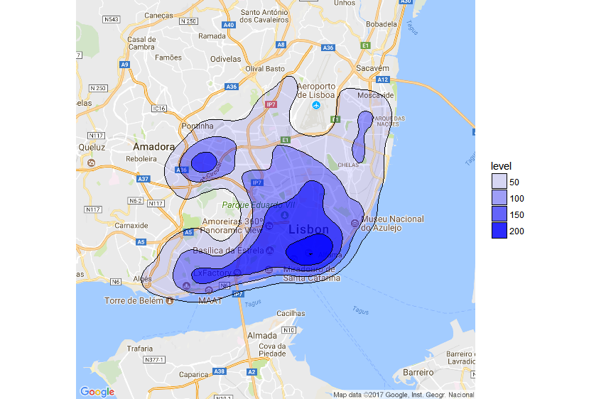 The code looks like this:
# read GTFS data
stops <- read.csv("stops.txt")
stop_times <- read.csv("stop_times.txt") %>% sample_n(10000) # use a data sample of 10.000 instead of the whole dataset
trips <- read.csv("trips.txt")
calendar <- read.csv("calendar.txt") %>% filterCalendar("2017-09-11") # filter trips of a given day

#join all stop times with stop info and trips
stops_freq =
  inner_join(stop_times,stops,by=c("stop_id")) %>%
  inner_join(trips,by=c("trip_id")) %>%
  inner_join(calendar,by=c("service_id")) %>%
  select(stop_id,stop_name,stop_lat,stop_lon) #%>%

# plot the map with a density/heatmap trips/stops
ggmap(lx_map, extent = "device") +
  stat_density2d(data = stops_freq, aes(x = stop_lon, y = stop_lat, alpha=..level..), # variable transparency according to number of trips
                 size = .5, color='black', bins=5, geom = "polygon", fill='blue') # use 5 bins(transparency levels) to reprisent different densities

#################################################################
# function to filter services valid on the date filter_date_str
filterCalendar=function (calendar, filter_date_str){
  calendar=calendar %>%
    mutate(start_date_dt=as.Date(as.character(start_date), format="%Y%m%d")) %>%
    mutate(end_date_dt  =as.Date(as.character(end_date), format="%Y%m%d"))

  filter_date=as.Date(filter_date_str, format="%Y-%m-%d")
  week_day=c("sunday", "monday", "tuesday", "wednesday", "thursday", "friday", "saturday")[as.POSIXlt(filter_date)$wday + 1]
  calendar[filter_date>=calendar$start_date_dt # filter start/end dates
           & filter_date<=calendar$end_date_dt
           & calendar[[week_day]] == 1 # filter the weekday
           ,]
}
Plot Stops With Size Based on Trip Frequency
Plot a circle for each stop. The circle size and color are based on the trip frequency.
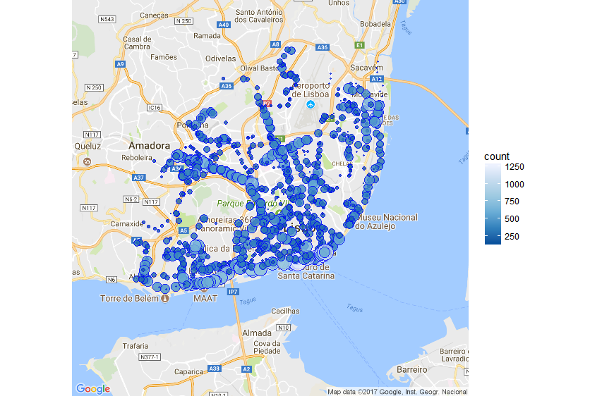
The code looks like this:
# read GTFS stop_times
stop_times <- read.csv("stop_times.txt")

#join all data and count number of services grouped by stop
  stops_freq =
    inner_join(stop_times,stops,by=c("stop_id")) %>%
    inner_join(trips,by=c("trip_id")) %>%
    inner_join(calendar,by=c("service_id")) %>%
    select(stop_id,stop_name,stop_lat,stop_lon) %>%
    group_by(stop_id,stop_name,stop_lat,stop_lon) %>%
    summarize(count=n()) %>%
    filter(count>=150) # filter out least used stops

  # plot the map with stop data
  ggmap(lx_map, extent = "device") +
     geom_point(data = stops_freq,aes(x=stop_lon, y=stop_lat, size=count, fill=count), shape=21, alpha=0.8, colour = "blue")+ #plot stops with blue color
     scale_size_continuous(range = c(0, 9), guide = FALSE) + # size proportional to number of trips
     scale_fill_distiller()  # circle fill proportional to number of trips
GTFS Data Sources
Here's a list of sites where you can get GTFS feeds from multiple operators
And that's it. Enjoy!
Opinions expressed by DZone contributors are their own.
Comments