How to Create a Mosaic Chart Using JavaScript
A step-by-step guide for building an interactive JS Mosaic Chart, illustrated by visualizing data on quarterly PC shipments by brand in 2020.
Join the DZone community and get the full member experience.
Join For FreeData visualization is a valuable tool in today’s scenario, with data everywhere and various opportunities to tap into that data to find insights. Visual charts are imperative to communicate ideas, identify patterns, and make the most of the available data.
So then, would you like to quickly and easily learn how to create a really cool chart that showcases data interestingly?
A mosaic chart is a multi-series chart that effectively represents data with over 2 parameters and is so-called because each data point has distinctive indents, making it visually similar to a piece of mosaic art. Not only is this chart beautiful to look at, but is also very helpful in representing multiple variables and recognizing the relationship between these different variables.
The year 2020 was not all bad, at least for the market of personal computers. The sales of PCs increased throughout each quarter of 2020, with more people working and studying from home. I explored how each brand fared in every quarter based on the number of global shipments.
Here is a look at the final chart to get you excited!
Follow along with this quick tutorial for front-end web developers and data viz enthusiasts to get the hang of creating a Mosaic Chart with JavaScript.
Building a JS Mosaic Chart in 4 Simple Steps
A mosaic chart may look exciting but difficult to create. However, it is pretty straightforward and easy to create this chart with a JavaScript charting library as one can remove a lot of the burden of coding and allow you to get a chart up quickly and with minimal technical details.
For this tutorial, I am using the AnyChart JS library. I’ve chosen AnyChart as it is flexible yet easy to start off. It is especially good for beginners because of the extensive documentation, along with many useful examples.
Having some background with technologies like HTML and JavaScript is an advantage when visualizing data. Nonetheless, it is quite uncomplicated to create interactive charts with a JS library, and the steps for creating mosaic charts with almost any JavaScript library that supports this chart type tend to be more or less the same.
The 4 fundamental steps to creating a JS Mosaic Chart are:
- Create an HTML page for the chart.
- Add the necessary JavaScript files.
- Connect the data.
- Write the required JS code for drawing the chart.
1. Create a Basic HTML Page
The first thing to do is create a basic HTML page that will hold the chart. Next, create an HTML block element, and to identify this <div> later in the code, I give it an id attribute like 'container.'
x
<html>
<head>
<title>JavaScript Mosaic Chart</title>
<style type="text/css">
html,
body,
#container {
width: 100%;
height: 100%;
margin: 0;
padding: 0;
}
</style>
</head>
<body>
<div id="container"></div>
</body>
</html>
I give 100% width and height to the block so that the chart fills the entire page, but it can be specified according to your preference.
2. Reference the necessary JavaScript files
The next step is adding the charting library scripts to create the mosaic chart. I include the corresponding files from AnyChart’s CDN since that is the library I am using. Of course, these scripts can also be downloaded and referenced as such.
For this chart, I need the core script along with the specific module for the mosaic chart. Here, the module for the mosaic chart contains 3 different types of Marimekko charts, mosaic being one of them. If you want to know more about these charts and their specific characteristics, check out the AnyChart documentation about Marimekko charts.
I add both of these scripts to the <head> section of my HTML page.
xxxxxxxxxx
<html>
<head>
<title>JavaScript Mosaic Chart</title>
<script src="https://cdn.anychart.com/releases/8.9.0/js/anychart-core.min.js">
</script>
<script src="https://cdn.anychart.com/releases/8.9.0/js/anychart-mekko.min.js">
</script>
<style type="text/css">
html,
body,
#container {
width: 100%;
height: 100%;
margin: 0;
padding: 0;
}
</style>
</head>
<body>
<div id="container"></div>
<script>
// All the JS code for the mosaic chart will come here.
</script>
</body>
</html>
3. Set the Data
I collated the sales data for different PC brands for each quarter of 2020 as given by Gartner. To facilitate the creation of the mosaic chart, I processed the data in a format that is suitable for it, and since the data is limited, I add it directly in the code.
Here, I plot the quarters on the X-axis and the brands as individual tiles, so I add the brands in the header data and the quarterly figures in the rows.
xxxxxxxxxx
<html>
<head>
<title>JavaScript Mosaic Chart</title>
<script src="https://cdn.anychart.com/releases/8.9.0/js/anychart-core.min.js">
</script>
<script src="https://cdn.anychart.com/releases/8.9.0/js/anychart-mekko.min.js">
</script>
<style type="text/css">
html,
body,
#container {
width: 100%;
height: 100%;
margin: 0;
padding: 0;
}
</style>
</head>
<body>
<div id="container"></div>
<script>
var data = {
header: [
'#',
'LENOVO',
'HP',
'DELL',
'APPLE',
'ACER',
'ASUS',
'OTHERS'
],
rows: [
['Q1', 12613,11114,10158,3555,2900,2603,8693],
['Q2', 16197,16165,10648,4368,4007,3593,9829],
['Q3', 18310,15447,10827,5513,5085,4747,11448],
['Q4', 21491,15683,13199,6893,4741,4570,12813]
]
};
</script>
</body>
</html>
Now that we have all the prep done, let’s go on to the final step for drawing the chic, interactive JS mosaic chart!
4. Write the JavaScript Code for Your Chart
Writing code might sound daunting for someone with not much coding experience, but believe me, it is literally 5 lines that need to be written to conjure up a beautiful mosaic chart.
Before anything else, I add a function enclosing all the code, which makes sure that the entire code inside it will only execute once the page is ready. I then put the data inside this function.
Next, I create the mosaic chart with the inbuilt function and set the data.
Finally, I add the reference to the container where the chart is to be drawn, set the title of the chart, and initiate the drawing.
xxxxxxxxxx
<html>
<head>
<title>JavaScript Mosaic Chart</title>
<script src="https://cdn.anychart.com/releases/8.9.0/js/anychart-core.min.js">
</script>
<script src="https://cdn.anychart.com/releases/8.9.0/js/anychart-mekko.min.js">
</script>
<style type="text/css">
html,
body,
#container {
width: 100%;
height: 100%;
margin: 0;
padding: 0;
}
</style>
</head>
<body>
<div id="container"></div>
<script>
anychart.onDocumentReady(function () {
var data = {
header: [
'#',
'LENOVO',
'HP',
'DELL',
'APPLE',
'ACER',
'ASUS',
'OTHERS'
],
rows: [
['Q1', 12613,11114,10158,3555,2900,2603,8693],
['Q2', 16197,16165,10648,4368,4007,3593,9829],
['Q3', 18310,15447,10827,5513,5085,4747,11448],
['Q4', 21491,15683,13199,6893,4741,4570,12813]
]
};
// create a mosaic chart
var chart = anychart.mosaic();
// set chart data
chart.data(data);
// set container id for the chart
chart.container('container');
// set the chart title
chart.title("Quarterly Brand-wise Personal Computer Shipments in 2020 (Thousands of Units)");
// initiate chart drawing
chart.draw();
});
</script>
</body>
</html>
Lo-and-behold! A fascinating and functional mosaic chart is created!
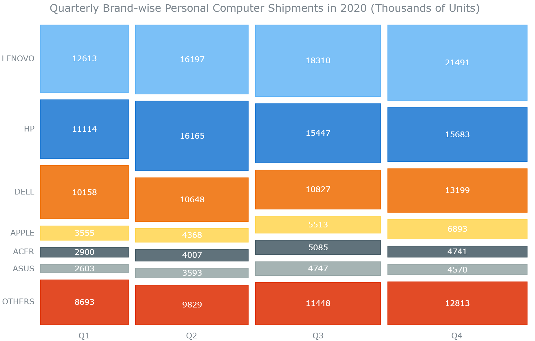
You can immediately see how the shipments increase each quarter by the increasing width of every quarter. In brands, Lenovo is the clear market leader and its sales have grown quarter by quarter. Also, something lucidly seen is that Lenovo, HP and Dell capture more than 50% of the market.
Have a look at this initial version of the mosaic chart with the full JS/CSS/HTML code on CodePen.
Customizing the Mosaic Chart
Most of the decent JS charting libraries allow you to customize the charts using their API. These customizations can make your data visualization stand out with personalized aesthetics and improved representation of the message you want to convey.
Now that the basic mosaic chart is created, let me show you how to enhance the chart’s capabilities in representing the data and tweaking its appearance by some simple customizations.
1. Reduce the Space Between Individual Tiles
To improve the appearance of the mosaic, I reduce the space between each of the points with just one line of code.
x
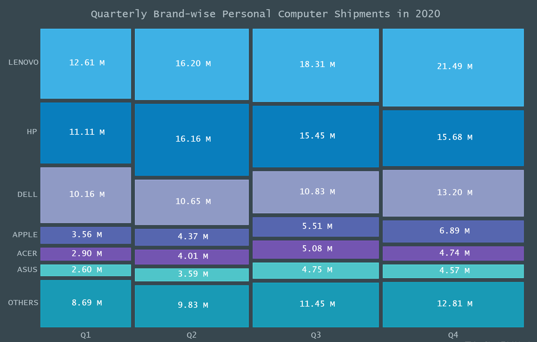
chart.pointsPadding(3);
2. Improve the Data Label Presentation
The values in the data are in the form of figures in thousands. To make it more readable and easily comprehensible, I change the format of the numbers to showcase the figures in millions. I also update the title of the chart to reflect this modification.
xxxxxxxxxx
// set the chart labels settings
chart.labels()
.format(function(e){
var value = ((this.value)/1000).toFixed(2);
return value + " M";
});
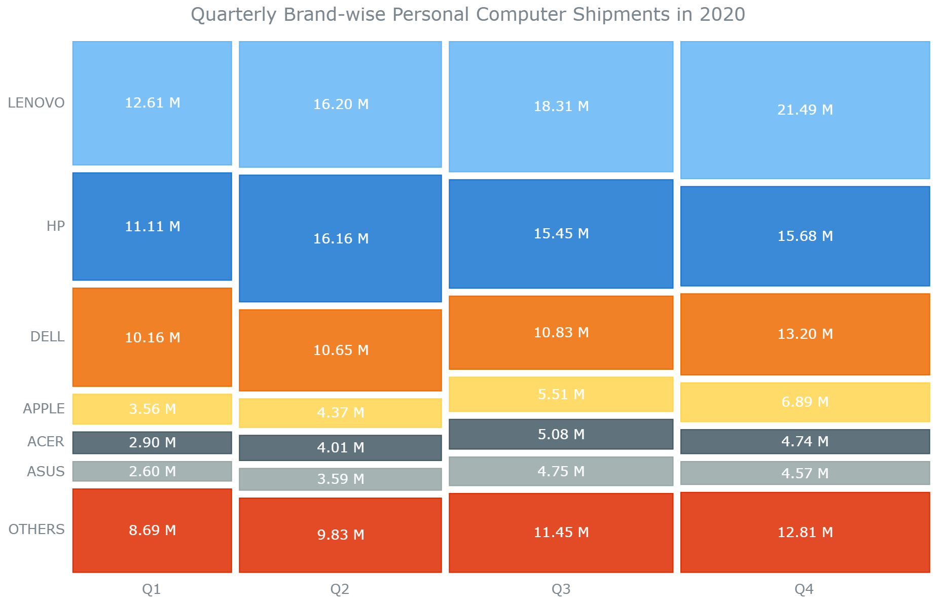
// set the chart title
chart.title("Quarterly Brand-wise Personal Computer Shipments in 2020");
You can check out the entire code for this intermediate version of the mosaic chart on CodePen.
3. Change the Color Theme and Make Other Related Modifications
To make the Mosaic chart more personalized, I decide to use a different color palette. AnyChart offers some great inbuilt themes that include pre-defined settings like the colors for the chart data points as well as background along with distinct fonts. You can also create a custom theme, but for this chart, I choose an out-of-the-box theme that feels like an old-generation PC screen.
I add the theme script in the <head> section and then add a line of code to set the theme for the mosaic chart.
The inherent font size is slightly small for my preference, so I specify the size of the font in the styling. Also, I want the title of the chart to be bigger, so I add some code to modify that as well.
xxxxxxxxxx
<head>
<script src="https://cdn.anychart.com/releases/8.9.0/themes/dark_blue.min.js">
</script>
<style type="text/css">
#container text {
font-size: 13px;
}
</style>
</head>
<body>
<script>
// set the chart theme
anychart.theme('darkBlue');
</script>
</body>
Also, I want the title of the chart to be bigger, so I add some code to modify that as well.
xxxxxxxxxx
// set the chart title
chart
.title()
.enabled(true)
.useHtml(true)
.text("<span style = 'font-size:16px';>Quarterly Brand-wise Personal Computer Shipments in 2020</span>");
Aha! Doesn’t the mosaic chart look so very personalized and engaging?
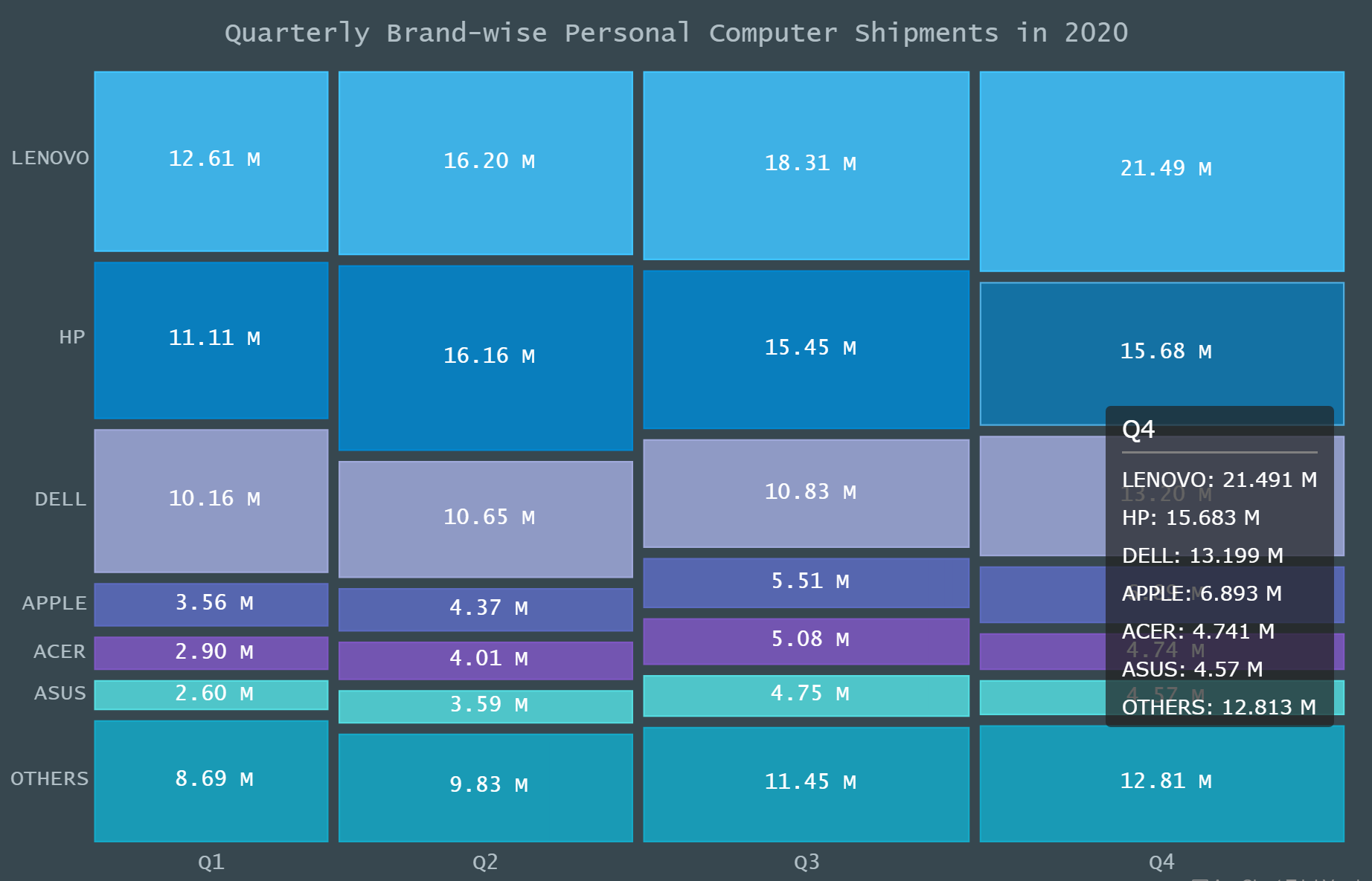
4. Enhance the tooltip
The last thing to do is make the tooltip more informative and better formatted. Since this is a mosaic chart with individual data points very distinctly identifiable, I want the tooltip to show all the data values for that particular quarter. This can be done by specifying the display mode for the tooltip.
Finally, I just tweak the appearance of the tooltip.
xxxxxxxxxx
// set union tooltip
chart.tooltip().displayMode('union');
// enable HTML in tooltips and format
chart
.tooltip()
.useHtml(true)
.format("<h5 style='font-size:14px; margin: 0.5rem 0;'>{%name}</h5>{%SeriesName}: {%value}{scale:(1000)(1000)|( M)}");
That’s it! A very appealing and informative JavaScript Mosaic Chart is ready.
Take a look at the final code for the mosaic chart here or on CodePen.
xxxxxxxxxx
<html>
<head>
<title>JavaScript Mosaic Chart</title>
<script src="https://cdn.anychart.com/releases/8.9.0/js/anychart-core.min.js">
</script>
<script src="https://cdn.anychart.com/releases/8.9.0/js/anychart-mekko.min.js">
</script>
<script src="https://cdn.anychart.com/releases/8.9.0/themes/dark_blue.min.js">
</script>
<style type="text/css">
html,
body,
#container {
width: 100%;
height: 100%;
margin: 0;
padding: 0;
}
#container text {
font-size: 13px;
}
</style>
</head>
<body>
<div id="container"></div>
<script>
anychart.onDocumentReady(function () {
var data = {
header: [
'#',
'LENOVO',
'HP',
'DELL',
'APPLE',
'ACER',
'ASUS',
'OTHERS'
],
rows: [
['Q1', 12613,11114,10158,3555,2900,2603,8693],
['Q2', 16197,16165,10648,4368,4007,3593,9829],
['Q3', 18310,15447,10827,5513,5085,4747,11448],
['Q4', 21491,15683,13199,6893,4741,4570,12813]
]
};
// set the chart theme
anychart.theme('darkBlue');
// create a mosaic chart
var chart = anychart.mosaic();
// set points padding
chart.pointsPadding(3);
// set chart data
chart.data(data);
// set the chart labels settings
chart.labels()
.format(function(e){
var value = ((this.value)/1000).toFixed(2);
return value + " M";
});
// set union tooltip
chart.tooltip().displayMode('union');
// enable HTML in tooltips and format
chart
.tooltip()
.useHtml(true)
.format("<h5 style='font-size:14px; margin: 0.5rem 0;'>{%name}</h5>{%SeriesName}: {%value}{scale:(1000)(1000)|( M)}");
// set container id for the chart
chart.container('container');
// set the chart title
chart
.title()
.enabled(true)
.useHtml(true)
.text("<span style = 'font-size:16px';>Quarterly Brand-wise Personal Computer Shipments in 2020</span>");
// initiate chart drawing
chart.draw();
});
</script>
</body>
</html>
Conclusion
As you can see, building a creative and interactive JS Mosaic Chart is not difficult with the help of a charting library. Of course, this is just scratching the surface, so go ahead and experiment with different charts as well as datasets. There are many other JS charting libraries to explore or if you want, check out some awesome other chart types in AnyChart.
Use that Lenovo or Dell (or are you a Mac person?) of yours to create visualizations and please share your creations here. Of course, let me know if you have any questions.
Opinions expressed by DZone contributors are their own.
Comments