HTML Layout
Explore the fundamentals of HTML layout, including the essential elements and techniques that empower web developers to structure and style web content effectively.
Join the DZone community and get the full member experience.
Join For FreeThe general appearance of a piece of writing, a picture, a piece of text, or another medium is created to appeal to the spectator and aid in understanding what they are looking at. For instance, Computer Hope has a distinctive layout that is identifiable to our visitors, making it easier for them to move around the website.
What Is an HTML Layout?
An HTML layout is a template for organizing web pages in a specific way. It is straightforward to use, understand, and adjust web design elements using HTML tags. A proper HTML layout is essential for any website and will significantly enhance its visual appeal. They will also be appropriately formatted on mobile devices because HTML layouts are often responsive by default.
A page layout determines how a website looks. An HTML layout is a structure that makes it simple for users to move between online pages. It is a method for creating web pages with straightforward HTML tags.
The layout of the web pages is the most crucial aspect to consider while developing a website so that it can look fantastic and appear professional. For building layouts for responsive and dynamic websites, you can also employ JAVASCRIPT and CSS-based frameworks. There are many html interview questions that can be asked about HTML layout. Explore more for HTML-based interview questions and answers.
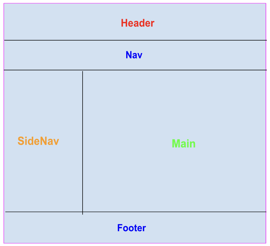
The above image shows a typical layout of an HTML page.
Elements in an HTML Layout
A web page's structure is defined by a variety of HTML elements. Some of them are given below:
Header
The webpage's logo or symbol, the heading element, the introduction, and the author information are all found in the header. Web pages' header sections are made using the <header> element.
<header>: This tag is used to define a section or header of the HTML documents.
Example
   <header>
        <h1> This is an Html Layout Example !! </h1>
    </header>
Navbar
The primary block of navigational links is contained within the navbar. It may have connections to that page or to different pages.
To create a navbar in a webpage <nav> tag is used.
<nav>: Establishes a group of navigation links.
Example
The following is an example of how the <nav> tag is used along with some other HTML tags to create a navbar of a website.
    <nav>
        <ul>
            <li><a href="index.html">Home</a></li>
            <li><a href="about.html">About</a></li>
            <li><a href="contact.html">Contact</a></li>
            <li><a href="#">Other Link</a></li>
            <li><a href="#">Link 2</a></li>
        </ul>
    </nav>
Main Section
The main section of the webpage can be divided into multiple sections like <article>,<section>.
<article>: The HTML element known as <article> denotes a self-contained composition that is meant to be independently distributable or reusable within a document, page, application, or website. An interactive widget or gadget, a blog entry, a product card, a user-submitted comment, a forum post, a magazine or newspaper story, or any other independent piece of content are examples.
Example
    <article>
        <h2>
            This is the article section
        </h2>
        <p>
           Write your content here
        </p>
    </article>
<section>
The HTML <section> element designates a distinct portion of a website that has similar items grouped together. With very few exceptions, sections should always have a heading. It might have text, pictures, tables, videos, etc.
Example
    <section>
        <h2> Introduction to HTML section Element... </h2>
        <p>  Lorem ipsum, dolor  perspiciatis voluptas deserunt  sit amet consectetur adipisicing elit.
            Illum modi eos eveniet facere delectus sint autem perspiciatis voluptas deserunt velit labore,
            in fugit mollitia culpa quas, alias similique ratione adipisci!
        </p>
    </section>
SideNav
This section of the webpage contains a side navbar that can be used to define other links that are present on the website, or we can define the indexes of the current page.
We can create a side navbar in the webpage using the <aside> HTML tag.
<aside>
The HTML element known as <aside> designates a section of a page whose content is only loosely connected to the document's primary text. Frequently, sidebars or call-out boxes are used to present asides.
Example
    <aside>
        <h2>Side Bar Section</h2>
        <p>Lorem ipsum dolor sit amet consectetur adipisicing elit. Quisquam, quae.</p>
        <ul>
            <li><a href=" #intoduction ">Introduction</a></li>
            <li><a href=" #Our-team">Our Team</a></li>
            <li><a href="#">Other Link</a></li>
            <li><a href="">Link 2</a></li>
        </ul>
    </aside>
Footer
The footer of an HTML document is specified using the <footer> tag. The footer information located in this section is author information, copyright information, carriers, etc. Within the body tag, the footer tag is utilized. In HTML 5, a new tag called <footer> has been added. Both a start tag and an end tag are necessary for the footer elements.
Example
<footer>
        <p>  This is an example of what the footer section of the page would look like..... </p>
        <p> © 2022 abcd </p>
        <p> Auther: xyz</p>
        <a href="#navbar"> Back to top </a>
    </footer>
HTML Layout Techniques
There are numerous frameworks and ways for generating layouts; however, in this article, we'll focus on basic methods.
Multicolumn layouts can be made using the techniques listed below:
- CSS float property
- CSS flexbox
- CSS grid
- CSS framework
Besides these, there are also some other methods to create a layout, for example table-based and using only div tags, but using the table to create a layout is not recommended.
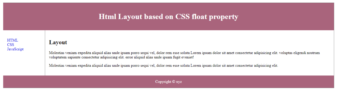
1. CSS Float Property
The CSS float feature is frequently used to create complete web layouts. Learning float is simple; all you need to do is keep in mind how the float and clear properties operate.
Example
<!DOCTYPE html>
<html>
  <head>
    <meta charset="UTF-8" />
    <meta data-fr-http-equiv="X-UA-Compatible" content="IE=edge" />
    <meta name="viewport" content="width=device-width, initial-scale=1.0" />
    <title>Html Layout based on CSS float property</title>
    <style>
      div.container {
        width: 100%;
        border: 1px solid gray;
      }


      header,
      footer {
        padding: 1em;
        color: rgb(255, 255, 255);
        background-color: #b4607c;
        clear: left;
        text-align: center;
      }


      nav {
        float: left;
        max-width: 160px;
        margin: 0;
        padding: 1em;
      }


      nav ul {
        list-style-type: none;
        padding: 0;
      }


      nav ul a {
        text-decoration: none;
      }


      article {
        margin-left: 170px;
        border-left: 1px solid gray;
        padding: 1em;
        overflow: hidden;
      }
    </style>
  </head>
  <body>
    <div class="container">
      <header>
        <h1>Html Layout based on CSS float property</h1>
      </header>


      <nav>
        <ul>
          <li><a href="#">Link1</a></li>
          <li> <a href="#">Link 2</a></li>
          <li><a href="#">Link 3</a></li>
        </ul>
      </nav>
      <article>
        <h1> Layout </h1>
        <p>
            Molestias veniam expedita aliquid alias unde ipsam porro sequi vel, dolor rem esse soluta
         Lorem ipsum dolor sit amet consectetur adipisicing elit.
         voluptas eligendi nostrum voluptatem sapiente consectetur adipisicing elit.
          error aliquid alias unde ipsam fugit eveniet!
        </p>
        <p>
            Molestias veniam expedita aliquid alias unde ipsam porro sequi vel, dolor rem esse soluta
            Lorem ipsum dolor sit amet consectetur adipisicing elit.
        </p>
      </article>
      <footer>Copyright © xyz</footer>
    </div>
  </body>
</html>
Output
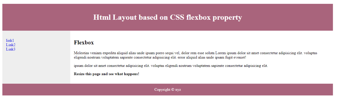
2. CSS Flexbox
When the page layout must handle various screen sizes and display devices, the use of Flexbox guarantees that elements behave consistently.
Example
<!DOCTYPE html>
<html>
  <head>
    <meta charset="UTF-8" />
    <meta data-fr-http-equiv="X-UA-Compatible" content="IE=edge" />
    <meta name="viewport" content="width=device-width, initial-scale=1.0" />
    <title>Html Layout based on CSS flexbox property</title>
    <style>
      .flex-container {
        display: -webkit-flex;
        display: flex;
        -webkit-flex-flow: row wrap;
        flex-flow: row wrap;
        text-align: center;
      }


      .flex-container > * {
        padding: 15px;
        -webkit-flex: 1 100%;
        flex: 1 100%;
      }


      .article {
        text-align: left;
      }


      header {
        background: #b4607c;
        color: white;
      }
      footer {
        background: #b4607c;
        color: white;
      }
      .nav {
        background: #eee;
      }


      .nav ul {
        list-style-type: none;
        padding: 0;
      }
      .nav ul a {
        text-decoration: none;
      }


      @media all and (min-width: 768px) {
        .nav {
          text-align: left;
          -webkit-flex: 1 auto;
          flex: 1 auto;
          -webkit-order: 1;
          order: 1;
        }
        .article {
          -webkit-flex: 5 0px;
          flex: 5 0px;
          -webkit-order: 2;
          order: 2;
        }
        footer {
          -webkit-order: 3;
          order: 3;
        }
      }
    </style>
  </head>
  <body>
    <div class="flex-container">
      <header>
        <h1>Html Layout based on CSS flexbox property</h1>
      </header>


      <nav class="nav">
        <ul>
          <li><a href="#">link1</a></li>
          <li><a href="#">Link2</a></li>
          <li><a href="#">Link3</a></li>
        </ul>
      </nav>


      <article class="article">
        <h1>Flexbox</h1>
        <p>
            Molestias veniam expedita aliquid alias unde ipsam porro sequi vel, dolor rem esse soluta
            Lorem ipsum dolor sit amet consectetur adipisicing elit.
            voluptas eligendi nostrum voluptatem sapiente consectetur adipisicing elit.
             error aliquid alias unde ipsam fugit eveniet!
        </p>
        <p>
            ipsum dolor sit amet consectetur adipisicing elit.
            voluptas eligendi nostrum voluptatem sapiente consectetur adipisicing elit.
        </p>
        <p><strong>Resize this page and see what happens!</strong></p>
      </article>


      <footer>Copyright © xyz</footer>
    </div>
  </body>
</html>
Output
3. CSS Grid
It is simpler to design web pages without the usage of floats and positioning, thanks to the CSS Grid Layout Module, which provides a grid-based layout system with rows and columns.
4. CSS Framework
Websites may easily be made to run with different browsers and browser versions thanks to CSS frameworks. This lessens the possibility that errors will emerge during cross-browser testing. Utilizing these frameworks enables quicker and more efficient web development because they come with ready-to-use stylesheets.
Conclusion
Designing the layout of a webpage is the most crucial part because this is the first thing a user will see on your website. There are several ways to design a layout of a page. We can use any CSS-based frameworks like Bootstrap, Material, and Tailwind, and there are also many JavaScript-based frameworks available.
Opinions expressed by DZone contributors are their own.
Comments