Beginners Guide to CSS Flexbox With Examples
In this article, look at a complete guide for CSS Flexbox.
 ·
·
Join the DZone community and get the full member experience.
Join For FreeFlexbox is not a single property; it's a complete module that comes with a number of features. In this article, we will look at a complete guide for CSS Flexbox.
Before going into detail, I just want to answer why we should use flexbox layout instead of a traditional way of doing layout webpage using display properties, float properties, positional properties
Advantages of Using Flexbox
- Flexbox equally distributes height and width for the item, and even though items are added dynamically, yu don't need to care about CSS properties
- Easily reverse the structure of items
- Easily grow and shrink the width of the item as per dynamic width of the container
- Easily control the direction of the elements like vertical or horizontal based on a single property
- Change the order of any element
- 96% of the browser having support for flexbox
Layout for Flexbox
Refer to the below diagram to see how Flexbox works.
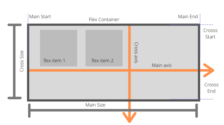
Flexbox is divided into two-axis main axis and cross axis.
In normal layout, when we are using display inline or inline-block, it goes from left to right only
- main-axis: This is the default axis where items are laid out by default. It's not necessarily horizontal always; it can be vertical depending upon flex-direction
- Main start/Main-end: Items will be placed from main-start to main-end
- Main size: The width or height of the container depending upon flex-direction
- Cross-axis: Cross axis is perpendicular to the main axis.
- Cross-start/Cross-end: Items will be laid out started from cross-start to cross-end
- Cross-size: The width or height of a flex item, whichever is in the cross dimension, is the item's cross size. The cross size property is whichever of ‘width’ or ‘height’ that is in the cross dimension.
Before starting with the Flexbox properties, we should understand which properties are meant for flex container and flex items.
Flexbox Container Properties
- display
- flex-direction
- flex-wrap
- justify-contents
- align-items
- align-contents
Flexbox Item Properties
- order
- flex-grow
- flex-shrink
- flex-basis
- flex
- align-self
Flexbox Container Properties
Display
As we know display property have the number of value like inline, block, inline-block, etc. But if we are giving value as flex then we are turning on flexbox context
.container { display: flex }
flex-direction
flex-direction decides that how items will be laid out on main-axis horizontally or vertically
xxxxxxxxxx
flex-direction: row|row-reverse|column|column-reverse|initial|inherit;
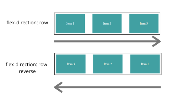
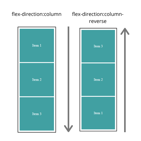
Above are the possible values for flex-direction property
- row: Row is by default value for flex-direction where item will be placed from left to right
- row-reverse: Items will be placed from right to left
- column: Items will be placed vertically top to bottom
- column-reverse: Items will be placed bottom to top
- initial: It set's value to the default
- inherit: Inherit the value from the parent
flex-wrap
flex-wrap controls the behavior that items will move into the next line if the container width is less than the total item width.
xxxxxxxxxx
flex-wrap: nowrap | wrap | wrap-reverse;
Default value: nowrap
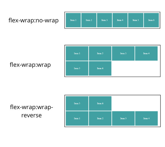 no-wrap: fit into the one line by adjusting the width of the item
- wrap: item will be laid down to next line from top to bottom
- wrap-reverse: item will be laid down to next line from bottom to top
flex-flow
flex-flow is shorthand for flex-direction and flex-wrap
xxxxxxxxxx
flex-flow: <flex-direction> | <flex-wrap>
Default value: row no-wrap
Let's see some examples:
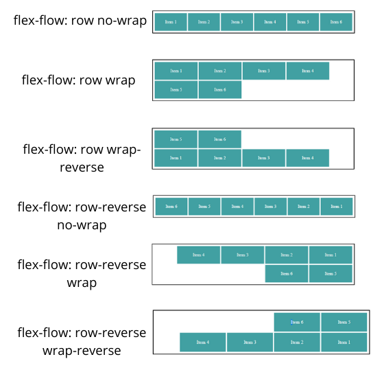
Above, we saw an example of flex-flow where flex-direction is row. You can do the same for flex-direction column just consider the above vertically.
justify-content
justify-content is used to align items on the main-axis. Its container property so it will align all child items to the particular position like to the center, start or end or giving space between them.
xxxxxxxxxx
justify-content: flex-start|flex-end|center|space-between|space-around|initial|inherit;
Default value: flex-start
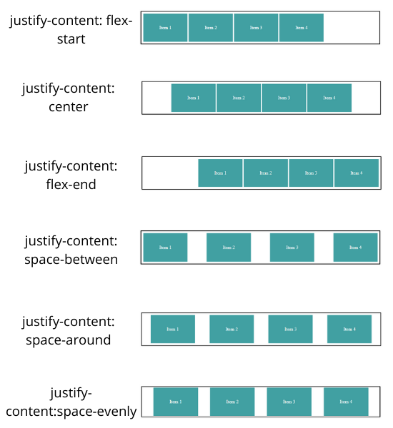
- flex-start - Align items to the start of the container depending upon flex-direction
xxxxxxxxxx
.container { flex-direction: row-reverse justify-content: flex-start; }
As you can see above, flex-start started from the right side, not from the writing mode direction
- center: Align items to the center
- flex-end: Align items to the end of the container as per flex-direction
- space-around: Gives space around the items by adjusting width
- space-between: Gives space between the items not at the start and end of the container
- space-evenly: Gives an equal amount of space around the item
- start: Align items to the start of the container as per writing mode direction
- end: Align items to the end of the container as per writing mode direction
align-items
align-items property is used to align items in respective of cross-axis like we have justify-content for main-axis
xxxxxxxxxx
align-items: stretch|center|flex-start|flex-end|baseline|initial|inherit;
Default value: stretch
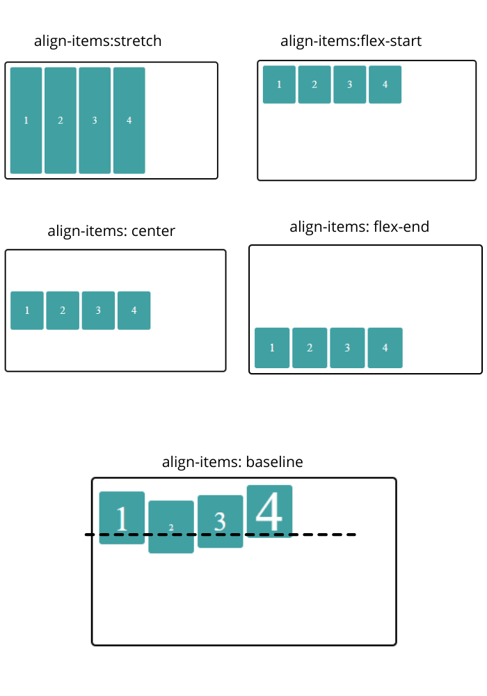
- stretch: occupies the full height of the container if height to the items not given externally
- flex-start: align-items to the start of the container in consideration with cross-axis
- center: align-items to the center in consideration with cross-axis
- flex-end: align-items to the end in consideration with cross-axis
- baseline: align-items as per baseline of the item content in consideration with cross-axis
align-content
align-content is used to align rows not items in respective of cross-axis.
You might get confused about the difference between align-items and align content.
Let' s see an example by comparing align-items and align-content.
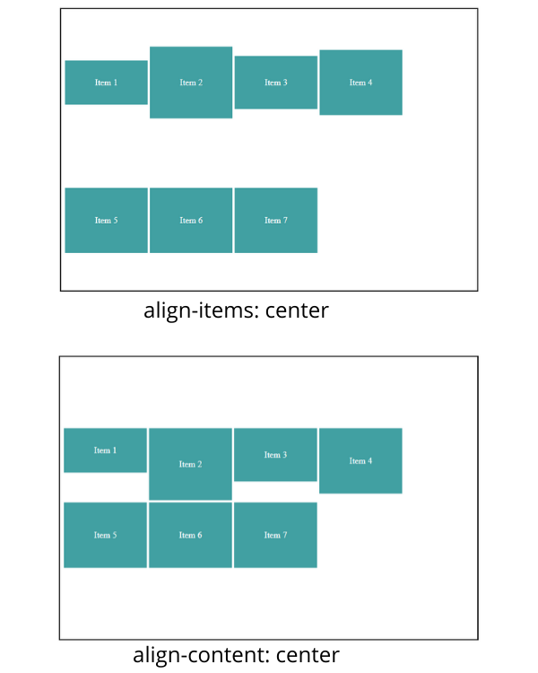
As you can see in the above align-items, center align-items to center in respective of cross-axis and align-content align rows to the center in respective of cross-axis.
We have taken an example with two rows because align-content does not affect single line
Flex Item Properties
Using order property, it’s possible to re-arrange the natural order of container items.
Default value: 0
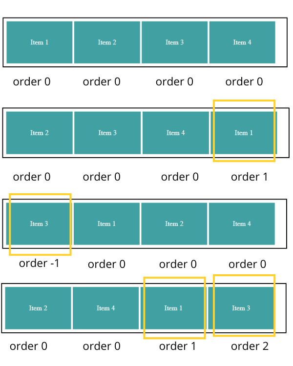
The first diagram shows default behavior where all items have order value 0.
In the second diagram, item 1 (highlighted one) moves to last because its order value is greater than the remaining three.
In the third diagram, item 3 moves to the first position because it has order value -1, which is smaller than the other three items.
In the fourth diagram, item 1 and item 3 move to last because their order value is greater than others.
flex-grow
flex-grow is allowed the item to grow as container size greater than the total items size.
Default value: 0
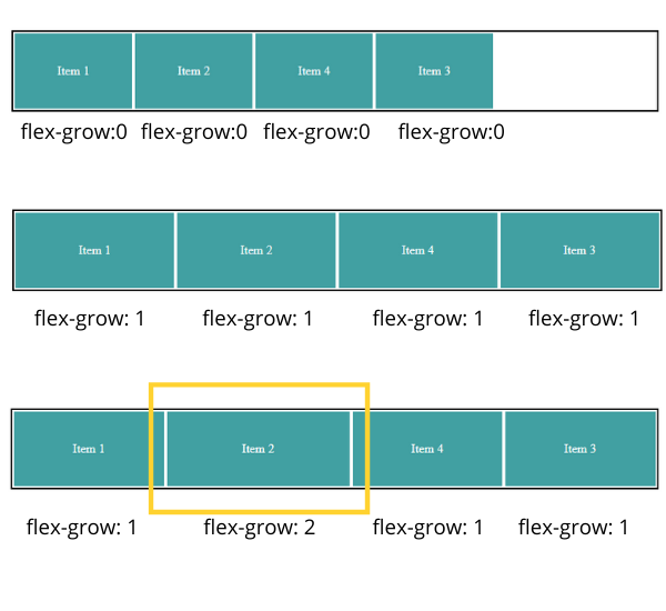
In the above example:
The first diagram shows default behavior where items not accommodating remaining space takes only width provided to the item.
In the second diagram, you can see we made flex-grow: 1 to all items it means all items divided remaining space in equal ratio. It will behave the same if we give value as 2 to all items because we are giving ratio value.
In the third diagram, item 2 (highlighted one) takes twice as much as space as compared to other items because it has value 2 and it's double the other items values.
NOTE: negative values are not allowed
flex-shrink
flex-shrink property allow item to shrink as container size decreases
Default value: 0
If all items in the container have value as 1, then all the items will shrink in equal ratio.
And all items have value as 1 except one item, which has value 2, then this item will shrink to half the other items.
For example:
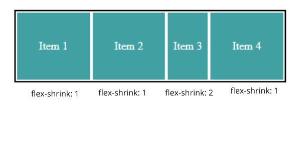
As you can see above in the given flex-shrink: 2 to the third element shrink twice as much as other elements.
Negative values are not allowed.
flex-basis
flex-basis is nothing but the min-width for the container items in flexbox context.
Default value: Auto
For example, if we haven't provided value to the flex-basis property, then its value will be auto by default, then flexbox items will take the width, which is equal to the content width.
flex
flex is shorthand for flex-grow, flex-shrink, and flex-basis
Default value: 0 1 auto
xxxxxxxxxx
flex-grow: <flex-grow> <flex-shrink> <flex-basis>
There are a number of possibilities for flex values
xxxxxxxxxx
/* One value, If unitless number then its flex-grow */ flex: 1;
/* One value, width/height: flex-basis */ flex: 10em; flex: 30%; flex: min-content;
/* Two values: flex-grow | flex-basis */ flex: 1 30px;
/* Two values: flex-grow | flex-shrink */ flex: 2 2;
/* Three values: flex-grow | flex-shrink | flex-basis */ flex: 2 2 10%;
align-self
align-self is for aligning individual items in respective of cross-axis, and it will override the values set by align-items.
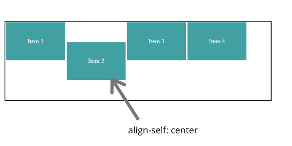
As you can see in the above example, we have given align-self: center to item 2 element, and then only that item's position has changed.
Examples
We have learned a lot, so let's look at a practical example.
Centering Element Vertically and Horizontally
xxxxxxxxxx
//html
<head>
<link rel="stylesheet" href="index.css" />
</head>
<body>
<section>
<div class="container">
<div class="item">
</div>
</div>
</section>
</body>
</html>
xxxxxxxxxx
.container {
display: flex;
width: 47%;
height: 300px;
border: 2px solid;
padding: 5px;
}
.container .item {
flex-basis: 100px;
height: 96px;
border: 2px solid;
justify-content: center;
color: white;
align-items: center;
background-color: cadetblue;
}
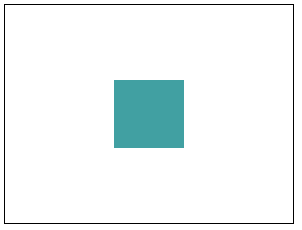
Output will be:
Creating a Navbar
xxxxxxxxxx
<head>
<link rel="stylesheet" href="index.css" />
</head>
<body>
<section class="main-container">
<div class="logo-container container">
<strong>Logo</strong>
</div>
<ul class="menu-container container">
<li class="menu">
<strong>
Home
</strong>
</li>
<li class="menu">
<strong>
Contact Us
</strong>
</li>
<li class="menu">
<strong>
About Us
</strong>
</li>
</div>
</section>
</body>
</html>
xxxxxxxxxx
.main-container {
display: flex;
background: #ce8888;
}
.container {
flex-basis: 50%;
}
.logo-container {
justify-content: flex-start;
align-items: center;
display: flex;
color: white;
padding: 10px;
font-size: x-large;
}
.menu-container {
display: flex;
height: 60px;
justify-content: flex-end;
align-items: center;
padding: 0;
width: 50%;
margin: 0;
}
.menu-container .menu {
padding: 4px 10px;
border-radius: 5px;
color: bisque;
display: flex;
justify-content: center;
align-items: center;
align-items: center;
cursor: pointer;
}
.menu-container .menu:active ,.menu-container .menu:hover{
background: repeating-linear-gradient(45deg, #824e4e, transparent 100px)
}
Output will be:

You can check out the demo here.
Conclusion
CSS flexbox has very good features to do layout for webpages. Please feel free to ask questions in the comments.
Published at DZone with permission of Nitin Hepat. See the original article here.
Opinions expressed by DZone contributors are their own.
Comments