

Differential Flamegraphs in Java in Jeffrey Microscope
How to set up a secondary profile and pinpoint the precise frames responsible for a performance change between two JFR recordings.

 CORE
·
CORE
·
Join the DZone community and get the full member experience.
Join For FreeIn the first article, we got started with Jeffrey Microscope and learned to read a single flamegraph — the timeseries, search, tooltips, and the allocation and wall-clock variants. This time we build directly on that foundation and tackle one of Jeffrey's most powerful features for real-world performance work: the differential flamegraph, which compares two recordings and shows you precisely what changed between them.
A single flamegraph tells you where your application spends its time. But the questions that matter most in practice are comparative:
- Did my optimization actually help?
- What did this refactor make slower?
- Where did the extra allocations come from?
Staring at two flamegraphs side by side and trying to spot the difference by eye is slow and error-prone — the graphs are large, and the interesting change is often a few frames buried deep in the stack. Jeffrey Microscope's differential flamegraph solves this by overlaying two recordings into a single graph and coloring every frame by how it changed:
- Red – where the primary profile spends more than the baseline (a regression).
- Green – where it spends less (an improvement).
- Deeper shades – brand-new and fully-removed frames, called out distinctly.
In this article, we'll take the two recordings from the previous post — the optimized direct serialization path and the garbage-heavy DOM path — set one as a secondary profile, and let the differential view pinpoint exactly which methods account for the difference.
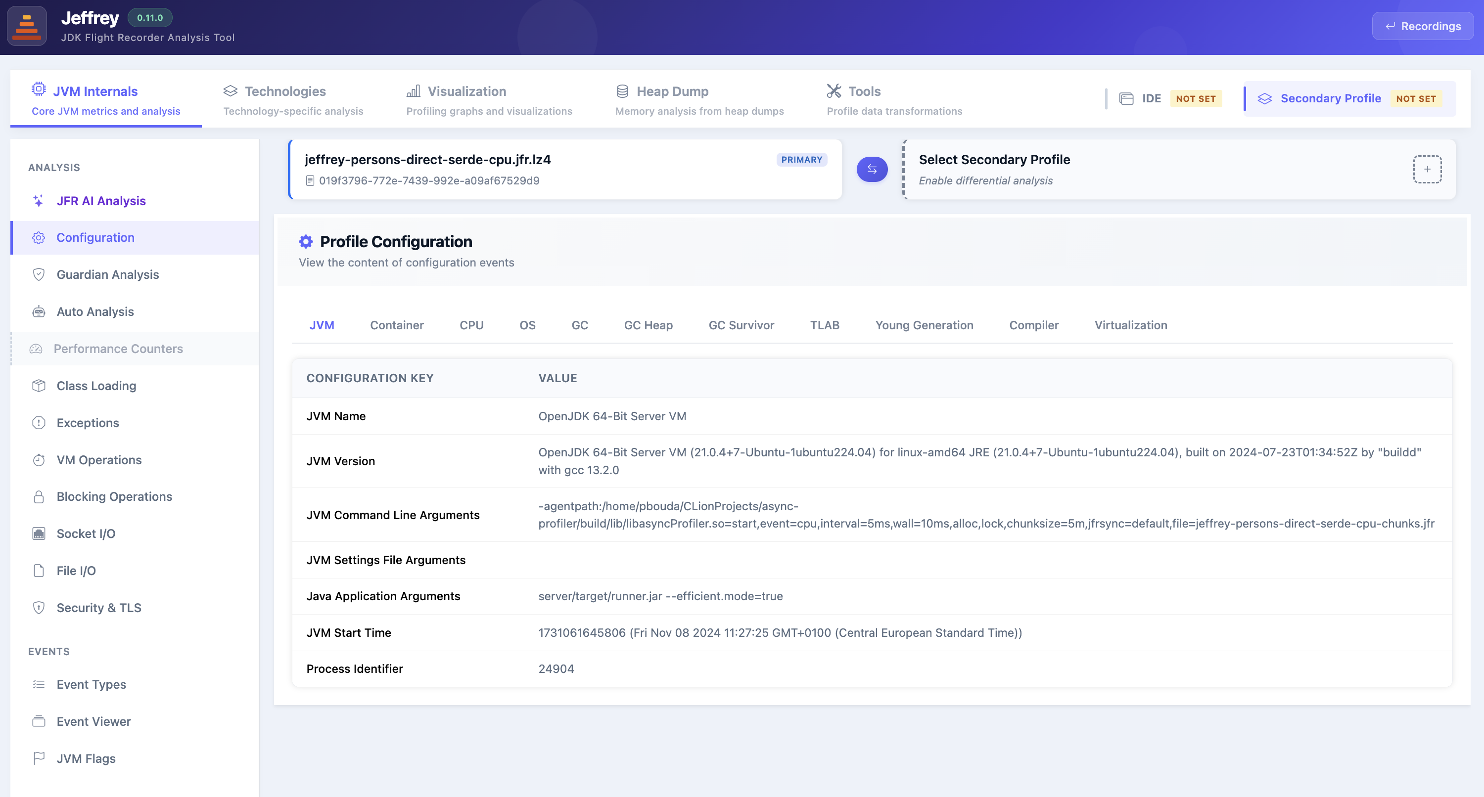
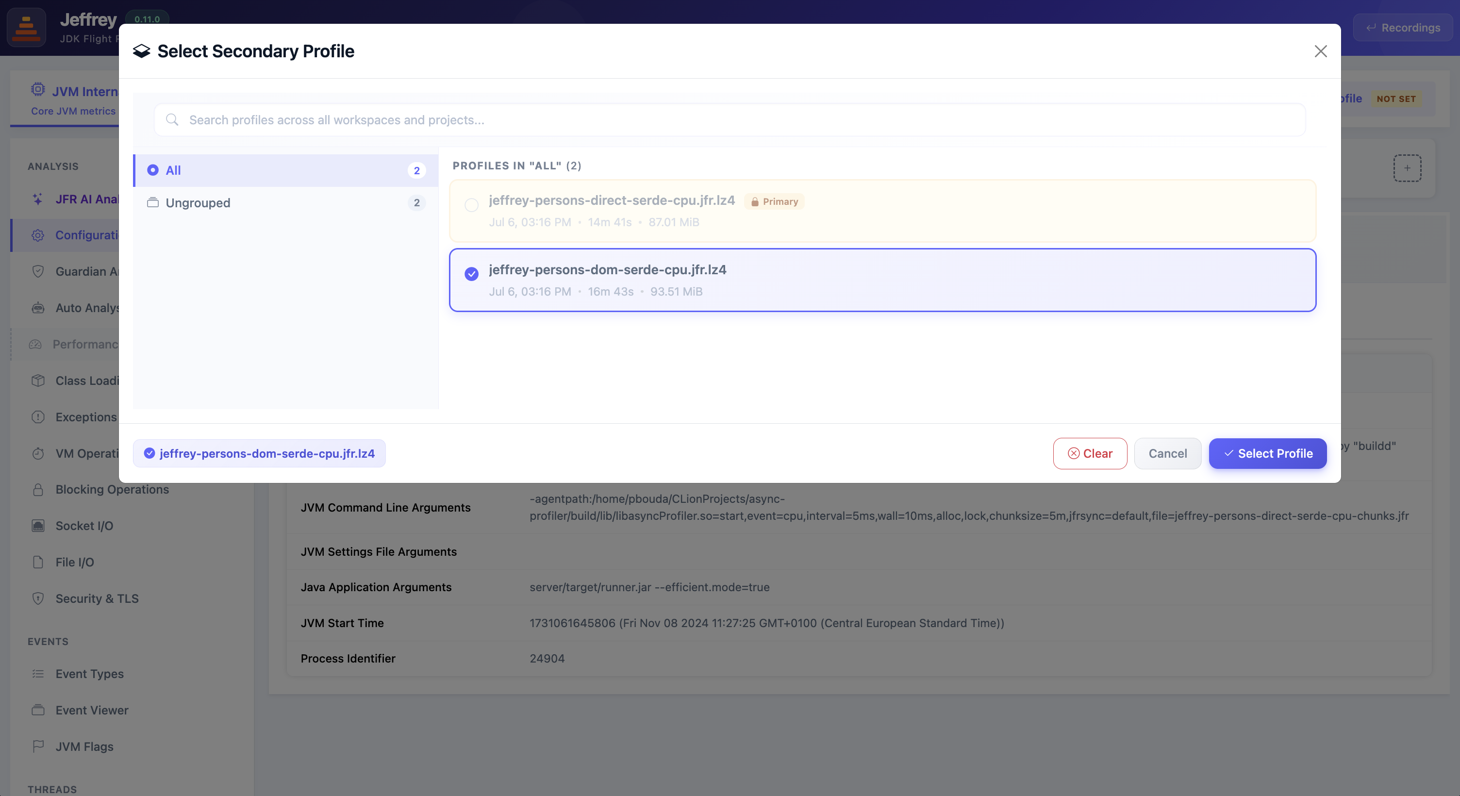
We start exactly where the first article left off. Open the optimized recording, jeffrey-persons-direct-serde-cpu.jfr.lz4, and head to the Visualization tab — this is our primary profile, the same CPU flamegraph we explored last time. On its own, it shows where the direct serialization path spends its time, but to turn it into a comparison we need a second recording to diff it against. That's what the Secondary Profile slot in the top bar is for — currently marked NOT SET. In the next step we'll point it at the DOM-based recording and unlock the Differential view in the sidebar.
Supported Events Types
With the secondary set, the Differential page mirrors the Primary one — a card per event type — but each now shows both sides at once. The value on the left is the baseline (the secondary profile), the value on the right is the primary, and the badge is the relative change from one to the other: a red +N% means the primary has more of that event than the baseline (grew), a green −N% means it has less (shrank). This lets you gauge the overall shift before opening a single graph — whether the change is a rounding-error wobble or a real regression worth investigating. Jeffrey supports differential flamegraphs for every sample-based event it can render normally:
- Execution Samples – total CPU work. More samples means more time spent on-CPU (
37.3K → 39.7K, +6.4% here). - Wall-Clock Samples – elapsed time including waiting and blocking, which can move independently of CPU (
5.0M → 4.4M, −12.4%). - Allocation Samples – memory pressure; switch Use Total Allocation to compare bytes rather than sample count and see the true allocation cost (
27.47 GiB → 30.45 GiB, +10.9%). - CPU-Time Samples and Method Traces – empty here, but diff identically when the recordings contain them.
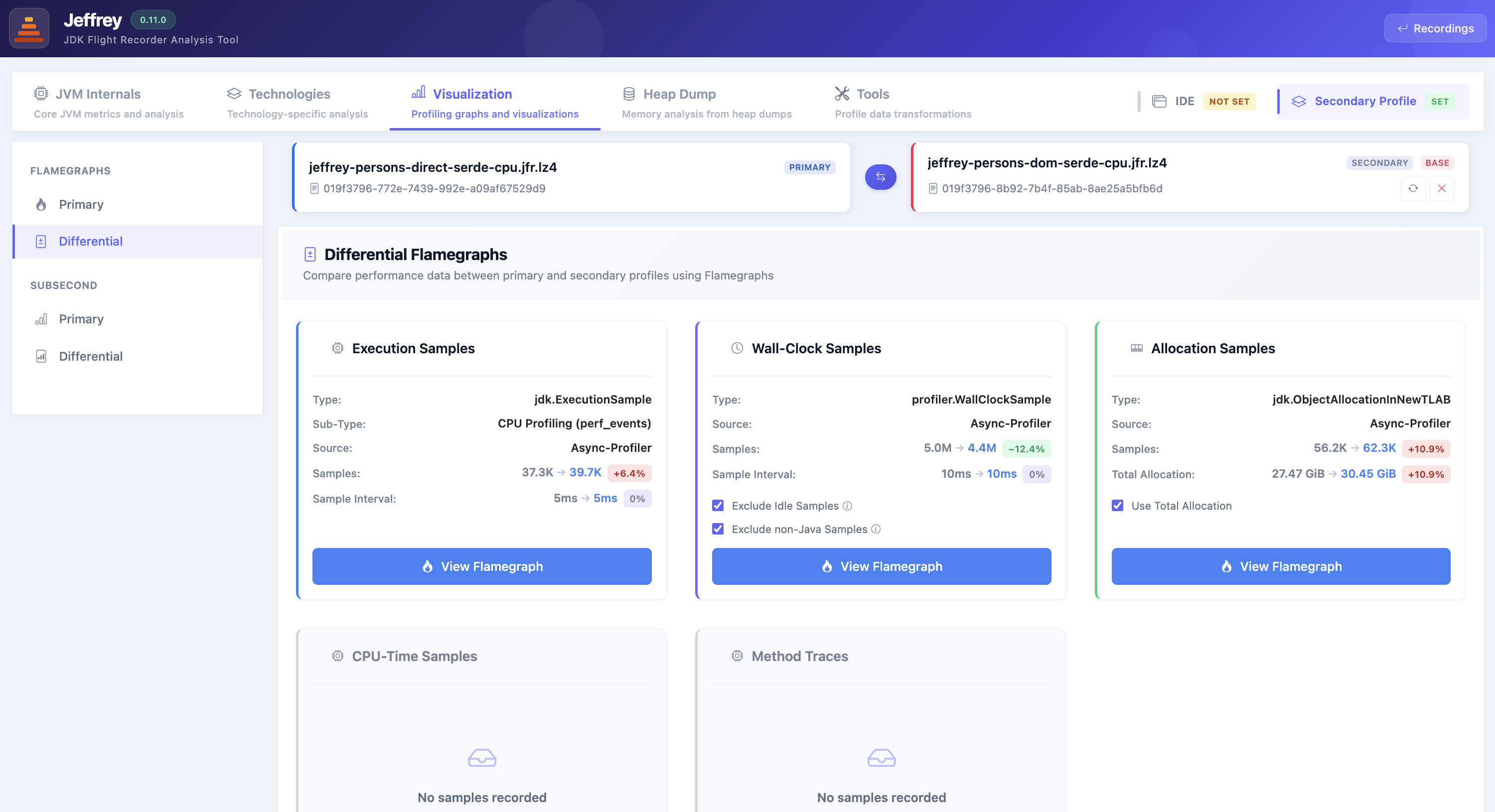
Each of these numbers is just the headline; the flamegraph below breaks the same delta down frame by frame, so you can see which methods drove it. Click View Flamegraph on the Execution Samples card to open the differential CPU view.
Reading the Differential Flamegraph
Opening the differential view feels familiar — same timeseries, search, and tooltip as a normal flamegraph — but everything now encodes two profiles at once:
- The summary bar at the top reports the totals side by side: baseline 35,472 vs primary 39,668, a net +4,196 (+11.83%) flagged as REGRESSED. That's the headline — the primary run did more on-CPU work overall.
- The timeseries overlays both recordings as two lines — Primary in blue, Secondary (baseline) in red — so you can see where in time the profiles diverge, not just that they differ.
- The flamegraph colors encode the per-frame change: pale pink/green for frames that shifted a little, and saturated deep red/deep green for frames that exist in only one profile — brand-new work versus work that disappeared entirely.
The payoff is in the last two screenshots. Because the optimized and unoptimized paths run through differently-named classes, the diff renders them as a matched pair: the deep-red EfficientPersonService.getNPersons subtree (new in the primary) sitting right next to the deep-green InefficientPersonService subtree (gone from the primary).
You're literally seeing the code swap, top to bottom. And hovering a shared frame quantifies it precisely — the tooltip on PersonController.getNPersons shows baseline 854 → primary 525, an IMPROVED −329 (−38.52%) for that endpoint's own path.
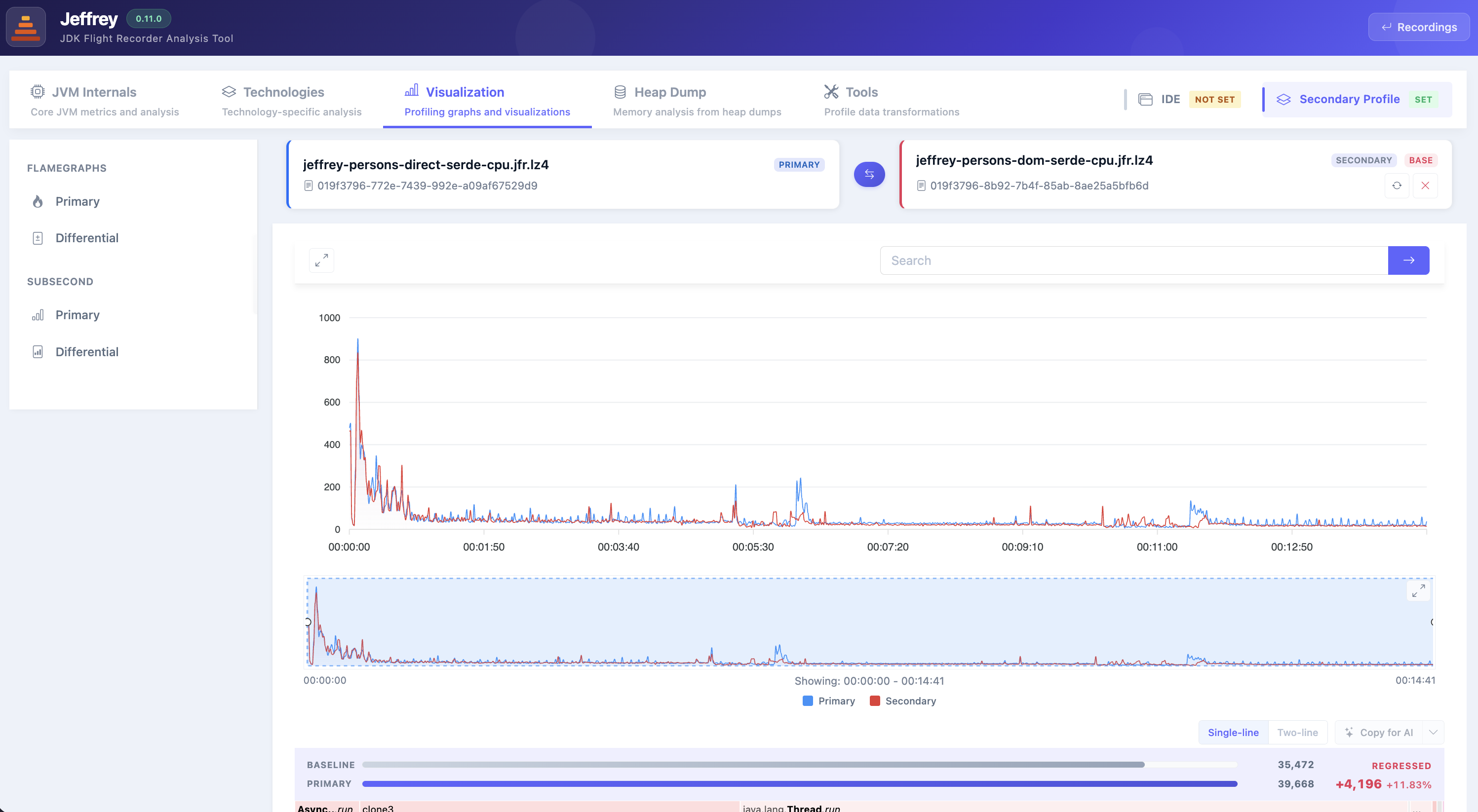
The differential CPU flamegraph overlays both recordings: the timeseries plots the primary (blue) against the secondary baseline (red), and the summary bar reports baseline 35,472 → primary 39,668, a net +4,196 (+11.83%) marked REGRESSED.
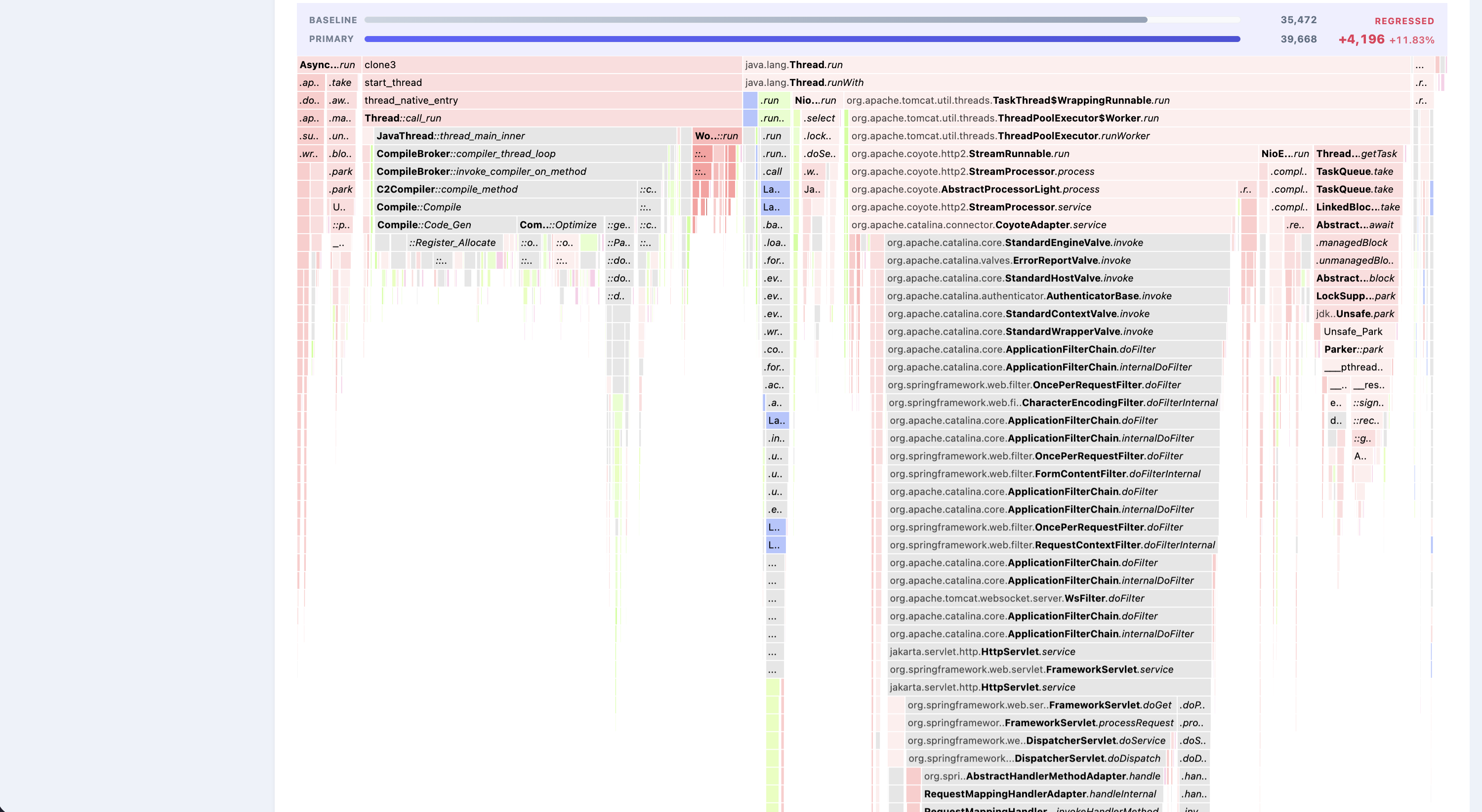
The merged flamegraph colors every frame by its change. The shared Tomcat, Coyote, and Spring layers stay mostly pale pink — small shifts — while the summary bar keeps the overall +11.83% delta in view.
The flamegraph also captures the JVM's own threads, not just your request path — the CompileBroker / C2Compiler stacks on the left are JIT compilation, and garbage-collection activity shows up the same way. Comparing them across the two recordings tells you whether either run triggered extra spikes in JIT or GC work, a common hidden cost when one version allocates more or churns more code.
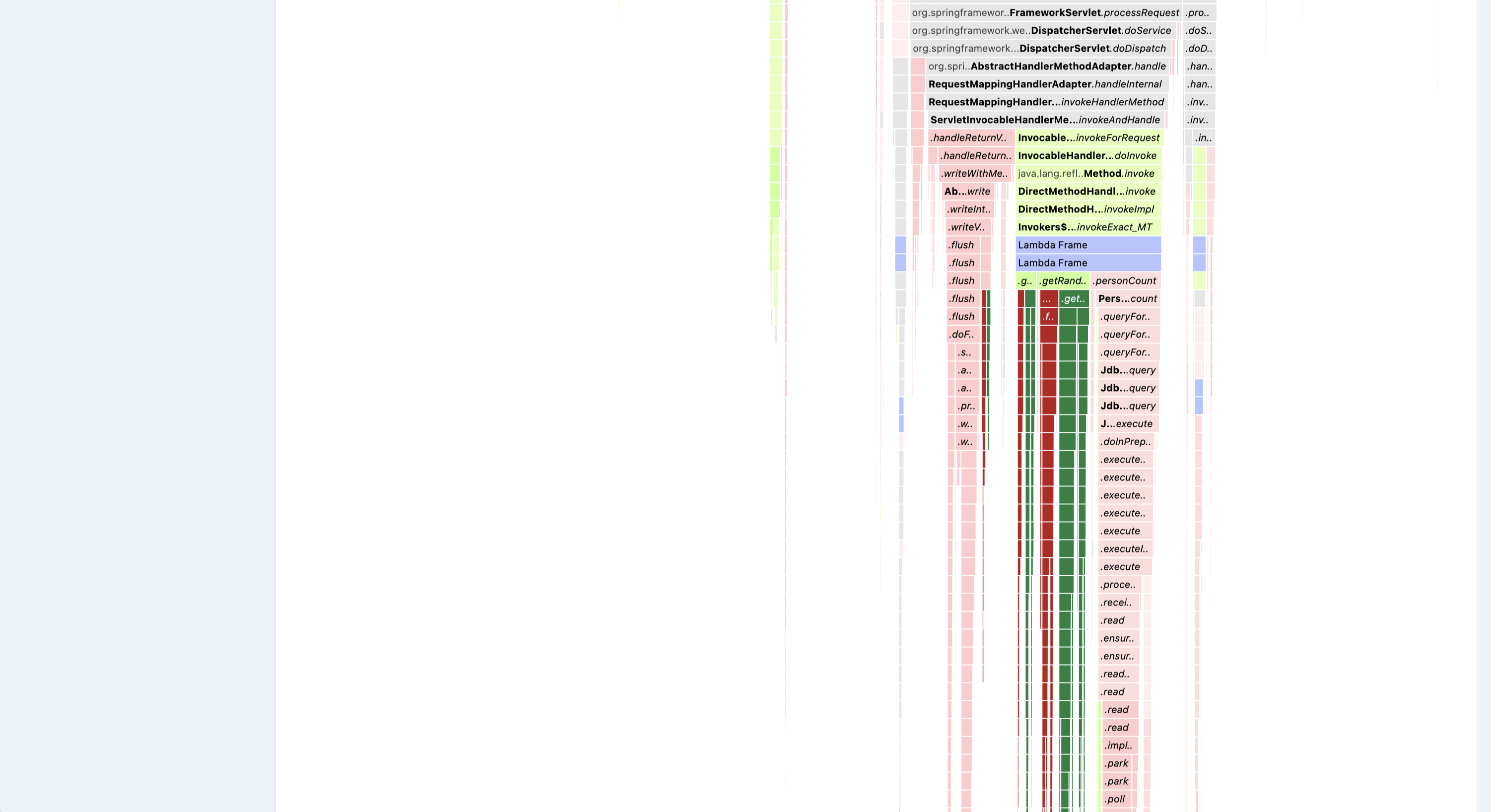
Deeper into the stack, the two implementations separate out: saturated red columns mark work that is new in the primary profile, while the deep-green columns are paths that existed only in the baseline and disappear in the primary.
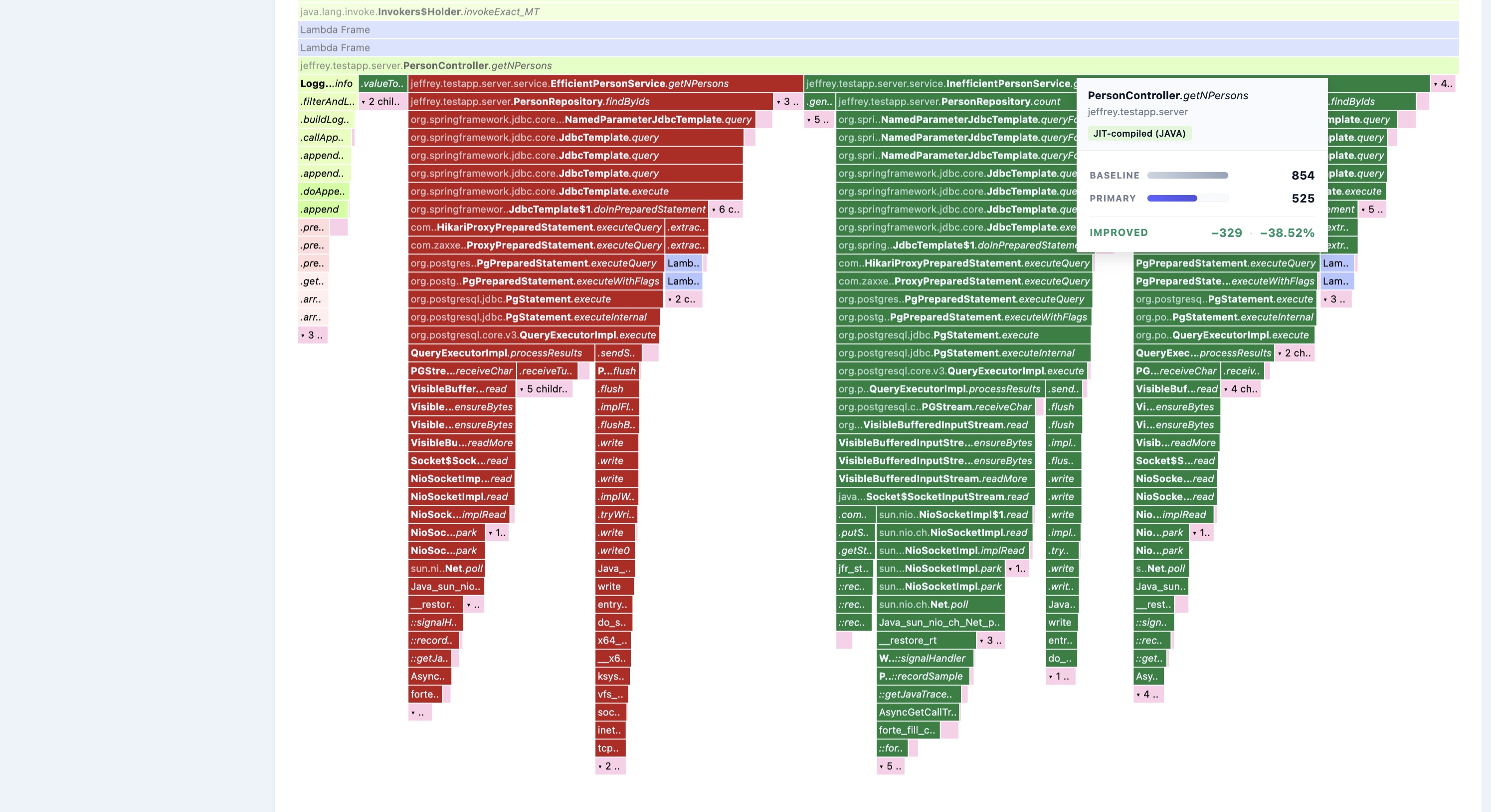
The optimized EfficientPersonService path (red, added) sits beside the removed InefficientPersonService path (green). Hovering the shared PersonController.getNPersons frame quantifies the change exactly: baseline 854 → primary 525, an IMPROVED −329 (−38.52%).
Summary
From here, try the same workflow on the Wall-Clock and Allocation differential flamegraphs — the steps are identical, and each reveals a different dimension of the change: time spent waiting, and bytes allocated.
Thank you for reading! To go deeper, visit the Jeffrey pages, or reach out to me directly on LinkedIn — I'd love to hear your feedback. And stay tuned: in the next article, we'll step away from flamegraphs and explore one of Jeffrey's JVM Internals views to dig into what the runtime does under the hood.
Opinions expressed by DZone contributors are their own.
Comments