JavaScript Temperature Anomaly Chart
Learn how to create a JS Temperature Anomaly Chart that you can use for anomaly weather and temperature scientific research using high-performance JS charts.
Join the DZone community and get the full member experience.
Join For FreeHello!
In this article, we will create a Temperature Anomaly chart.
For this example, we will use the LightningCharts JS library, specifically the XY chart. For those interested in technical details, here are some of XY Chart characteristics:
- This type of chart works with only two axes, X and Y.
- It allows us to locate data points within the graph as coordinates.
- The XY chart is a great tool for measuring and reading temperature anomalies.
- Anomaly refers to a change from a reference or average value within an extended period of time.
- Positive values indicate that the temperature has been warmer, while negative values refer to a colder temperature.
Main Uses of a Temperature Anomaly Chart

- Climate Monitoring: Temperature anomaly charts help monitor changes in temperature patterns over time, providing insights into climate trends and overall climate conditions.
- Climate Research: temperature anomaly charts have scientific use for studying climate dynamics, identifying climate drivers, and investigating the impact of natural and human-induced factors on temperature variations.
- Weather Forecasting: in meteorology, temperature anomaly charts are used to forecast weather patterns by identifying areas with unusual warmth or cold, contributing to more accurate short-term weather predictions.
- Environmental Analysis: Temperature anomalies affect ecosystems and environmental systems, making temperature anomaly charts valuable for analyzing the impacts of temperature variations on vegetation, wildlife, and ocean currents.
Let's begin implementation.
Template Setup
1. Please, download the following template (.ZIP), where you'll find the project and all required files to follow this tutorial. JavaScript Temperature Anomaly Chart Project Template.
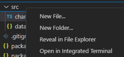
2. Once you download the project, open it in Visual Studio, and visualize the following file tree:

3. Now, open a new terminal, and as usual in a NodeJS project, run the NPM install command. Refer to this article for more information on installing NodeJS.
This would be everything for setting up the template. Now let's code.
CHART.ts
Inside this file, we will have all the logic needed to create our chart, configure animations, and format the data.
1. Importing the JSON data:
import data from './data.json'Ps. If you're new to JSON data, I recommend you this JSON data modeling guide.
2. Declare the constant lcjs that will refer to our @arction/lcjs library.
3. Extract required classes from lcjs.
const lcjs = require('@arction/lcjs')
const { lightningChart, AxisTickStrategies, UIElementBuilders, UIOrigins, ImageFill, emptyLine, ImageFitMode, emptyFill, Themes } = lcjs
4. Creating the chart object:
const chart = lightningChart()
    .ChartXY({
        theme: Themes.darkLime,
    })
.setTitle('')setTitle: Text that will be displayed as the top title in the dashboard.Theme: The LightningChart JS library features a collection of default implementations that can be accessed byThemes. The color theme of the components must be specified when it is created and can't be changed afterward.
5. Getting the Y axis:
const axisY1 = chart.getDefaultAxisY().setTitle('Atmospheric Carbon Dioxide (ppm)')The getDefaultAxisY, gives access to the Y axis, the same situation for the X axis (getDefaultAxisX).
Once we have access to this, we can add UI properties like the title. AxisY1 corresponds to the meaning line in the chart:
6. Creating the main Y-Axis line:
const axisY2 = chart
    .addAxisY({
        opposite: true,
    })
    .setTitle('Temperature Anomaly Index (°C)')
    // Hide tick grid-lines from second Y axis.
    .setTickStrategy(AxisTickStrategies.Numeric, (ticks) =>
        ticks
            .setMinorTickStyle((minor) => minor.setGridStrokeStyle(emptyLine))
            .setMajorTickStyle((major) => major.setGridStrokeStyle(emptyLine)),
    )
The tick strategy defines the positioning and formatting logic of Axis ticks as well as the style of created ticks. The numeric property corresponds to the number values to be shown on the Y axis.
For XY, the ticks will be empty lines because we don’t need to show each tick in the chart:
major.setGridStrokeStyle((solidLine) => solidLine.setThickness(500))),
7. X-axis:
const axisX = chart.getDefaultAxisX().setTickStrategy(AxisTickStrategies.DateTime)As you can see, the X axis has the Date Time strategy because we need to show the data by date:

8. Using the JSON data:
const { temperature, co2 } = data

//code stored in "data.json"
{
    "temperature":[-0.16,-0.08,-0.1,-0.17,-0.28,-0.33,-0.31,-0.36,-0.17,-0.1,-0.35,-0.22,-0.27,-0.31,-0.3,-0.23,-0.11,-0.11,-0.27,-0.18,-0.08,-0.16,-0.28,-0.37,-0.47,-0.26,-0.22,-0.39,-0.43,-0.49,-0.44,-0.44,-0.36,-0.35,-0.16,-0.15,-0.36,-0.46,-0.3,-0.28,-0.28,-0.19,-0.29,-0.27,-0.27,-0.22,-0.11,-0.22,-0.2,-0.36,-0.16,-0.1,-0.16,-0.29,-0.13,-0.2,-0.15,-0.03,0,-0.02,0.13,0.19,0.07,0.09,0.2,0.09,-0.07,-0.03,-0.11,-0.11,-0.17,-0.07,0.01,0.08,-0.13,-0.14,-0.19,0.05,0.06,0.03,-0.03,0.06,0.03,0.05,-0.2,-0.11,-0.06,-0.02,-0.08,0.05,0.03,-0.08,0.01,0.16,-0.07,-0.01,-0.1,0.18,0.07,0.16,0.26,0.32,0.14,0.31,0.16,0.12,0.18,0.32,0.39,0.27,0.45,0.4,0.22,0.23,0.32,0.45,0.33,0.46,0.61,0.38,0.39,0.54,0.63,0.62,0.53,0.68,0.64,0.66,0.54,0.66,0.72,0.61,0.65,0.68,0.74,0.9,1.01,0.92,0.85,0.98,1.02],
    "co2":[285.2,285.1,285,285,284.9,285.1,285.4,285.6,285.9,286.1,286.4,286.6,286.7,286.8,286.9,287.1,287.2,287.3,287.4,287.5,287.7,287.9,288,288.2,288.4,288.6,288.7,288.9,289.5,290.1,290.8,291.4,292,292.5,292.9,293.3,293.8,294,294.1,294.2,294.4,294.6,294.8,294.7,294.8,294.8,294.9,294.9,294.9,295.3,295.7,296.2,296.6,297,297.5,298,298.4,298.8,299.3,299.7,300.1,300.6,301,301.3,301.4,301.6,302,302.4,302.8,303,303.4,303.7,304.1,304.5,304.9,305.3,305.8,306.2,306.6,307.2,307.5,308,308.3,308.9,309.3,309.7,310.1,310.6,311,311.2,311.3,311,310.7,310.5,310.2,310.3,310.3,310.4,310.5,310.9,311.3,311.8,312.2,312.6,313.2,313.7,314.3,314.8,315.34,316.18,317.07,317.73,318.43,319.08,319.65,320.23,321.59,322.31,323.04,324.23,325.54,326.42,327.45,329.43,330.21,331.36,331.92,333.73,335.42,337.1,338.99,340.36,341.57,342.53,344.24,345.72,347.15,348.93,351.47,353.15,354.29]
  }
9. Adding values to the Atmospheric Carbon Dioxide line:
const carbonDioxideSeries = chart
    .addLineSeries({
        yAxis: axisY1,
    })
    .setName('Atmospheric Carbon Dioxide (ppm)')
    // Data set contains PPM measurement values only. First measurement is from year 1880, and each consecutive measurement is 1 year after previous.
    .add(
        co2.map((ppm, i) => ({
            y: ppm,
            x: new Date(1880 + i, 0, 1, 0, 0, 0, 0).getTime(),
        })),
    )
As you can see, a line series was added to the Y1 axis. The name was set to the series, and the data was mapped from the CO2 array object from the JSON data. We don't have a date value, so just add 1 consecutive year from 1880, to create a non-breaking line.
10. Adding the legend box:

// Add legend.
const legend = chart.addLegendBox(undefined, { x: axisX, y: axisY1 }).add(chart)
.setOrigin(UIOrigins.LeftTop)
.setMargin(4)
const positionLegendOnAxes = () => legend.setPosition({ x: axisX.getInterval().start, y: axisY1.getInterval().end })
positionLegendOnAxes()
The legendbox is added to the meaning line (Y axis) and the unique X axis.
-
setOrigin: Sets the position origin of this UiElement. setMargin: Set margin around the object in pixels.setPosition: Sets the position of this UiElement relative to its origin.getInterval: Get the currently applied axis scale interval.
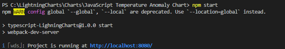
NPM Start
For initializing the chart, open up a new terminal and run the npm start command. You'll see the local host path. Click on it and interact with the chart on your browser.
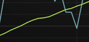
And here, you can visualize the final chart:

Conclusion
In this article, we have created an implementation of an XY chart in a very simple way. In order to generate an XY chart, we just need to make use of the charXY() method.
In this example, we have used the default values within the LC JS library, but in your case, you would only need an object of type JSON with the values that you need.
Technically, the process should work as long as you use two arrays. Almost all of the code development was focused on chart customization, and the process how to load the data is quite easy to understand.
Another important point is the use of the theme catalog, which allows us to generate a chart with a fairly complex appearance, but without the need to resort to external CSS classes.
Definitely, LC JS helps to perform optimal jobs for less use of time performed.
In case you have any questions, leave a comment with any code snippets, and I'll be happy to help!
See you in the next article with more Data Visualization tutorials,
Bye :)
Opinions expressed by DZone contributors are their own.
Comments