Mobile UI Patterns - A Flowchart for User Registration, Login and Logout
Join the DZone community and get the full member experience.
Join For Freein this mobile ui patterns article we will build a flowchart depicting the screens needed to handle user registration, login and logout in a mobile application. as a ux designer, it’s very important that you are familiar with these screens and how the interact with each other.
let’s start by taking a look at the typical application launch sequence.
an application’s launch sequence
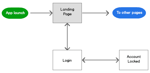
a large number of applications have a launch sequence that takes users to a landing page or landing screen, however you like to call it, from where they have access to deeper areas of the app. we could draw this ui pattern like this:

the login flowchart
most apps provide personalization features that require a user to have an account in the app. in those applications the launch sequence changes quite a bit. for starters, when users arrive at the landing page and you don’t know who they are, you need to redirect them to a login page where they will enter their credentials:

upon successful login you will take users back to the landing page.
to protect users and your app, you should consider locking user accounts for a period of time, or permanently, after a number of unsuccessful login attempts. if you do so, you will need to add an account locked page where you will let users know what happened.
the signup flowchart
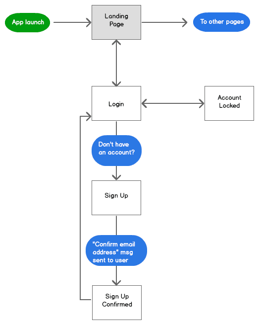
as users must have an account in the app in order to log in, you need to create a page that will allow them to sign up for such account. on the login page you will offer a path to this signup page:

after users enter their profiles through the signup page, you will send them a message asking them to confirm their email address. the message will contain a link to a page that can be in or outside your app, which they will need to access in order for you to confirm that they received the message. you will take users back to the login page once they confirm their email address.
the password reset flowchart
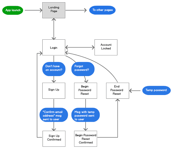
you need to offer an easy way for the users of your app to reset their passwords. a common approach to password reset consists of emailing users a temporary password, while giving them access to a page where they can use the temporary password to create a new permanent password.
after sending the temporary password, you will display a confirmation page that will offer access to the page where the user can create a new password. alternatively, you can skip the confirmation page a navigate directly to the “new password” page.
the logout and user profile pages
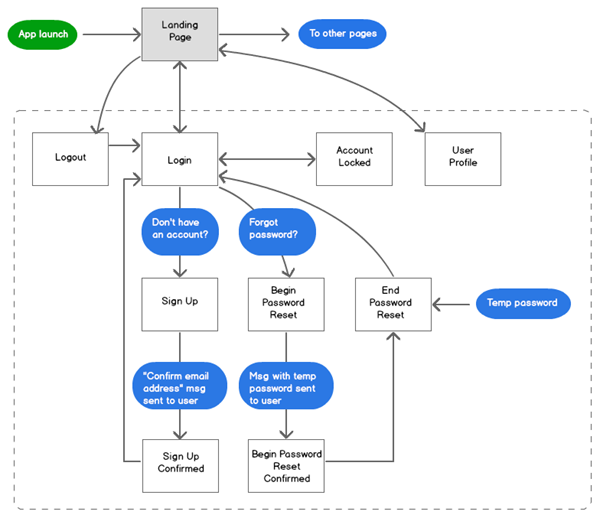
we are missing two more pages to complete this screen flow. first would be the logout page, which will allow users to manually end their session in the app; and last would be the user profile page, which is where users can change their personal information in the app.
summary and next steps
in this mobile ui patterns article we built a flow chart depicting the screens that you would need to create in order to implement user registration, login and logout features in a mobile app. these screens are essential in modern applications, as they are the foundation of any personalization features that we build into the apps. while there are variations to the approach i showed you in this article, the concepts behind them are similar.
do you follow a different approach? please let us know by leaving a comment.
stay tuned
don’t miss any articles. get free updates in your inbox.
Published at DZone with permission of Jorge Ramon, DZone MVB. See the original article here.
Opinions expressed by DZone contributors are their own.


Comments