Responsive Web Design With Oracle JET
In this part of the series, we are going to learn more about JET's support for responsive web design.
Join the DZone community and get the full member experience.
Join For FreeIn the previous Oracle JET article we looked at the basics of creating a JET web page out of the available web UI components. In this ongoing article series for this article, I'd like to share what I've learned about JET's support for responsive web design.
You can find a list of all articles to date in this article series at the bottom of this page.
Responsive Web Design
For readers familiar with the concepts of responsive web design skip down to the next section. However, I'll give a brief explanation of the concepts here as from an Oracle perspective we often meet customers and developers who only know the term but aren't really familiar with why it exists.
For those of us born in the dark ages (you know, before the internet), we distinctly remember the first time we saw our first website, on our desktop computers, possibly a 14" monitor maxed out at maybe 1024x768 if we were lucky, or 800 x 600 if we weren't: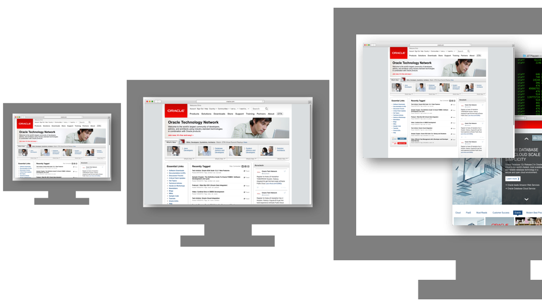
Browser windows took the full screen, but we didn't mind, the future had arrived! We could surf the internet at work pursuing our personal interests and get paid for it! And our productivity has suffered ever since ;-)
Time moved on, our monitors and resolutions grew bigger, but thanks to various standards put in place for screen resolutions to support smaller monitors our websites didn't get bigger, rather they developed vertical bars on each side as websites were standardized to be read on any monitor size including the smaller units we'd just come from.
Eventually, our monitors became huge... I still remember being amazed by my first 21" monitor (tube based, non-LED of course, so it was the size of a tank. Ikea office tables had to be much stronger in those days). Webpages still had the rapidy-becoming-useless grey side bars, but we could have multiple windows open on our super-sized monitors so we didn't really care. As a result, website design mainly remained the same.
And then dramatically the IT world changed with the introduction of the iPhone, which like our desktops could also render web pages:
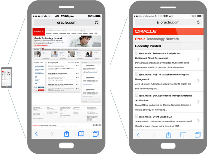
As you can see, there was a minor problem, it's screen was so much smaller. Many of us developed arthritis as we learned the two finger pinch zoom gesture so we could move around the page and read the small text. Page navigation became painful as you zoomed in and out repetitively.
At this point, web page design started to change. Adaptive web design was born, where separate websites for desktop and phone were created in parallel. This allowed content to be tailored to the different screen resolutions.
However as time went on mobile devices and computer platforms proliferated, with many many different sizes. While adaptive web design was still useful for special cases and where web teams had enough resources to maintain separate web designs, a new approach was needed for the majority:
So was born responsive web design. As Wikipedia states:
Responsive web design is an approach to web design aimed at allowing webpages to be viewed in response to the size of the device one is viewing with. A site designed with RWD adapts the layout to the viewing environment by using fluid, proportion-based grids, flexible images and CSS3 media queries ... Responsive web design has become more important as the amount of mobile traffic now accounts for more than half of total internet traffic.
A catch cry you will often read about responsive web design is it has the right design for every device. In other words, developers don't create separate content for each page different platforms: desktop, mobile, tablets. Rather they create one code base for each page for all platforms, and the website will automatically resize & orient itself based on the device's screen real estate and orientation.
In the following screenshots (which is another shameless plug for Oracle, but I need to keep my Oracle overlords happy somehow ;-) ), you can see the main Oracle website using responsive web design rendered on 3 different screen sizes. As you can see, when the screen gets smaller, the page content resizes and reorients itself to best take advantage of the screen real-estate:
 How pages do this is through the magic of CSS3 @media queries. As commonly known, CSS is typically used to define the presentation of HTML content. Colours, fonts, layouts and more, through CSS styles and classes. A CSS3 @media query allows specific styles and classes to be applied dependent on the screen size (or more specifically the browser's visible width).
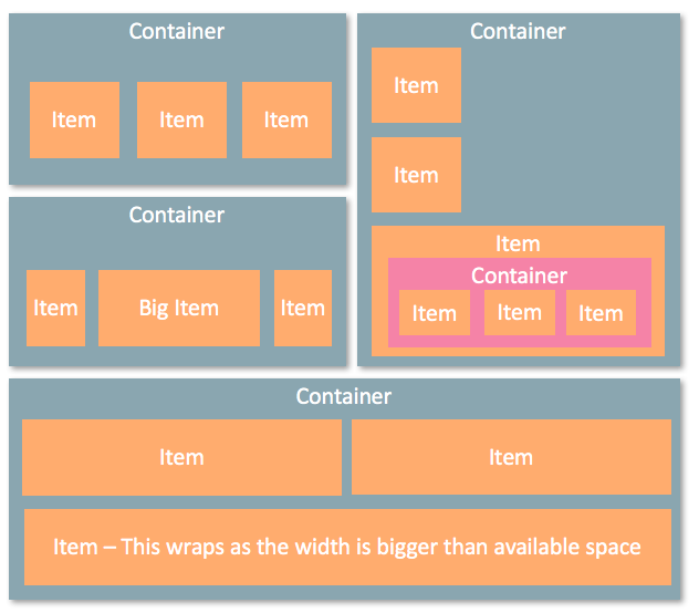
In addition responsive web designs typically use flexible grids to hide & rearrange content via the @media queries, where the grids are based on containers and items. The containers and items do not used fixed pixel widths, rather, they are designed to grow and shrink to fill the available space.
Responsive web design doesn't just apply to screen layout, though, it can be applied to all content including images, video and more. There's no point serving a high-resolution picture if the mobile device can't fit it or the fine resolution details can't be seen.

Hopefully, this description gives anyone new to the concepts of responsive web design an idea what it entails.
Oracle JET Responsive Page Design Features
In investigating Oracle JET, it provides numerous features to support responsive web design including out-of-the-box CSS3 @media queries for different screen sizes, flex, grid and form responsive layout schemes, convenience styleclasses, and JavaScript utilities to make developing with different screen sizes easier, support for responsive images and even different font sizes.
In starting out though let's look at the Oracle JET CSS3 @media queries as these form the basis for all the responsive web design features.
When generating a JET app via one of the provided Yeoman templates, it will make use of the Alta theme and associated alta.css, which includes the @media queries. Essentially 4 @media queries are defined as follows where among the 4 we can see a medium sized screen is between 768 to 1023 pixels in width: As highlighted in blue above, note the abbreviated screens size names sm, md, lg and xl for small, medium, large and extra-large screen sizes respectively. These abbreviations are meaningful to us as the web developer, because in selecting different JET styleclasses to use for different screen sizes in our responsive web design, we pick styleclasses for our screen size based on the abbreviations above. As an example, the oj-md-flex-items-1 styleclass provided is used for medium sized screens.
If you're curious to know how the @media queries do this, the following code exert from alta.css shows how the @media query groups styleclasses oj-md-flex-item-1 and oj-md-flex-1 and more. In this way for a medium screen size, the oj-md* styleclasses will become active.
@media screen and (min-width: 768px) {
  .oj-md-flex-items-1 > .oj-flex-item,
  .oj-md-flex-1 {-webkit-flex:1; flex:1;}
  ..etc..
}
Flex Layouts
@media queries provide one part of the solution to responsive web design, Oracle JET's support for flex layouts is another significant part of the solution.
Oracle JET's flex layout system implemented via CSS3 styleclasses is based on the W3C CSS flexible box layout proposal
Flex layouts support the concept of a container of items where items can grow to fill the unused space, or shrink to not overflow the parent. The layouts also support layout in any direction, as well as nesting (containers of containers so to speak) and wrapping of items:
 Implementing flex layouts is best demonstrated by a code example:
<!-- Flex container -->
<div class="oj-flex">
<!-- Flex items -->
<div class="oj-flex-item">A</div>
<div class="oj-flex-item">B</div>
<div class="oj-flex-item">C</div>
</div>
<!-- Flex container -->
<div class="oj-flex">
<!-- Flex items -->
<div class="oj-flex-item">D</div>
<div class="oj-flex-item">E</div>
<div class="oj-flex-item">FGHIJKLMNOP</div>
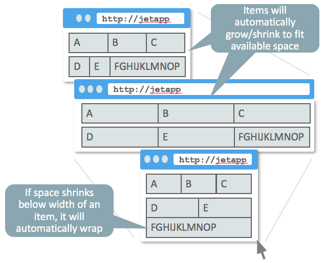
</div>As seen the oj-flex class identifies the 2 flex containers, while oj-flex-item is used to identify each individual item in the containers. Rather than trying to describe the behavior in a narrative, the following diagram attempts to visualize what happens with these 2 containers displayed in a browser, what happens when you expand and shrink the browser size beyond the @media query widths:
Overall the Oracle JET flex layout comes with a considerable amount of styleclasses we can make use of in our web applications, indeed too many to cover in this article. But let's see if we can broadly understand what is available: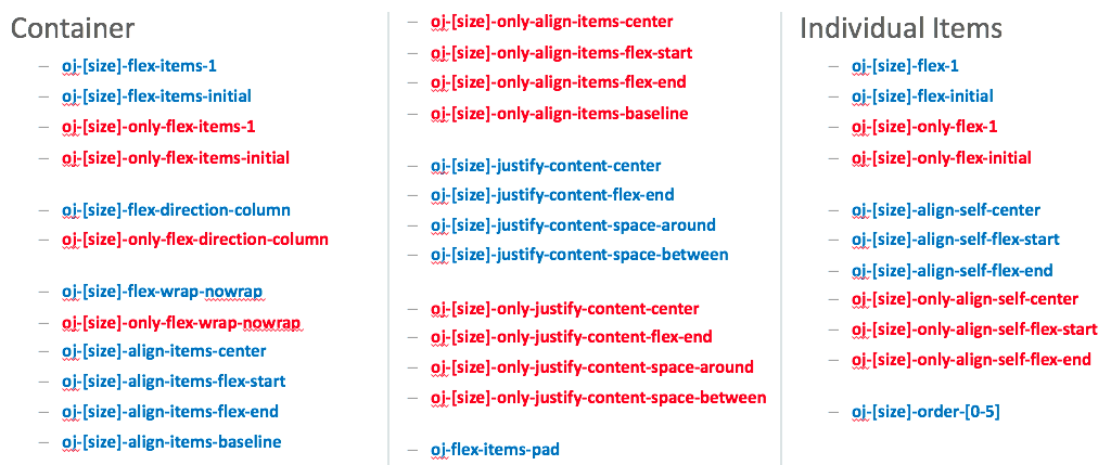 Firstly note the [size] annotation indicating we have a full set of styleclasses for small, medium, large and extra large screens. Which we choose is based on what screen sizes we're building for. In turn, note the styleclasses with the text "only" marked in red. If we choose one of these styleclasses, they apply only to that screen size. Alternatively, if we choose a styleclass without the word "only" marked in blue above, this applies to that screen size and above unless a larger screen size styleclass is used.
Second, note that the styleclasses are broken into those you apply at the flex container level such as oj-[size]-flex-item-1, versus styleclasses we apply at the flex item level such as oj-[size]-flex-1.
As mentioned there are far too many styleclasses to cover in this article, so let's pick and choose a few to get a feel for how they work. Let's start with oj-[size]-flex-items-initial.
As described earlier the default behavior of the Oracle JET flex layout is to grow and shrink the container items depending on the available screen space. We can override this behavior by using oj-[size]-flex-items-initial at the container level so the container items will shrink, but not grow to consume the available size:
<div class="oj-flex oj-md-flex-items-initial">
  <div class="oj-flex-item">A</div>
  <div class="oj-flex-item">B</div>
  <div class="oj-flex-item">C</div>
</div>
Give a screen of medium size the above code would result in: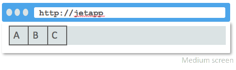
Alternatively, rather than applying this at the container level, if we only wanted to apply this for the first item we could use oj-[size]-flex-initial on one of the items:
<div class="oj-flex">
  <div class="oj-flex-item oj-md-flex-initial">A</div>
  <div class="oj-flex-item">B</div>
  <div class="oj-flex-item">C</div>
</div>
Again assuming a medium screen we would see: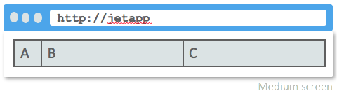
Conversely to shrinking, if we want to grow all the items to the same width, we can apply oj-[size]-flex-items-1 to the container:
<div class="oj-flex oj-md-flex-items-1">
  <div class="oj-flex-item">A</div>
  <div class="oj-flex-item">B</div>
  <div class="oj-flex-item">C</div>
</div>
<div class="oj-flex oj-md-flex-items-1">
  <div class="oj-flex-item">D</div>
  <div class="oj-flex-item">E</div>
  <div class="oj-flex-item">F – This text will auto wrap</div>
</div>
...which on a medium screen would look like: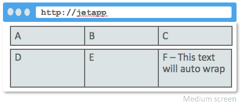 I can imagine wrapping of items is something we'd like to control when the screen shrinks. Exploring our earlier sample of code:
<!-- Flex container -->
<div class="oj-flex">
<!-- Flex items -->
<div class="oj-flex-item">A</div>
<div class="oj-flex-item">B</div>
<div class="oj-flex-item">C</div>
</div>
<!-- Flex container -->
<div class="oj-flex">
<!-- Flex items -->
<div class="oj-flex-item">D</div>
<div class="oj-flex-item">E</div>
<div class="oj-flex-item">FGHIJKLMNOP</div>
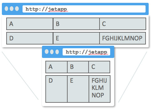
</div>...note how the last item will be entirely wrapped to a new line if it doesn't fit: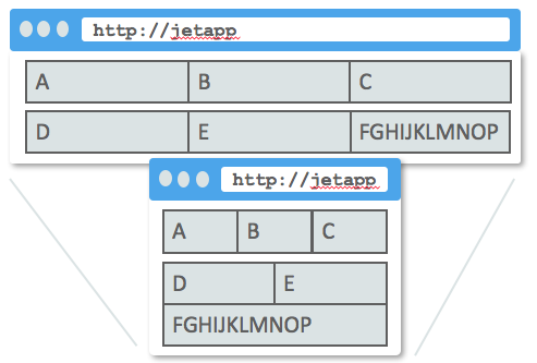 We might instead prefer that the text within the item wrapped instead. To do this we use oj-[size]-flex-nowrap on the container (I'll save you reading more code, you should be able to work it out now) which would have this effect depending on the screen size you select:
There's plenty to explore with the flex layout provided by Oracle JET. My only bit of advice from my own experimentation is if you can't get a layout to work, and you've added 1001 styleclasses which are interacting in some weird way, strip out the styleclasses and start again based on what you've learned.
Grid Layouts
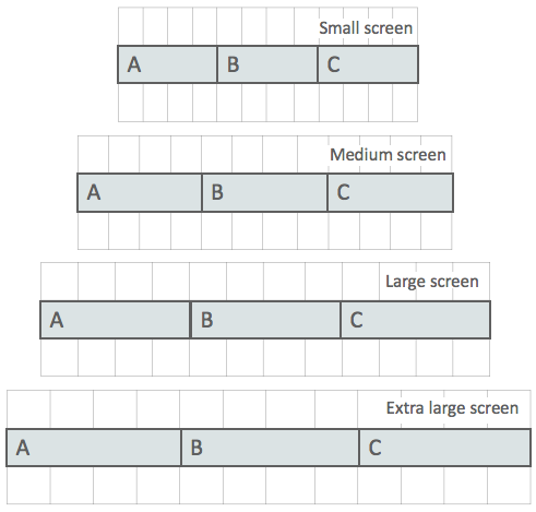
An alternative responsive web design system is the 12 column grid layout scheme. Essentially screens regardless of their size are divided into 12 columns which grow and shrink based on the screen size:
How it works is when we define an item, we simply state how many columns should it take, from 1 to a total of 12 for different screen sizes, based on the styleclasses you pick.
I spent quite a bit of time trying to work out how to visualize this, and I hope the following picture helps convey how it works:
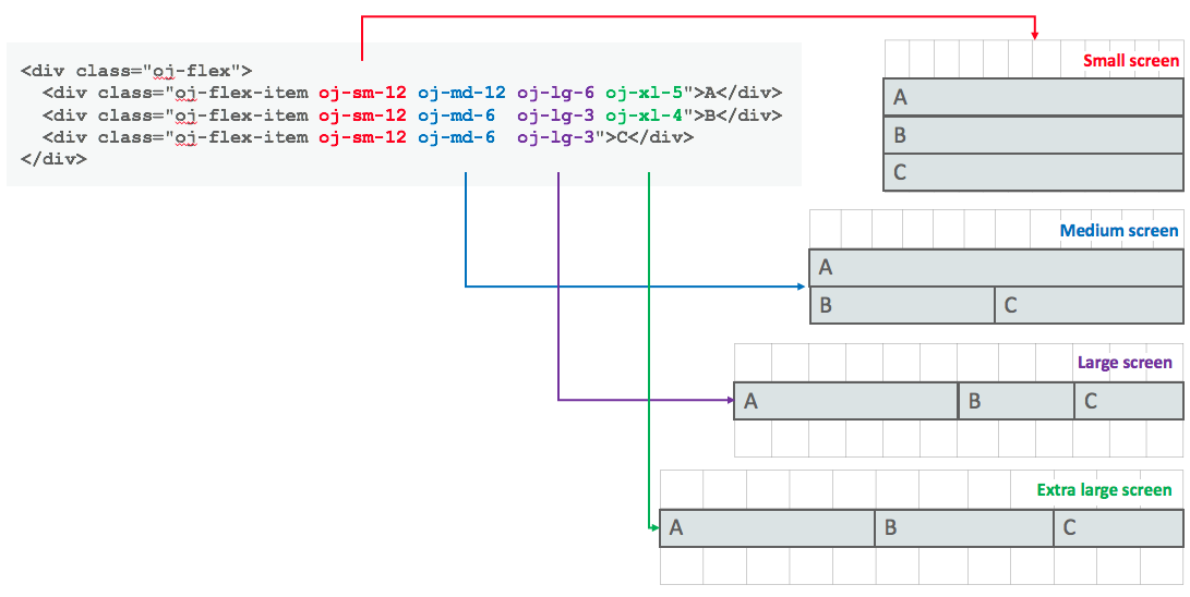
From the code, you can see we have 1 container and 3 items. Depending on the size of the screen, different styleclasses will be applied:
For a small sized screen, each item with be stretched to the full 12 column width. This forces the next item to wrap onto the next line.
For a medium sized screen, the first item stretched the full 12 column width pushing the remaining items onto the next line. As the 2 remaining items are both 6, to a total of 12, they fit onto the next line together.
For a large-sized screen, the 3 items of a width 6+3+3 to a total of 12 columns fit on the one line.
Finally, for an extra large screen, the first 2 items fit on the first line. The 3rd takes up the remaining space as it doesn't have a styleclass defined for extra large.
Of special note for the last comment, however, as we haven't defined an extra large styleclass for the 3rd item, but we have defined a large styleclass, this takes effect. It's as I mentioned before about "only" vs "non-only" styleclasses:
Note the styleclasses with the name "only"... If we choose one of these styleclasses, they apply only to that screen size. Alternatively if we choose a styleclass without the word "only" marked ... this applies to that screen size and above unless a larger screen size styleclass is used.
This is why the 3 items on the extra large example fit onto one line: 5+4+3 = 12
Form Layouts
Another layout scheme supported by Oracle JET is that of form layouts, for editable controls such as inputText components. Data entry forms typically have a layout where each editable control is left aligned down the page, with their labels either to the left or above them as seen in the following picture:
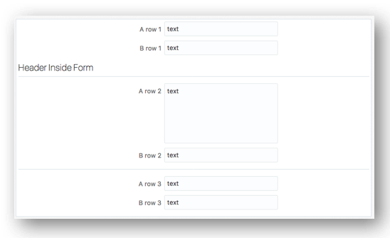
The Oracle JET forms layout support includes support for aligning component labels to the left or above the component, the ability to group components horizontally within a vertical form (useful where some fields can't be split across lines such as state and postcode), can wrap components on small screens, supports laying components in multiple columns, or nesting forms within forms, the ability to group components within headers, expand components horizontally across a form, and also align non-editable components such as buttons in a form too.
Phew, that's a large list. It seems Oracle has interest in data entry for some reason ;-)
Using the Oracle JET form layout we may want to build a login panel with an email address field, a password field, each with labels, and a login button: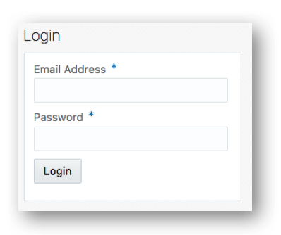 The following code demonstrates how this can be achieved:
<h3>Login</h3>
<div class="oj-form oj-panel">
  <label for="username-input">Email Address</label>
  <input id="username-input" type="text"
    data-bind="ojComponent: {component: 'ojInputText', value: username, required: true}"/>
  <label for="password-input">Password</label>
  <input id="password-input" type="password"
     data-bind="ojComponent: {component: 'ojInputPassword', value: password, required: true}"/>
  <button id="login-button"
     class="oj-label-nocomp oj-form-non-control"
     data-bind="ojComponent: {component: 'ojButton', label: 'Login'}, click: loginClick"/>
</div>
Of most significance is the oj-form styleclass in the parent <div>. In defining this, the editable child components are then set down the vertical form column. In order to align the field labels to the field, it is important to include the "for" property in the label mapping to the id of the associated editable components such as the inputText controls above.
Of special note is the oj-label-nocomp and oj-form-non-control styleclasses that is applied to the button. By default, the oj-form lays out only editable controls that have separate layouts. The button breaks this feature, so in order to get it to align to the fields, we use these two styleclasses.
Conclusion
As mentioned early on, this isn't the limits of Oracle JET's responsive web design features. It also supports convenience styleclasses and JavaScript utilities to make developing with different screen sizes easier, support for responsive images and even different font sizes. However for beginners to start out with, hopefully, we've investigated & explained enough to help you start building your own JET page layouts.
Article Series Links
The complete series of articles published to date can be found here:
- Installing Oracle JET for JavaScript Web Development
- Installing Oracle JET for Hybrid-Mobile Application Development
- Understanding the Development Process With Oracle JET for Web and Mobile
- Working with RequireJS in Oracle JET
- Investigating KnockoutJS in Oracle JET
- Working with Oracle JET UI Web Components
Opinions expressed by DZone contributors are their own.
Comments