Storybook: A Developer’s Secret Weapon
Some developers shy away from Storybook. Here, gain insight into the integration process, and explore some features that are most beneficial when using Storybook.
 ·
·
Join the DZone community and get the full member experience.
Join For FreeIn my experience, Storybook has been a game-changer as a front-end developer who has mainly relied on Jest, Mocha, and Chai to get the basic testing working for the components I've built — learning about Storybook has been an eye-opener. It's one of those tools that once you've used you wonder how you managed without it. The ability to visualize components in isolation has streamlined our development process, making collaboration between devs and designers seamless.
That said, I’ve seen some developers shy away from Storybook, citing the extra setup and maintenance as a downside. But here’s why I disagree: once you get past the initial integration, the time saved outweighs the setup cost in the long run. In this article, I would like to shed some light on the integration process and showcase some features that are most beneficial when using Storybook.
What Is Storybook?
Storybook is an open-source library for developing UI components in isolation. It is a useful tool for developing, testing, and documenting your components and design systems. The result of this tool is a component or library that could be a guide to help you render the right components for the right scenarios. This can be integrated with most front-end libraries like React, Vue, and Angular.
How Does Storybook Work?
Storybook allows you to see how exactly the components will look instead of describing how things should be. It does this by rendering your components in an iframe. It loads the actual components into a JavaScript file using a standard JavaScript import, and it passes data the same way as if you were using this in your application.
Benefits of Storybook
Storybook allows you to see the actual UI under different variations. This is helpful, especially as the project grows and contains hundreds of components that yield thousands of discrete variations. Here are some top benefits of using Storybook:
- Testing the functionality of components becomes a breeze with the actual visual representation provided by Storybook, relieving you from the burden of describing them.
- It is easier to render hard-to-reach edge cases and see if the components are rendered as expected.
- It is easier to detect issues and implement solutions.
- It is easier to collaborate among teams, use UX QA, and generate quick documents with built-in documentation rendering.
- Storybook integrates with almost all front-end libraries.
Explore Storybook Features With an Example
In my experience, integrating Storybook with a simple React app is one of the best ways to showcase its value. I find that starting with basic components like the LoginSignUp component — which handles styling properties like color, background, and size — gives a strong foundation. I believe this straightforward approach is ideal for anyone new to Storybook, and the added benefit of real-time interaction with user inputs like name, email, and password makes it indispensable for form-heavy apps.
- Prerequisites:
- Node - v20.17.0
- npm - v10.8.2 (To install node/npm - learn more)
Integrate With Storybook
To integrate with Storybook let's install the library.
> npx storybook@latest initThis will successfully build and launch the latest stable version of Storybook (v8.3.5). You can see the address that Storybook is hosted at in the terminal. In my case, localhost:6006.
> [email protected] storybook
> storybook dev -p 6006

storybook v8.2.9

info => Starting manager..
info => Starting preview..
info Addon-docs: using MDX3
info => Using implicit CSS loaders
info => Using default Webpack5 setup
<i> [webpack-dev-middleware] wait until bundle finished
╭─────────────────────────────────────────────────╮
│                                                 │
│   Storybook 8.2.9 for react-webpack5 started    │
│   157 ms for manager and 2.58 s for preview     │
│                                                 │
│    Local:            http://localhost:6006/     │
│    On your network:  http://10.0.0.127:6006/    │
│                                                 │
╰─────────────────────────────────────────────────╯
<i> [webpack-dev-middleware] wait until bundle finished: /__webpack_hmr
It will also automatically open a tab in your default web browser and the website will look like this:
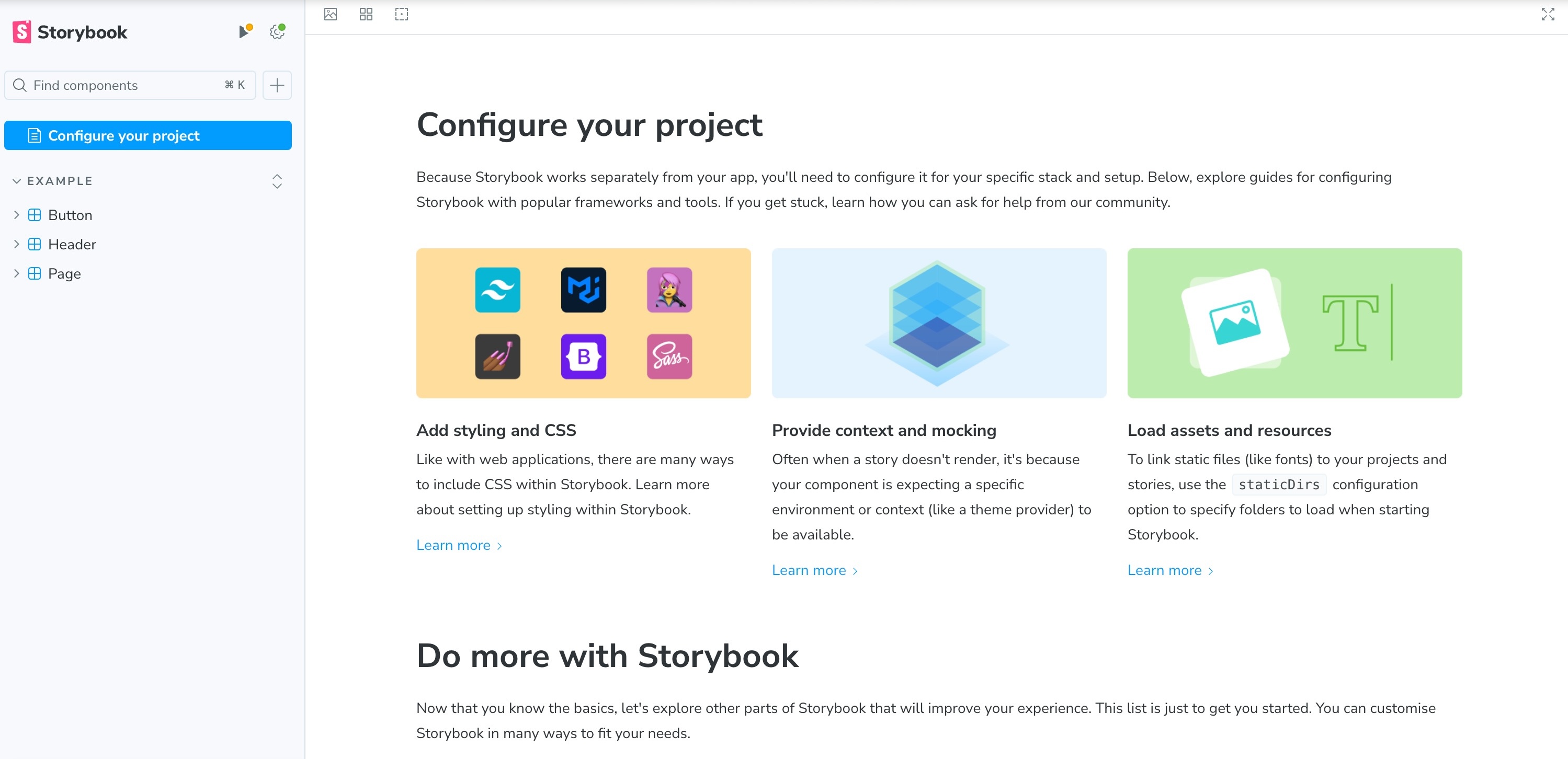
The Storybook CLI does a fantastic job of simplifying the setup process by automatically adding all the necessary configurations to integrate Storybook into your application. It creates two key folders:
- The .
storybookfolder is especially important because it contains critical files likemain.jsfor configuration andpreview.jsfor global settings, saving you the hassle of setting things up manually. - The
storiesfolder, where your Storybook code will live, is also incredibly useful. Storybook even goes the extra mile by including example code, making it easier for you to hit the ground running.
Finally, it also adds a script within the package.json file to run the Storybook using the npm run storybook command. This setup is a breeze compared to some other tools out there, and by this point, you’re already on your way to visualizing components. Congratulations — you’ve just made your development workflow that much smoother!
Write a Basic Story
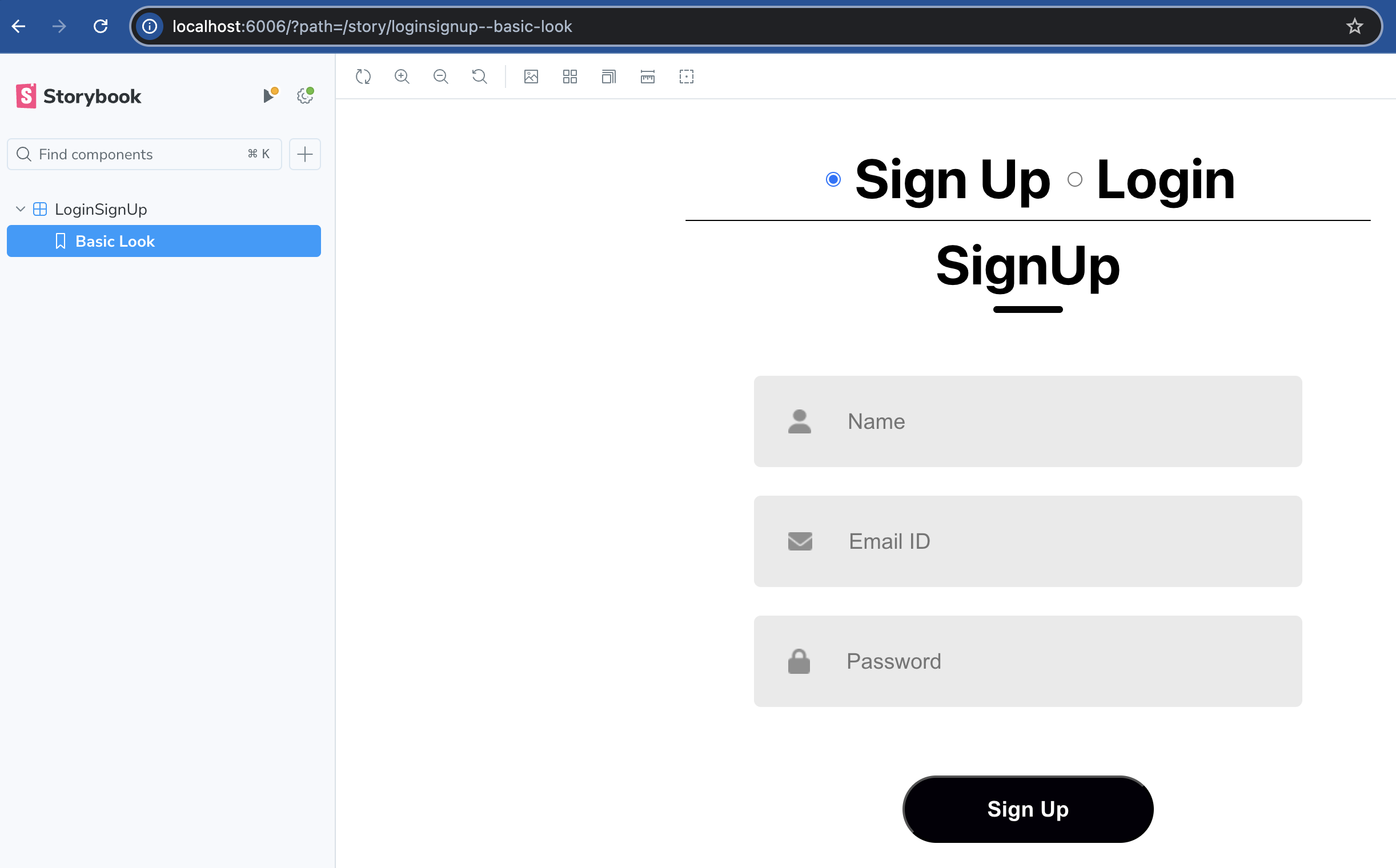
Create a new story by adding LoginSignUp.stories.js within the src/stories folder, and to make it focussed, remove the default examples created. The great part is that simply appending .stories.js to your filename means Storybook will automatically detect and render it when you run the npm run storybook command. From there, it's as simple as adding the title and component details, as shown below. I'd suggest starting with a basic story, like BasicLook, by exporting your component to keep things clean. This will render the LoginSignUp component with the default props passed to this component.
import LoginSignUp from "../Components/LoginSignUp/LoginSignUp";

export default {
    title: "LoginSignUp",
    component: LoginSignUp
}

export const BasicLook = () => <LoginSignUp />;
This will add a new story, LoginSignUp, and you will see "Basic Look" as your first story.
Enhance Stories With Args, ArgTypes, and Controls
To recap, we've created a story that renders the component LoginSignUp. As I mentioned above, this component takes in some props that are passed from /src/Components/MainPage/MainPage.js.
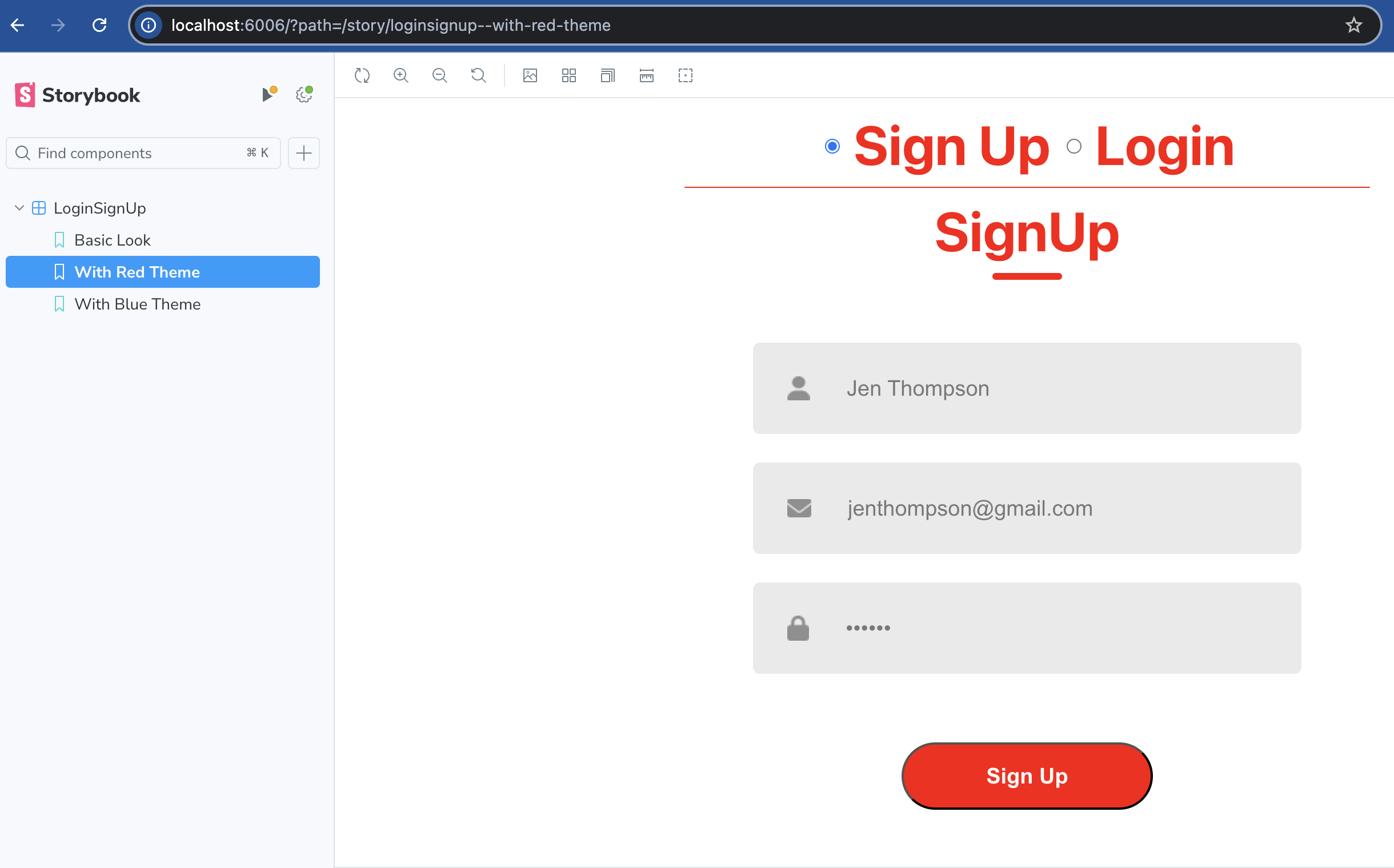
Args
Args are useful when you want to define those arguments (aka props) in a single JavaScript object. For our app, let's add the values for name, email, and password and pass them as props to see how the component would render.
export const BasicLook = (args) => <LoginSignUp {...args} />;

BasicLook.args = {
    name: "Jen Thompson",
    email: "[email protected]",
    password: "******",
}
These args will only apply to the story for which they are attached, although you can reuse them via JavaScript object reuse. For the same values, if we want to try different styling options, we could use the object spread feature of ES 2015. This makes testing so much cleaner and more efficient — you can instantly see how the component renders with different inputs without constantly tweaking your code. It’s one of the best features for quickly iterating on UI components.
export const WithRedTheme = {
args: {
...BasicLook.args,
color: "red",
backgroundColor: "red",
},
};
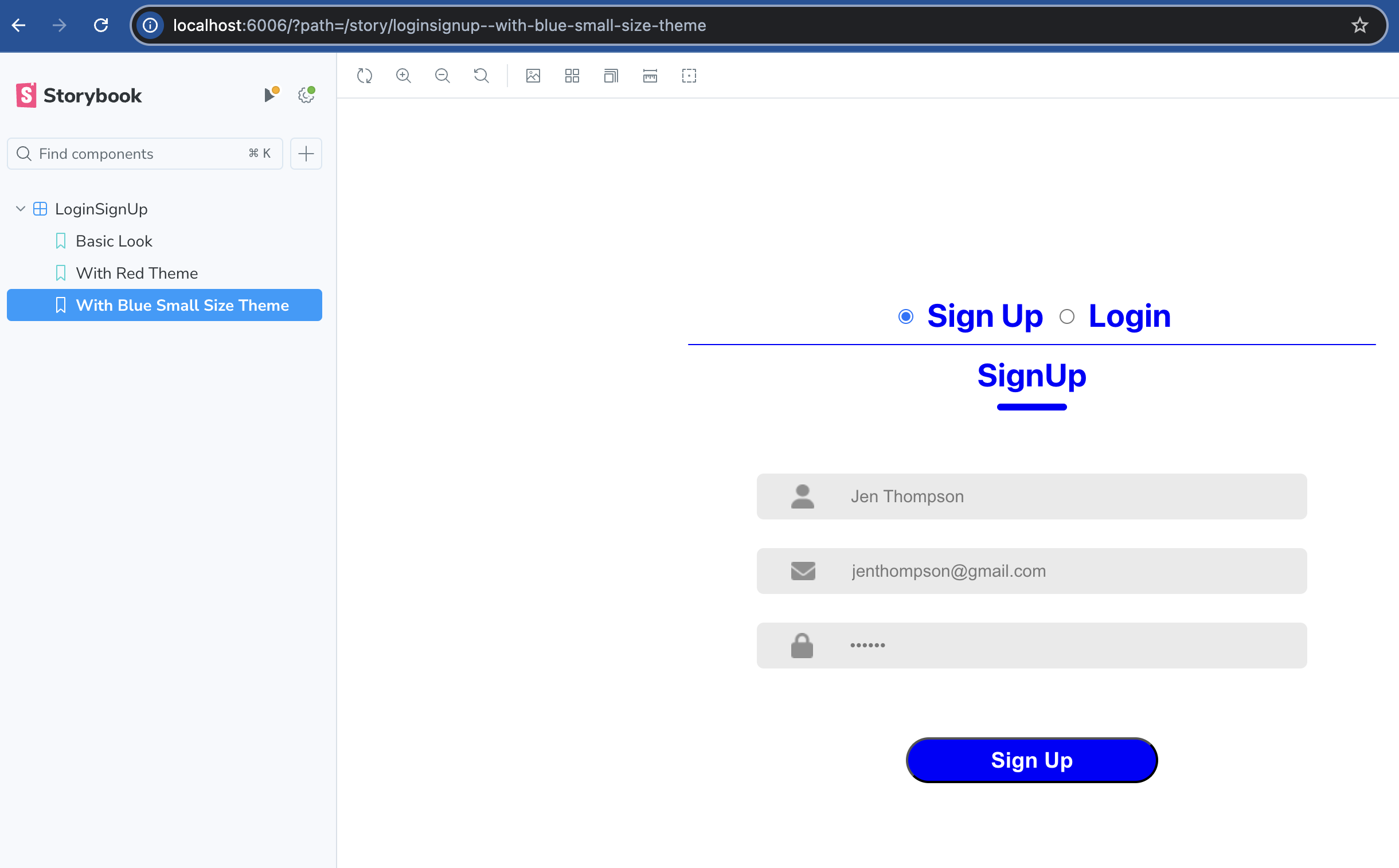
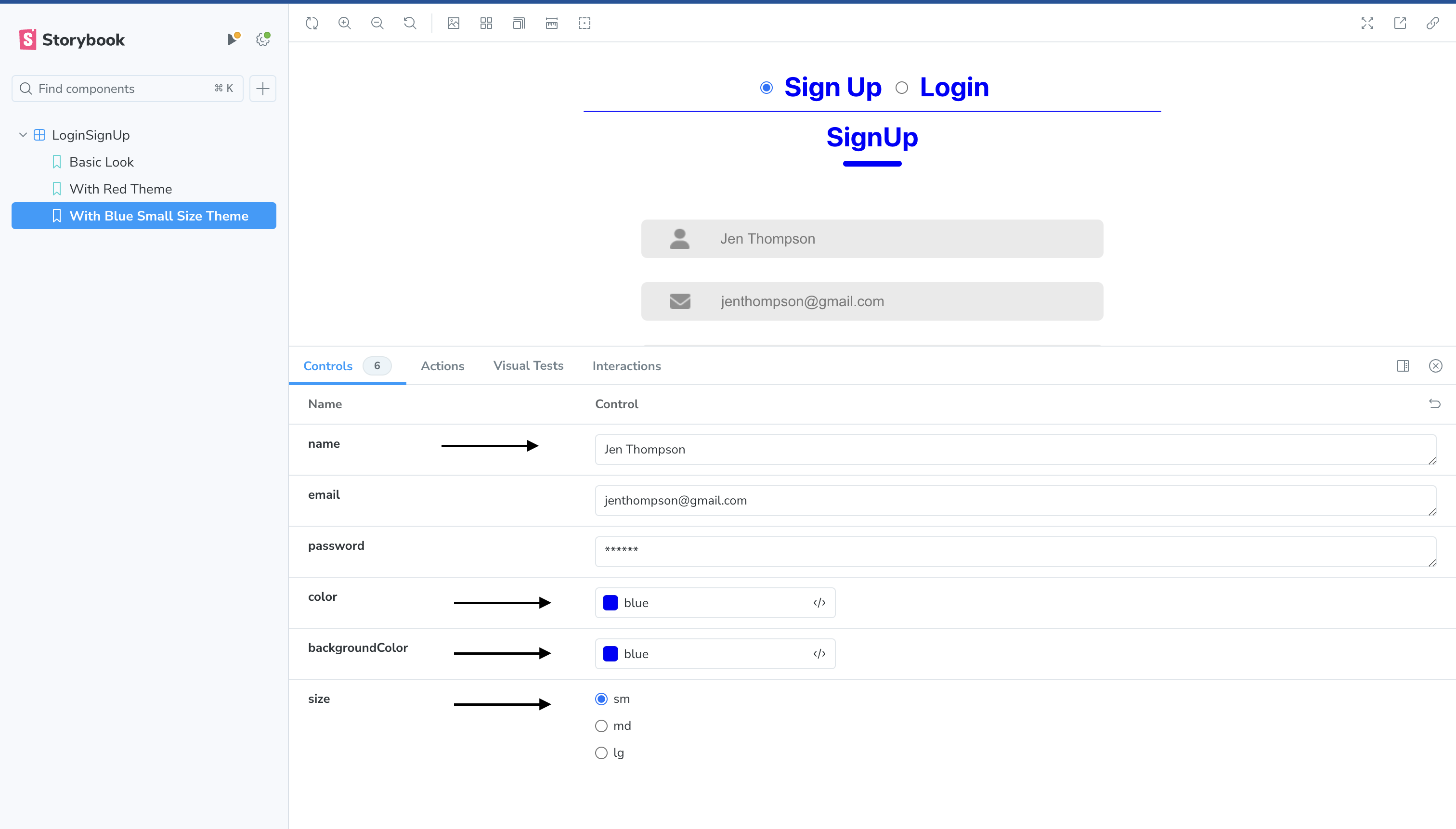
export const WithBlueSmallSizeTheme = {
args: {
...BasicLook.args,
color: "blue",
backgroundColor: "blue",
size: "sm"
},
};You will see 2 new stories added to your Storybook which look like the below:
With the above definition for args, you can specify any value for a given prop, which could result in inconsistent rendering. We can restrict the values set for each prop by adding Arg types.
Arg Types
ArgTypes are crucial for defining the behavior and constraints of your args. It ensures that they accept only valid values while clarifying defaults. By specifying arg types in the default export, you streamline the setup for every story in the file. This enforces consistency and enhances the user experience by clearly visualizing the options in the "Controls" section.
export default {
  title: "LoginSignUp",
  component: LoginSignUp,
  argTypes: {
    color: { control: "color" },
    backgroundColor: { control: "color" },
    name: { control: "text" },
    size: { control: "radio", options: ["sm", "md", "lg"] },
  },
};
Controls
Storybook Controls is a convenient add-on that gives you a no-code UI to manipulate component props directly in the browser. This powerful tool instantly lets you tweak your components, offering a faster, more interactive development experience. Using ArgTypes is essential — without them, you'd miss out on precise controls like a color picker or restricted size options. By specifying types for your props, you're not just adding polish; you're building an intuitive, dynamic editing interface for anyone interacting with your stories.
Play With Actions and Interactions in Stories
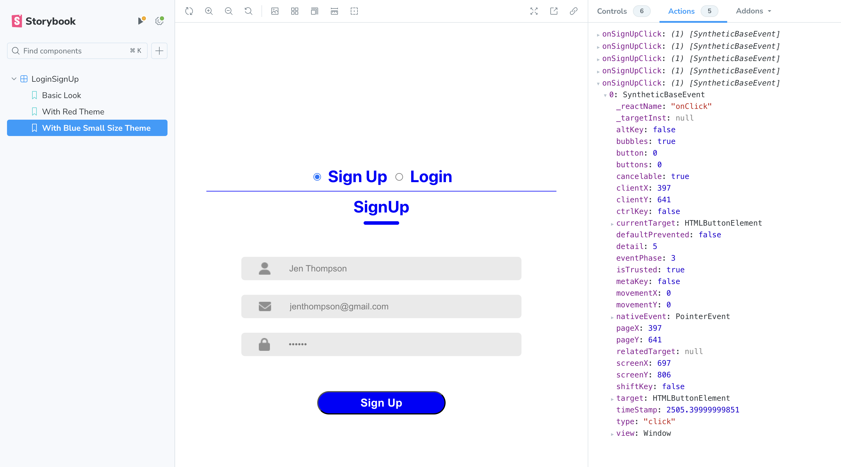
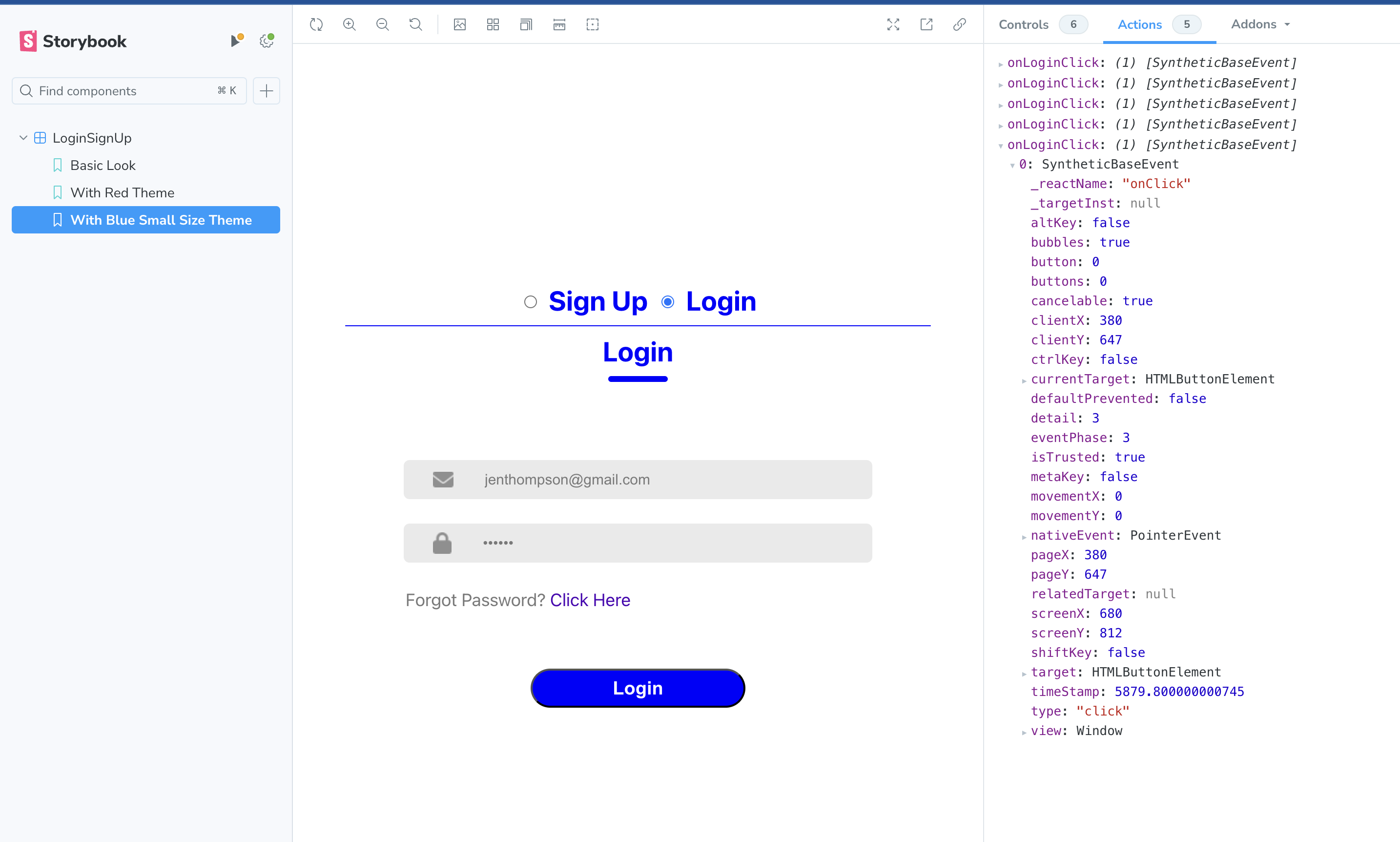
Actions
The Actions addon is essential for tracking and visualizing event handler data, which is ideal for testing and debugging events. In our example, simulating clicks on the Login and SignUp buttons demonstrates the power of this tool. Every click logs the specific events tied to each button, providing real-time feedback. We can do this by defining a @storybook/test fn() to mock and spy on the args.
import { fn } from "@storybook/test";

export default {
.....
  args: {
    onSignUpClick: fn(),
    onLoginClick: fn(),
  },
.....
};
You can observe that when the Sign Up button is clicked, it logs events invoked by that button.
When the Login button is clicked, it logs events invoked by that specific button.
Interactions
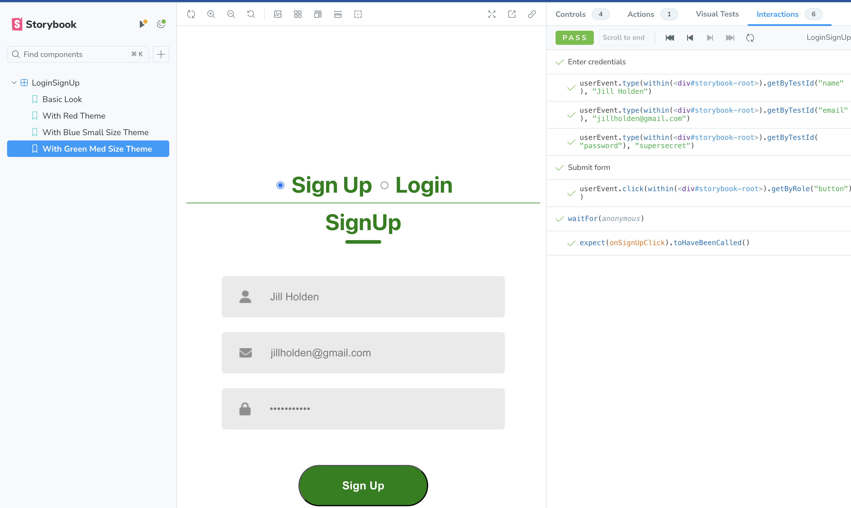
Interaction testing in Storybook takes the defined Actions further by allowing you to simulate and automate user interactions. It’s like creating automated UI tests that run in the browser, ensuring that your components behave as expected across different interaction patterns.
To demonstrate the usefulness of this feature, we can use a new story to which we will add a new function, play(). The play() function will find each element in the canvas, populate values, and trigger the click of the Sign Up button. When executed, you'll immediately see the Sign Up click event in the Actions tab, giving you invaluable, real-time feedback.
export const WithGreenMedSizeTheme = {
  args: {
    color: "green",
    backgroundColor: "green",
    size: "md"
  },
  play: async ({ args, canvasElement, step }) => {
    // Starts querying the component from its root element
    const canvas = within(canvasElement);

    await step('Enter credentials', async () => {
      await userEvent.type(canvas.getByTestId('name'), 'Jill Holden');
      await userEvent.type(canvas.getByTestId('email'), '[email protected]');
      await userEvent.type(canvas.getByTestId('password'), 'supersecret');
    });

    await step('Submit form', async () => {
      await userEvent.click(canvas.getByRole('button'));
    });

    await waitFor(() => expect(args.onSignUpClick).toHaveBeenCalled());
  },
};
The corresponding events logged in the Interaction tab allow us to see each step in the interaction flow showcased in real time. This makes debugging more straightforward, as you can identify which step is causing the failure.
Creating Docs With Storybook
Creating documentation is a breeze with Storybook. By simply adding tags like ['autodocs'] to your stories, you can witness the transformation of your stories into dynamic, live documentation.
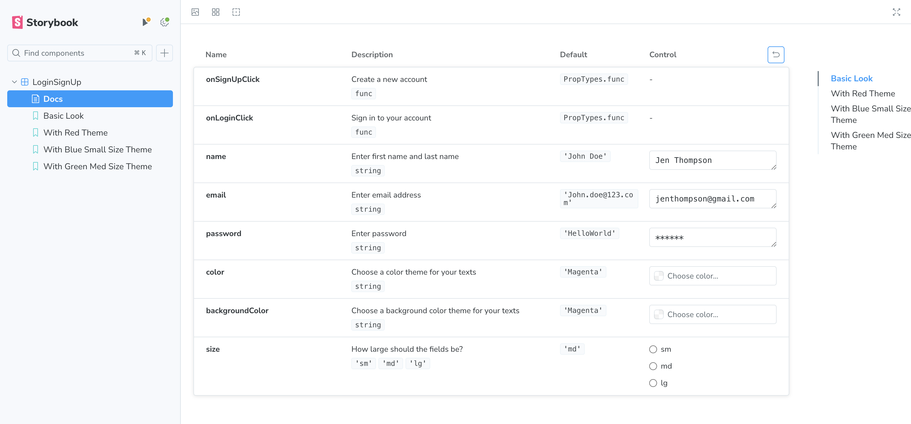
It is helpful to add more details to component PropTypes, as Storybook relies on these details to add more details to your documentation. For example, when you add comments to your props, these get converted into descriptions when docs are auto-generated.
LoginSignUp.propTypes = {
  /**
  * Enter first name and last name
  */
   name: PropTypes.string,
 /**
  * Enter email address
  */
   email: PropTypes.string,
 /**
  * Enter password
  */
   password: PropTypes.string,
 /**
  * Create a new account
  */
   onSignUpClick: PropTypes.func,
 /**
  * Sign in to your account
  */
   onLoginClick: PropTypes.func,
 /**
  * Choose a color theme for your texts
  */
   color:PropTypes.string,
 /**
  * Choose a background color theme for your texts
  */
   backgroundColor: PropTypes.string,
 /**
  * How large should the fields be?
  */
   size: PropTypes.oneOf(['sm', 'md', 'lg'])
}
You can configure documentation settings for all your stories by adding tags in .storybook/preview.js. You can also configure it per component level as I've shown here. Sometimes the autogenerated documentation could be quite long and difficult to scroll through all of contents. Storybook easily allows you to add a table of contents to summarize the docs and access the content of interest. To add a table of contents, simply add toc: true in your doc settings.
export default {
.....
tags: ['autodocs'],
parameters: {
  docs: {
    toc: true, // Enables the table of contents
  },
 }
}
If you have configured it for all your stories, you can disable auto docs for a particular component by adding the tag ['!autodocs'] to your specific story.
Summary
Storybook is an indispensable tool for front-end development, offering far more than just a component viewer. Using Storybook, we can see how components are rendered rather than describe them. You can play with props and settings in real time, instantly revealing how your component behaves. Beyond that, it’s perfect for simulating tricky, hard-to-reach edge cases that are difficult to test otherwise. And the auto-generated documentation? A game-changer. It ensures you not only build components but also showcase them with clarity and professionalism. If you have not yet started exploring this, this is a perfect time to start looking into it.
Opinions expressed by DZone contributors are their own.
Comments