Creating 3D CSS Buttons That Move as You Mouse Over
Let's take a look at how to make 3D Javascript/CSS buttons with shadows, edges, and animations that move as you hover your mouse over them.
Join the DZone community and get the full member experience.
Join For Free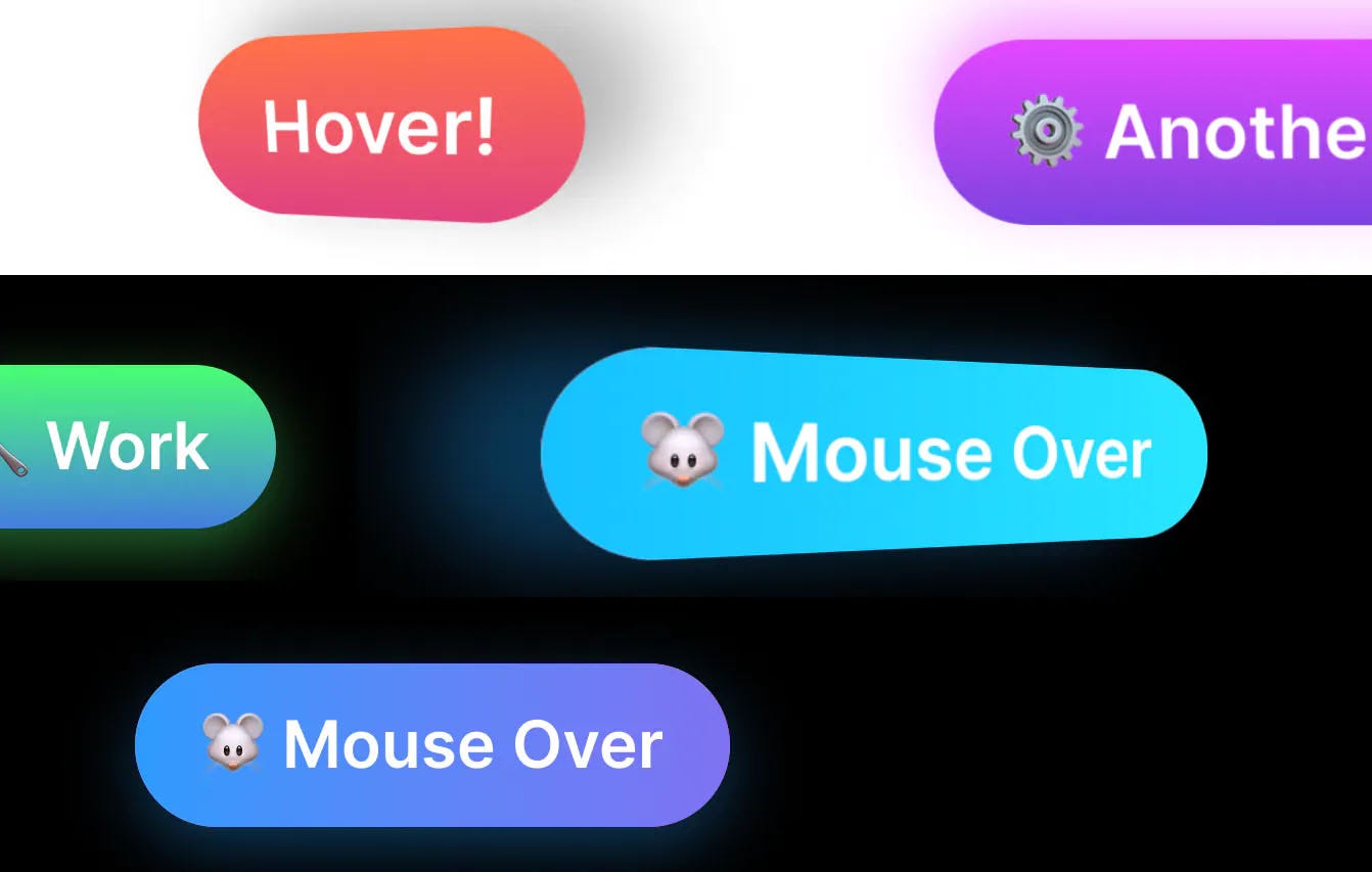
Recently I was toying with the idea of a 3D button that moves as the user moves their mouse around it. To further this effect, I added some 3D shadows which move in tandem to give the illusion of a 3D button that is sitting off the page and moves with the user’s mouse movements.
Demo
How Does It Work?
The fundamental concept behind these buttons is that we need to track when the user mouses over the button, moves, and mouses out. On mouseover, we will move the button so it appears 3D. On mouse out, we will reset it.
Before we get to the Javascript, let’s make our button look good. Our HTML will look like this:
<button class="button"><span>Hover!</span></button>
And our CSS looks like this:
button {
    box-shadow: none;
    background: transparent;
    transform-style: preserve-3d;
    padding: 0;
    height: auto;
    float: none;
}

button span {
    background: linear-gradient(180deg, #ff7147, #e0417f);
    font-size: 2rem;
    padding: 1rem 2rem;
    line-height: 3rem;
    will-change: transform, filter;
    float: none;
    margin: 0;
    transition: all 0.15s ease-out;
    height: auto;
    border-radius: 100px;
    overflow: hidden;
    display: block;
    margin: 0px auto;
    display: block;
    transform: rotateX(0deg) rotateY(0deg) scale(1);
    filter: drop-shadow(0 15px 15px rgba(0,0,0,0.3));
    font-weight: 600;
    perspective-origin: 0 0;
    letter-spacing: 0;
}
Minor Background Animations
You may have noticed that the third button has a background animation. If you’re interested in how I did that, I used a pseudo-element that is moving via animation. The pseudo-element has a simple gradient, and the overflow is hidden. You can test this out yourself by removing overflow: hidden from the span and button elements.
How the Javascript Works
Let’s take a look at our Javascript now. You may have noted we have two elements for our button: the button itself and a span inside of it. There is a good reason for this — this lets us apply 3D perspective on the parent, which is required for the effect to work. It also allows us to target the parent for the hover effect. If we use hover on the child, the effect will bug out as the child will rotate, and we will miss the hitbox.
I am using a function that uses the event variable (e) and references both the span (noted here as item) and the button (referenced as parent).
let calculateAngle = function(e, item, parent) {
    let dropShadowColor = `rgba(0, 0, 0, 0.3)`
    // If the button has a data-filter-color attribute, then use this for the shadow's color
    if(parent.getAttribute('data-filter-color') !== null) {
        dropShadowColor = parent.getAttribute('data-filter-color');
    }

    // If the button has a data-custom-perspective attribute, then use this as the perspective.
    if(parent.getAttribute('data-custom-perspective') !== null) {
        parent.style.perspective = `${parent.getAttribute('data-custom-perspective')}`
    }

    // Get the x position of the users mouse, relative to the button itself
    let x = Math.abs(item.getBoundingClientRect().x - e.clientX);
    // Get the y position relative to the button
    let y = Math.abs(item.getBoundingClientRect().y - e.clientY);

    // Calculate half the width and height
    let halfWidth  = item.getBoundingClientRect().width / 2;
    let halfHeight = item.getBoundingClientRect().height / 2;

    // Use this to create an angle. I have divided by 6 and 4 respectively so the effect looks good.
    // Changing these numbers will change the depth of the effect.
    let calcAngleX = (x - halfWidth) / 6;
    let calcAngleY = (y - halfHeight) / 4;

    // Set the items transform CSS property
    item.style.transform = `rotateY(${calcAngleX}deg) rotateX(${calcAngleY}deg) scale(1.15)`;

    // And set its container's perspective.
    parent.style.perspective = `${halfWidth * 2}px`
    item.style.perspective = `${halfWidth * 3}px`

    // Reapply this to the shadow, with different dividers
    let calcShadowX = (x - halfWidth) / 3;
    let calcShadowY = (y - halfHeight) / 3;

    // Add a filter shadow - this is more performant to animate than a regular box shadow.
    item.style.filter = `drop-shadow(${-calcShadowX}px ${calcShadowY}px 15px ${dropShadowColor})`;
}
Effectively this splits the button into four quadrants. The midpoint represents an angle of change on the X and Y axis of 0, while a movement to the left results in a more negative Y angle, and a more positive one to the right. The same applies for X, where moving the cursor up turns the X angle more positive, and down, more negative.
Some things worth noting:
- We are using filter box-shadows because they transition better with CSS’
transitionproperty. - I’ve added the ability to add custom perspective and box-shadow colors to give more flexibility without having to change the code.
- The effect is modulated by dividing the
calcAngle*variables. If you change how much you divide them by, or even change the perspective, the effect will become more or less pronounced.
Applying Our Function to Each Button
To apply our function to each button, we simply iterate through them all with forEach.
document.querySelectorAll('.button').forEach(function(item) {
    // Add on mouseenter
    item.addEventListener('mouseenter', function(e) {
        calculateAngle(e, this.querySelector('span'), this);
    });
    // Add on mousemove
    item.addEventListener('mousemove', function(e) {
        calculateAngle(e, this.querySelector('span'), this);
    });

    // Reset everything on mouse leave
    item.addEventListener('mouseleave', function(e) {
        let dropShadowColor = `rgba(0, 0, 0, 0.3)`
        if(item.getAttribute('data-filter-color') !== null) {
            dropShadowColor = item.getAttribute('data-filter-color')
        }
        item.querySelector('span').style.transform = `rotateY(0deg) rotateX(0deg) scale(1)`;
        item.querySelector('span').style.filter = `drop-shadow(0 10px 15px ${dropShadowColor})`;
    });
})
We’re Done
With that, we have recreated the effect shown at the start of the article. We hope you’ve enjoyed this guide.
Published at DZone with permission of Johnny Simpson. See the original article here.
Opinions expressed by DZone contributors are their own.
Comments