Creating Custom Dashboards With Vizro: A Comprehensive Guide
Learn the essential techniques to create visually appealing and informative dashboards using McKinsey’s Visualization Framework.
Join the DZone community and get the full member experience.
Join For FreeWhat Is Vizro?
Vizro is a Python library to create dashboards for your data simply, built on top of Dash and Plotly. It aims to merge the rapid prototyping abilities of Streamlit with the customization capabilities of Dash.
A Vizro Dashboard is made of Pages, with each page mainly comprising Components (which can be Graphs or Tables), Filters (which can be sliders, dropdown boxes, and other buttons), and optional Actions. Together, they can be formatted in native Python as an object, or as a YAML file. In this tutorial, I will be locally developing a Vizro Dashboard using Python. I assume some prior knowledge of the Pandas Library.
Use a few lines of simple configuration to create complex dashboards, which are automatically assembled using libraries such as Plotly and Dash, with inbuilt coding and design best practices.
Define high-level categories within the configuration, including:
- Components: Create charts, tables, input/output interfaces, and more.
- Controls: Create filters, parameter inputs, and custom action controllers.
- Pages, layouts, and navigation: Create multiple pages, with customizable layouts and flexible navigation across them.
- Actions and interactions: Create interactions between charts, and use pre-defined or customized actions (such as exporting).
Configuration can be written in multiple formats including Pydantic models, JSON, YAML, or Python dictionaries for added flexibility of implementation.
Optional high-code extensions enable almost infinite customization in a modular way, combining the best of low-code and high-code — for flexible and scalable, Python-enabled data visualization applications.
The Dataset I am using contains the death rate of various countries and regions and the most likely factor of their deaths from the years 1990–2019. ( For reference, the columns look like Country/Region Name, Year, Risk Factor 1, Risk Factor 2, Risk Factor 3,4….) Sourced from: OurWorldInData.
Creating a Basic Vizro Page
Let's start simple. We will create scatter plots of two of the columns, “Deaths that are from all causes attributed to high systolic blood pressure, in both sexes aged all ages,” and “Deaths that are from all causes attributed to a diet high in sodium, in both sexes aged all ages” (Yes, the columns are a mouthful, we will deal with that soon).
All the Imports for This Tutorial
from typing import List, Literal

import dash_core_components as dcc
import vizro.models as vm
import vizro.plotly.express as px

from dash import html
from vizro import Vizro

from vizro.models.types import capture
from vizro.models import Action
from vizro.models._action._actions_chain import _action_validator_factory

import pandas as pd
import plotly.graph_objects as go
Loading the Data, and Creating the Graphics
# Load the data
df = pd.read_csv('vizro/number-of-deaths-by-risk-factor.csv')
df['Year'] = pd.to_datetime(df['Year'], format='%Y') # Format the Year column into datetime

# Create a scatter plot for high systolic blood pressure deaths over years
fig_sbp = px.scatter(df, x="Year", y="Deaths that are from all causes attributed to high systolic blood pressure, in both sexes aged all ages", color="Entity", title="High Systolic Blood Pressure Deaths Over Years")

# Create a scatter plot for diet high in sodium deaths over years
fig_sodium = px.scatter(df, x="Year", y="Deaths that are from all causes attributed to diet high in sodium, in both sexes aged all ages", color="Entity", title="Diet High in Sodium Deaths Over Years")
Note that fig_sbp and fig_sodium are created using vizro.plotly.express, which wraps around the base Plotly Express functionalities.
So far, we have loaded the data and created two plotly scatter plots of its columns. These plots will be added as components to our Vizro Page. Also, we would like to extend the functionality of the graphs, by allowing the User to say, select which countries he wants included and from what year to what year. (Remember, the Entities column has the value of the Countries, and the Year column contains the Year in Datetime format).
Using Filters in Vizro
Filters are essentially buttons, you define a Filter, and in that filter, you set the column parameter with the column of the dataframe you want to filter to interact with. The selector, which is the button itself, can be a dropdown (for categorical valued columns), slider (to select a value within a range), etc.
# Add filters
filters = [
    vm.Filter(column="Entity", # for the column "Entity" ....
              selector=vm.Dropdown(title="Country")), # ... Create a Dropdown
    vm.Filter(column="Year", selector=vm.DatePicker(range=True))
]

# Create a page with the graphs and filters
temp_page = vm.Page(
    title="Temporary Dashboard", # Title must be unique to the Page
    components=[
        vm.Graph(figure=fig_sbp), # Wrap the Ploty Figure into a Graph
        vm.Graph(figure=fig_sodium),

    ],
    controls=filters,
)

# Create the dashboard
dashboard = vm.Dashboard(pages=[temp_page]) # Supports multi pages

# Build and run the dashboard
Vizro().build(dashboard).run()
If you, like me, run this locally as a Python script, the dashboard will be locally served (similar to say, a Flask Server).
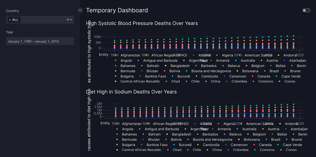
Well, the good news is we now have our very first dashboard up and running. The bad news is that it's really messy. Let us take the first four risk factor columns, clean the long text we get as labels, and change the page layout to better display our graphs.
Layout can be used to manage the overall structure of the page and control where components are displayed.
components = list() # We will create components as a list

for col in df.columns[3:7]: # Taking the first 4 Risk Factor columns iteratively
    fig_col = px.scatter(df, x="Year", y=col,
                        color="Entity", title=col.replace('Deaths that are from all causes attributed to ', '').title(),
                        # Parsing the long title into a more readable form
                        labels={"Year": "", col: ""}
                        )
    components.append(vm.Graph(figure=fig_col))

page_0 = vm.Page(
    title="Health-Related Deaths Dashboard",
    layout=vm.Layout(grid=[[0, 1],
                            [2, 3]]),
    components=components,
    controls=filters,
)

# Create the dashboard
dashboard = vm.Dashboard(pages=[page_0])

# Build and run the dashboard
Vizro().build(dashboard).run()Now that we are more familiar with Vizro as a library, let us look at the actual plot itself. Vizro has the functionality to create a “custom chart,” let’s explore it in more detail.
Custom Chart: Stacked Bar Chart
Let us write a function that uses the much more flexible Plotly graph objects to return a stacked bar chart. Some of my requirements were:
- Only keep the countries in, and remove all pre-aggregated regions like G20, World, etc.
- Sum over the deaths for each country Year-on-Year (we can later filter for each country using the dropdown selector in the dashboard)
- Clearly demarcate each cause within the bar chart.
- Create an “Others” category with the columns of lowest risk factors.
If we create a function that accepts the dataframe and returns a Plotly object, we can perform the data transformations we need and are still able to attach it to the general framework we have built so far.
@capture("graph")
def stacked_bar(data_frame):
    values_to_remove = ['G20', 'World', '(WHO)', '(WB)']
    # Aggregated Regions have these substrings in them, so we filter them outr
    data_frame = data_frame[~data_frame['Entity'].str.contains('|'.join(values_to_remove))]

    data_frame = data_frame.drop(columns=["Entity", "Code"])
    df_agg = data_frame.groupby('Year').sum().reset_index()
    df_agg.columns = df_agg.columns.str.replace('Deaths that are from all causes attributed to ', '')
    df_agg.columns = df_agg.columns.str.split(',').str[0]

    # Sort the columns by the sum of values in descending order excluding 'Year' column
    sorted_cols = df_agg.drop(columns=['Year']).sum().sort_values(ascending=False).index
    df_agg = df_agg[['Year'] + sorted_cols.tolist()]

    # Combine the lowest 5 causes into 'Others'
    others_sum = df_agg.iloc[:, -8:].sum(axis=1)
    df_agg = pd.concat([df_agg.iloc[:, :-8], pd.DataFrame({'Others': others_sum})], axis=1)

    # Create the stacked bar chart
    fig = go.Figure()

    for i, col in enumerate(df_agg.columns[1:]):  # Exclude 'Year' column
        fig.add_trace(go.Bar(
            x=df_agg['Year'],
            y=df_agg[col],
            name=col,
        ))

    # Update layout
    fig.update_layout(
        title='Stacked Bar Chart of Causes of Death (Worldwide)',
        xaxis_title='Year',
        yaxis_title='Death Count',
        barmode='stack'  # Stacked bar chart
    )

    return fig
Let us add the output of this function as a separate page into our dashboard.
filters_2 = [
    vm.Filter(column="Entity", selector=vm.Dropdown(title="Country")),
    vm.Filter(column="Year", selector=vm.DatePicker(range=True))
] # You will need to redefine the filters to prevent unwanted bugs

page_1 = vm.Page(
    title="Custom Year on Year Deaths bar chart",
    path="my-custom-url", # You can redirect a page to any particular URL
    components=[
        vm.Graph(
            figure=stacked_bar(data_frame=df),
        ),
    ],
    controls=filters_2,
)
dashboard = vm.Dashboard(pages=[page_0,page_1])

Vizro().build(dashboard).run()
By now, we have become well acquainted with Vizro and built a custom dashboard. If you have worked with it, however, you will almost immediately notice a problem.
The Date Picker selector.
It is fairly clunky to use, and more importantly, we really only need the Year, not the date. So why not use the Range Slider function?
Well, the Range Slider is only for integers, if we want to use it, we will have to extend its functionality. This is where the Dash Framework comes in play. vm.RangeSlifer is built on top of dcc.RangeSlider(dcc = Dash Core Component) which has a bunch of useful parameters like these:
marks (dict; optional): Marks on the slider. The key determines the position (a number), and the value determines what will show. If you want to set the style of a specific mark point, the value should be an object which contains style and label properties.

marks is a dict with strings as keys and values of type string | dict with keys:

    1. label (string; optional)

    2. style (dict; optional)

value (list of numbers; optional): The value of the input.

drag_value (list of numbers; optional): The value of the input during a drag.

allowCross (boolean; optional): allowCross could be set as True to allow those handles to cross.


--- and so on
We can use these parameters to improve the way the numbers are parsed and displayed for our Filter. To use these parameters, Vizro allows us to extend its native RangeSlider to create our own custom Selector.
Object Oriented Programming ftw.
Creating a Custom Component
The general format of creating a custom selector is fairly standard:
class YearRangeSelector(vm.RangeSlider):
    # Make sure you inherit the selector class off which you are building yours
    type: Literal["year_range_selector"] = "year_range_selector"
    # First, Define a unique id for your new selector
    def build(self):
        # The build method should contain all the dash parameters
        # Make sure you inherit the build functionality of you base selector
        range_slider_build_obj = super().build()

        # To set your desired Dash parameter:
        # range_slider_build_obj[self.id].<parameter> = < value >
Make sure you are referring to the Dash Core Components Guide to find the list of parameters that are allowed while making these changes. After a bit of trial and error, this style is what I came up with:
class YearRangeSelector(vm.RangeSlider):
    type: Literal["year_range_selector"] = "year_range_selector"

    def build(self):
        range_slider_build_obj = super().build()
        range_slider_build_obj[self.id].value = list(range(1990,2020,1))
        range_slider_build_obj[self.id].allowCross = False
        range_slider_build_obj[self.id].tooltip = {"always_visible": True,
                                                    "template": "{value}"
                                                   }
        # You can add any other parameters you feel like setting here
        return range_slider_build_obj
Your final step is to add the name of your new selector to Vizro so it actually recognizes it.
vm.Filter.add_type("selector", YearRangeSelector)
vm.Parameter.add_type("selector", YearRangeSelector)
Now, you need to make two changes to fully replace the DatePicker selector.
Simply add your new YearRangeSelector instead of DatePicker in filters and filters_2 lists.
filters = [
    vm.Filter(column="Entity", selector=vm.Dropdown(title="Country")),
    vm.Filter(column="Year", selector=YearRangeSelector(
        min = 1990,
        max = 2019,
        marks = {i: {'label': "'{}".format(str(i)[-2:]),
                 'style': {"fontSize": "10px"}} for i in range(1990, 2021, 2)}
    ))
]

filters_2 = [
    vm.Filter(column="Entity", selector=vm.Dropdown(title="Country")),
    vm.Filter(column="Year", selector=YearRangeSelector(
        min = 1990,
        max = 2019,
        marks = {i: {'label': "'{}".format(str(i)[-2:]),
                 'style': {"fontSize": "10px"}} for i in range(1990, 2021, 2)}
    ))
]
Note: You also no longer need to typecast the Year column of your dataframe since we now handle the datetime component within RangeSlider filter itself.
df = pd.read_csv('vizro/number-of-deaths-by-risk-factor.csv')
# df['Year'] = pd.to_datetime(df['Year'], format='%Y')
# You don't need this anymore.
And we are done!
Page 2 of your final Vizro Dashboard.
In this tutorial, we started out by creating a simple Vizro page and went on to fully utilize its customization powers to create entirely unique components. I hope you enjoyed it. Thanks for reading!
Published at DZone with permission of Syed Daimi. See the original article here.
Opinions expressed by DZone contributors are their own.
Comments