Doing Residual Analysis Post Regression in R
In this post, we take a deep dive into the R language by exploring residual analysis and visualizing the results with R.
Join the DZone community and get the full member experience.
Join For FreeResiduals are essentially gaps that are left when a given model, in this case, linear regression, does not fit the given observations completely.
A close analogy for residual analysis is found in medical pathology. What remains post-metabolism usually becomes an indicator of what was processed and absorbed versus what was not so.
Residuals are the difference between the original value to be modeled and the estimator of original value that came as a result of your model.
Residual error = Y- Y-hat, where Y is the original value and Y-hat is the computed value.
I would expect this error to be as close to zero as possible and will be interested in finding any outliers or aberrations thereof.
A quick way to find outliers is to use either standardized or studentized residuals. The first is simply scaling the residuals relative to their standard deviation and, hence, anything that lies beyond 3 standard deviations can be considered to be an aberration.
## standardize residuals - scale residuals relative to their standard deviation
residueStandard<-rstandard(lmfit)
df[residueStandard>3,]
Here is what you get:
   days.instant days.atemp days.hum days.windspeed days.casual
442          442   0.505046 0.755833       0.110704        3155
456          456   0.421708 0.738333       0.250617        2301
463          463   0.426129 0.254167       0.274871        3252
470          470   0.487996 0.502917       0.190917        2795
471          471   0.573875 0.507917       0.225129        2846
505          505   0.566908 0.456250       0.083975        3410
512          512   0.642696 0.732500       0.198992        2855
513          513   0.641425 0.697083       0.215171        3283
533          533   0.594708 0.504167       0.166667        2963
624          624   0.585867 0.501667       0.247521        3160
645          645   0.538521 0.664167       0.268025        3031
659          659   0.472842 0.572917       0.117537        2806
Naturally, I would expect my model to be unbiased, at least in intention, and hence any leftovers on either side of the regression line that did not make it on the line are expected to be random, i.e. without any particular pattern.
That is, I expect my residual error distributions to follow a bland, normal distribution.
In R, you can do this elegantly with just two lines of code.
1. Plot a histogram of residuals
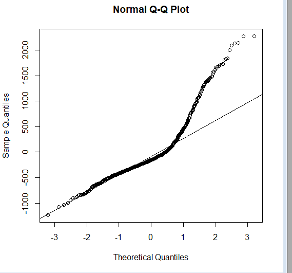
2. Add a Quantile-Quantile plot with a line that passes through, namely, the first and third quantiles.
hist(lmfit$residuals)
qqnorm(lmfit$residuals);qqline(lmfit$residuals)
So we know that the plot deviates from normal (represented by the straight line).
But that binary aspect of information is seldom enough. So, we should check the skewness and kurtosis to know the dispersion of the distribution.
First, we will compute the skewness; we will use a simple Galton's skewness formula.
## check on symmetry of distribution: skewness
summary<-summary(lmfit$residuals)
Q1<-summary[[2]]
Q2<-summary[[3]]
Q3<-summary[[5]]
skewness<-((Q1-Q2)+(Q3-Q2))/(Q3-Q1)
skewness
[1] 0.2665384
This quantifies which side the distribution has swayed to (the right side or left side, or if it's perfectly symmetrical or even).
Another measuring aspect is Kurtosis, which will tell you whether the distribution is assembled towards the center (+ve value) or away from it. (-ve value). Kurtosis is a metric that quantifies the possibility of outliers. A positive value indicates their existence.
 kurtosis(lmfit$residuals)
[1] 2.454145
Next, apart from visualizing the distribution of residual errors, I would also like to find whether the residuals are correlated with each other.
For a model to account for all the variation in observations, residual errors must occur at random and be uncorrelated with each other.
Durbin-Watson test allows you to test the independence of residuals from each other.
 dwt(lm(df$days.windspeed~df$days.atemp+df$days.hum),method='resample', alternative='two.sided')
 lag Autocorrelation D-W Statistic p-value
   1       0.2616792      1.475681       0
 Alternative hypothesis: rho != 0
The statistic value needs to be compared with lower and upper limits established by the critical values table, for a given degree of freedom and number of observations. In this case, the range is [1.55,1.67].
Since the computed D-W statistic falls below the lower value of this range, we reject the null hypothesis that residuals are not correlated. Hence, an alternate hypothesis that there may be a correlation between residuals comes into play.
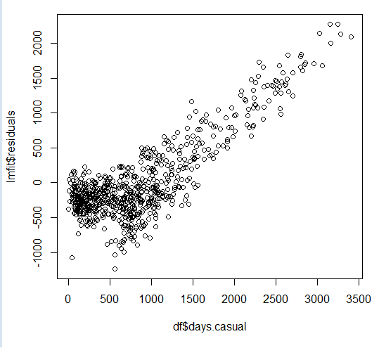
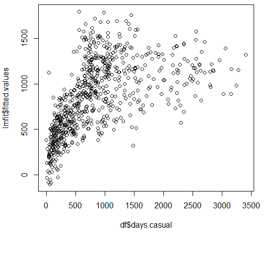
Visually, this can be learned by studying how a model falls short when attempting to capture increases in the value of the original Y value. As this happens, the residuals appear proportional to Y, as Y increases.

Compare this with plotting the fitted Y-hat value against Y. Where Y-hat values tend to fall behind, residuals appear to run along with Y and hence the past residual value appears to be a better predictor of present values as they appear to continue along a fixed slope value. And correlation shows up in Darwin-Watson tests that try to compare and contrast the sum square of the difference between residual errors and their previous value(s) in relation to the sum of a given residual error over all observations.
Correlation between residual errors is thus like failing on a cardio test. If your model simply can't keep up with the rapid changes in Y, it will start looking more and more like an exasperated runner, with the count of lost steps appearing to be more and more correlated than the actual steps taken by the runner.

Reconstructing the subconscious influence your linear regression model was under.
It is important to remember that when you run a linear regression on any given set of observations, each value of THE computed estimator (symbolically represented as Y-hat) of THE dependent variable (similarly represented as Y), is not only dependant on the current value (say, with the observation), but also dependant on each observation.
After all, your multiple linear regression models computed the coefficients for each contributing factor, only after minimizing the error between the actual value of dependent variable Y and the computed estimator of Y (Y-hat) on all observations.
Mathematically, this can be represented by the simple weighted average model as follows.
Yhat(j)= w1j*Y(1)+w2j*Y(2)+w3j*Y(3)+w4j*Y(4)+.....+wnj*Y(n);
where n is number of observations and j is one particular estimated value.
If you want to think of this in matrix notation, matrix W will have dimensions [n,n] where n is the number of observations. Similarly, Y represented in matrix form will have dimensions [n,1], and hence Y-hat[j] is represented as a matrix because it is obtained as a product of two matrices (W and Y) and will have the dimensions [n,1], which are the same as Y.
So, each value of the computed estimator can be expressed as a weighted average of all original Y values, indicating to what extent a given computed estimator is influenced by each original Y value.
To put it more simply, if I see a bunch of observations scattered here and there, and I have to somehow draw a straight line that passes through them with as little bias as possible, that is, if I must leave out some observations, I must do so equally on either side of this regression line.

But while doing so, I (or the regression program of choice) subconsciously estimated to what extent the slope of my regression line was influenced by each observation, irrespective of where it belonged.
All I am doing now is back calculating such influences in retrospective. How much weight did each observation carry in order to sway my regression line to either include them or exclude them?
The statistical term for weights is hat values because they bridge computed estimators and their original counterparts.
This is how it is computed in R.
modelmatrix<-model.matrix(lmfit)
hatvalues<-hat(modelmatrix)
First, we get the model in a matrix form. Then we compute the hat values.
Alternatively, you can use the following function to get a similar result.
hatvalues<-lm.influence(lmfit)$hatLet's think about the limits that can be imposed on each weight.
Obviously, the lowest possible value for the weight will be equal to the possibility when all original Y values contribute equally (since they must contribute something for the linear regression program to estimate the coefficients by working and optimizing through all observations).
In this case, the lower limit of its range will be 1/n, where n is the total number of observations. In any case, since n will always be +ve, the weights will always be <1.
Now try to sum up your hat values and you will see an interesting result...
sum(hatvalues)
[1] 4
They equal the number of contributing factors your linear regression model has considered for computation +1.
For instance, in the example dataset, we have three contributing factors, namely: temperature, humidity, and wind speed.
lmfit$coefficients
      (Intercept)     df$days.atemp       df$days.hum df$days.windspeed
         490.2956         2312.0163         -875.6955         -992.1411
Next, how do we find the most significant or influencing observations?
An elegant way will be to just:
segment hat values into quantiles .
apply the 95% criterion to filter the most aberrant values.
apply this filtering criterion back on observations.
R allows you to all of this in one step!
df[hatvalues>quantile(hatvalues,0.95),]We can get specific observations that satisfy this criterion.
   days.instant days.atemp days.hum days.windspeed days.casual
9              9  0.1161750 0.434167       0.361950          54
21            21  0.1578330 0.457083       0.353242          75
22            22  0.0790696 0.400000       0.171970          93
26            26  0.2036000 0.862500       0.293850          34
32            32  0.2345300 0.829565       0.053213          47
36            36  0.2430580 0.929167       0.161079         100
45            45  0.3983500 0.375833       0.417908         208
50            50  0.3914040 0.187917       0.507463         532
65            65  0.3662520 0.948261       0.343287         114
69            69  0.3856680 0.000000       0.261877          46
90            90  0.2575750 0.918333       0.217646         179
94            94  0.5429290 0.426250       0.385571         734
95            95  0.3983500 0.642083       0.388067         167
106          106  0.4254920 0.888333       0.340808         121
153          153  0.6439420 0.305000       0.292287         736
239          239  0.6355560 0.850000       0.375617         226
249          249  0.5152000 0.886957       0.343943         204
293          293  0.4665250 0.636250       0.422275         471
302          302  0.2279130 0.882500       0.351371          57
341          341  0.4002460 0.970417       0.266175          50
368          368  0.1262750 0.441250       0.365671          89
383          383  0.2752540 0.443333       0.415429         109
388          388  0.2430580 0.911250       0.110708         145
408          408  0.1016580 0.464583       0.409212          73
421          421  0.2556750 0.395833       0.421642         317
433          433  0.5246040 0.567500       0.441563         486
434          434  0.3970830 0.407083       0.414800         447
463          463  0.4261290 0.254167       0.274871        3252
465          465  0.4766380 0.317500       0.358196         905
478          478  0.3895040 0.835417       0.344546         120
543          543  0.5947040 0.373333       0.347642        1077
627          627  0.5650670 0.872500       0.357587         371
667          667  0.4677710 0.694583       0.398008         998
668          668  0.4394000 0.880000       0.358200           2
694          694  0.2487420 0.404583       0.376871         532
722          722  0.2361130 0.441250       0.407346         205
726          726  0.2203330 0.823333       0.316546           9
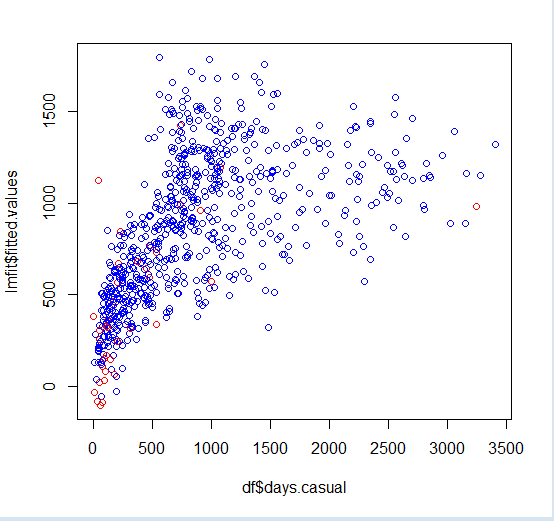
Finally, you can visualize them with color coding.
##visualize
plot(df$days.casual,lmfit$fitted.values,col=ifelse(hatvalues>quantile(hatvalues,0.95),'red','blue'))
That's it! This is a simple overview of doing residual analysis and why it's important.
The link to the data set and model assumptions are mentioned in the references section.
Opinions expressed by DZone contributors are their own.

Comments