Enhance User Experience With a Formatted Credit Card Input Field
This article shows how to implement a credit card input that automatically formats numbers into readable four-digit groups in Java and JS for an enhanced user experience.
 CORE
·
CORE
·
Join the DZone community and get the full member experience.
Join For FreeIn this article, I will guide you on how to create a credit card input by extending existing ZK components. Moreover, I'll apply a customized ZK JavaScript widget to format the card numbers in groups of four digits, improving readability and user experience. Additionally, we'll integrate a custom JavaScript widget to ensure that only numeric input is accepted.
This guide is ideal for web developers needing a dedicated input field for credit card information. Using the ZK UI Framework as an example, I’ll walk you through creating a well-structured, readable credit card input box.
Start With One Textbox
The ZK framework provides ready-to-use UI components including input controls, so the most straightforward approach is to use a single Textbox in a Zul page to accept a credit card number. It's as simple as:
<textbox type="tel" cols="16" maxlength="16"/>maxlength="16"ensures that users cannot enter more than 16 digits.cols="16"sets the textbox width to fit approximately 16 characters, ensuring the field visually matches the expected input length.
The result looks like this: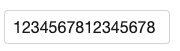 However, the downside is that all the numbers appear "crowded together," which makes them difficult to read.
Creating a Number Padding Box
To make the input more user-friendly, I can improve its readability by customizing the textbox to format the digits in groups of 4 digits. This is commonly seen in online payment forms where credit card numbers are displayed as 1234 5678 1234 5678.
I start by analyzing how the framework and the default textbox work. Each ZK component has 2 entities:
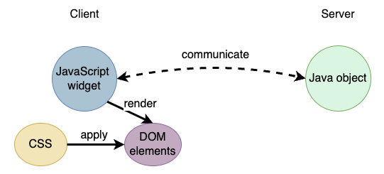
- Java object: Allows you to control a UI component with Java API
- JavaScript widget: Determines the client-side behavior
To group the numbers, I need to add custom behavior to the textbox by extending its JavaScript widget. The widget will automatically insert a space after every four digits as the user types and will remove any non-numeric characters.

Here's the logic and where you would need to insert it in TypeScript:
@zk.WrapClass('business.input.NumberPaddingBox')
// @ts-ignore
class NumberPaddingBox extends zul.inp.Textbox {
    /** default onInput event listener **/
    doInput_(event: zk.Event) {
        super.doInput_(event);
        this.removeNonNumericCharacters();
        this.addPaddingEach4Digits();
    }

    removeNonNumericCharacters() {
        // @ts-ignore
        this.getInputNode().value = this.getInputNode().value.replace(/\D/g, '');
    }

    addPaddingEach4Digits() {
        // @ts-ignore
        let value = this.getInputNode().value;
        // avoid exceeding credit card number length when pasting texts
        value = value.substring(0, 16);
        // @ts-ignore
        this.getInputNode().value = value.replace(/(\d{4})(?=\d)/g, '$1 ');
    }

    getZclass() {
        return 'z-textbox';
    }
}removeNonNumericCharacters(): Enforce to allow number characters only.doInput_(): ZK widgets provide a function naming convention to register an event listener:do[EVENT_NAME]_()is the default handler for the eventon[EVENT_NAME]
Apply Custom JavaScript Widget
Now that we have the formatting logic, it is simple to apply this customized JavaScript widget to a textbox:
<zk xmlns:w="client">
    <textbox type="tel" cols="19" maxlength="19"  w:use="business.input.NumberPaddingBox"/>
</zk>- By default, a tag attribute indicates a Java component's attribute. In this case, I want to specify an attribute for the JavaScript widget, so I have to use XML namespace.
Declare It as a ZK Component
This would apply the custom JavaScript widget to a specific <textbox>. For ease of use, it's beneficial to declare this setup as a ZK component. This way, developers can use it like a regular component without specifying a custom widget name. Additionally, you can set default attributes for the credit card input.
An example declaration in lang-addon.xml:
<language-addon>
    <addon-name>business-input</addon-name>
    <depends>zul</depends>
    <language-name>xul/html</language-name>
    <version>
        <zk-version>10.0.0</zk-version>
    </version>
    ...
    <component>
        <component-name>creditcardbox</component-name>
        <extends>textbox</extends>
        <widget-class>business.input.NumberPaddingBox</widget-class>
        <property>
            <property-name>type</property-name>
            <property-value>tel</property-value>
        </property>
        <property>
            <property-name>cols</property-name>
            <property-value>19</property-value>
        </property>
        <property>
            <property-name>maxlength</property-name>
            <property-value>19</property-value>
        </property>
</component><widget-class>declares the custom JavaScript widget.
Check lang-addon.xml specification.
After adding this declaration, I can use it as a normal component in a zul like this:
<creditcardbox/>Give It a Try
I’ve shown how small adjustments can significantly enhance the user experience of your web app. To give it a try, simply clone this ZK project from GitHub. Then, include the artifact in ZK Maven repository, specify <creditcardbox/> in a zul, follow the readme to start the server, and visit the zul with your browser.
Opinions expressed by DZone contributors are their own.
Comments