A Hands-On Guide to OpenTelemetry: Exploring Telemetry Data With Jaeger
This article continues the journey by learning how to effectively use visualized instrumentation telemetry data in Jaeger on your observability journey.
Join the DZone community and get the full member experience.
Join For FreeAre you ready to start your journey on the road to collecting telemetry data from your applications? Great observability begins with great instrumentation!
In this series, you'll explore how to adopt OpenTelemetry (OTel) and how to instrument an application to collect tracing telemetry. You'll learn how to leverage out-of-the-box automatic instrumentation tools and understand when it's necessary to explore more advanced manual instrumentation for your applications. By the end of this series, you'll have an understanding of how telemetry travels from your applications to the OpenTelemetry Collector, and be ready to bring OpenTelemetry to your future projects. Everything discussed here is supported by a hands-on, self-paced workshop authored by Paige Cruz.
The previous article programmatically instrumented and configured an application to direct all telemetry data to a Jaeger instance for visual insights. In this article we'll zoom into the usage of Jaeger to help developers when visually exploring their telemetry data.
It is assumed that you followed the previous articles in setting up both OpenTelemetry and the example Python application project, but if not, go back and see the previous articles as it's not covered here.
Exploring Jaeger
While we installed Jaeger in the previous article, we did not dive into its background or details. Jaeger is an open-source distributed tracing system and graduated CNCF project. It supports multiple telemetry storage backends and provides a web-based front end. It natively supports receiving OTLP formatted telemetry as we are using it in our examples with in-memory storage (default).
Starting from the point we left off in the previous article, we had our Python application, hello-otel, running, which our developer had programmed in our trace instrumentation. We had set up our trace exporter and used the OTLPSpanExporter to push our telemetry data in an OpenTelemetry Protocol (OTLP) format.
Next, in our pod configuration, we added a Jaeger all-in-one instance that is designed for use for testing in development environments. It includes a collector, query, and UI components that we spun up to explore. From that point, we opened a browser and viewed the Jaeger UI at http://localhost:16686, which displayed the Gopher Detective as shown below: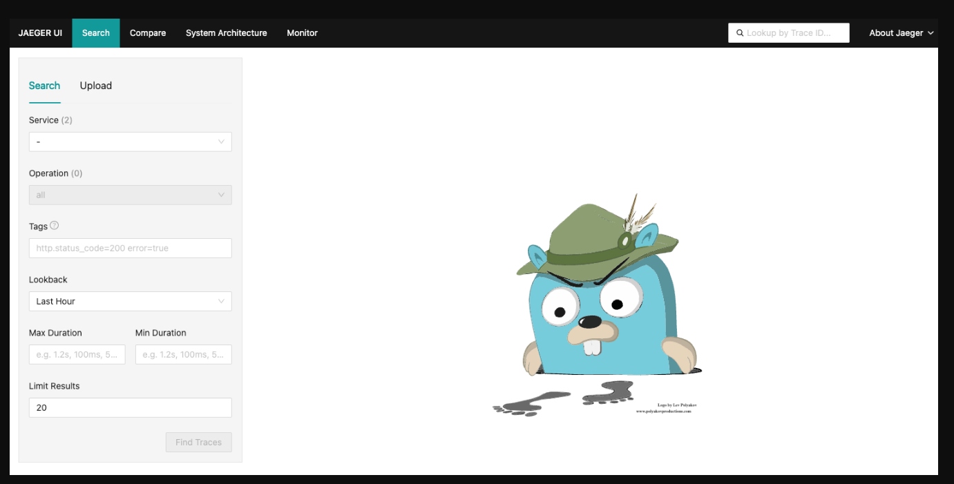 We then generate telemetry data (tracing spans) by accessing our application and make several requests to the http://localhost:8001/doggo endpoint.
Searching Through Traces
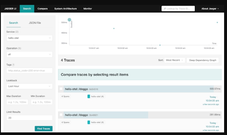
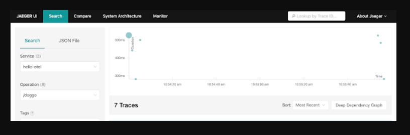
Back in our Jaeger UI, we can select hello-otel from the service dropdown menu and note that this Traces landing page provides us with a search panel. This is where you can filter to look at traces with a specific service, a particular operation, relevant tags (e.g., status http.status_code=500), duration, or any combination of the above:
The traces matching our search query above populate a scatter plot and a table. The scatter plot is a quick way to visually identify traces that look out of the ordinary, and by clicking on the bubble, you'll be taken straight to the corresponding trace waterfall. The table view is helpful for sorting to find specific traces by duration, amount of spans, or recency.
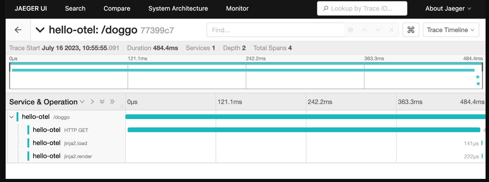
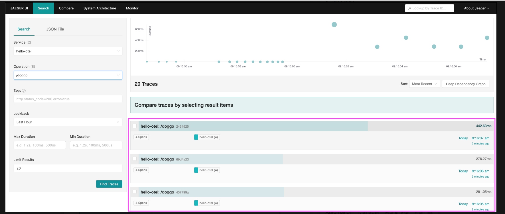
Traces can feature hundreds of services and thousands of spans, so the default view is to have all span details collapsed providing an overview of the request results with quick stats about the trace like duration and number of services. From this view you can see what spans are taking up the most time relative to the overall request duration:
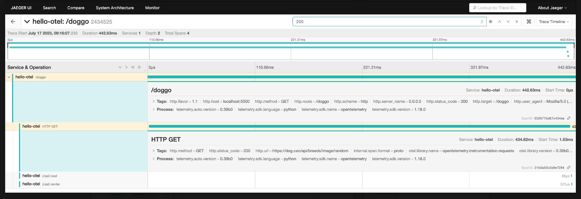
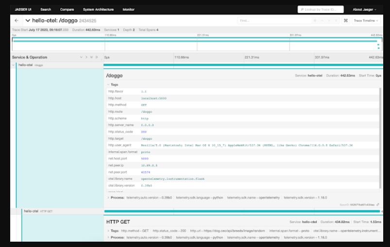
The search bar here allows you to search within the trace for spans with properties like GET, 200, etc. Clicking the target opens up the matching spans as shown:
Let's look closer at the visual options for exploring our traces.
Scatter Plots and Graphs
The scatter plot is a quick way to visually identify traces that look out of the ordinary and by clicking on the bubble, you'll be taken straight to the corresponding trace waterfall. The table view is helpful for sorting to find specific traces by duration, amount of spans, or recency:
Clicking on a trace name takes you to its trace waterfall page, and selecting two or more checkboxes lets you compare the selected traces with each other:
Once we've zeroed in on an interesting span, clicking the name opens up more details like the associated tags and process information. This is where your manually instrumented metadata becomes a powerful way to inspect your system behavior:
Special Visualizations
Now, you might have noticed there is a drop-down next to the trace search bar. Clicking on this reveals a specific list of visualizations that are available, including a few we will detail below.
- Trace graph
- Trace spans table
- Trace flamegraph
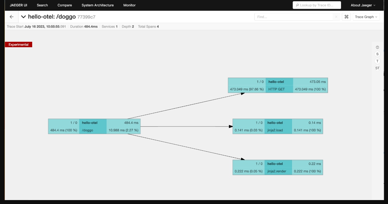
The trace graph view shows the trace with spans groups into node blocks with options to color the nodes uniquely by service, by time to highlight the critical path, or self time which shows the longest span durations not waiting on children:
The trace spans table shows a table with duration, operation, and service name per span in the trace. The option to search by service or operation lets you zoom in on specific interactions. Clicking a span ID takes you to the trace detail view with that span highlighted:
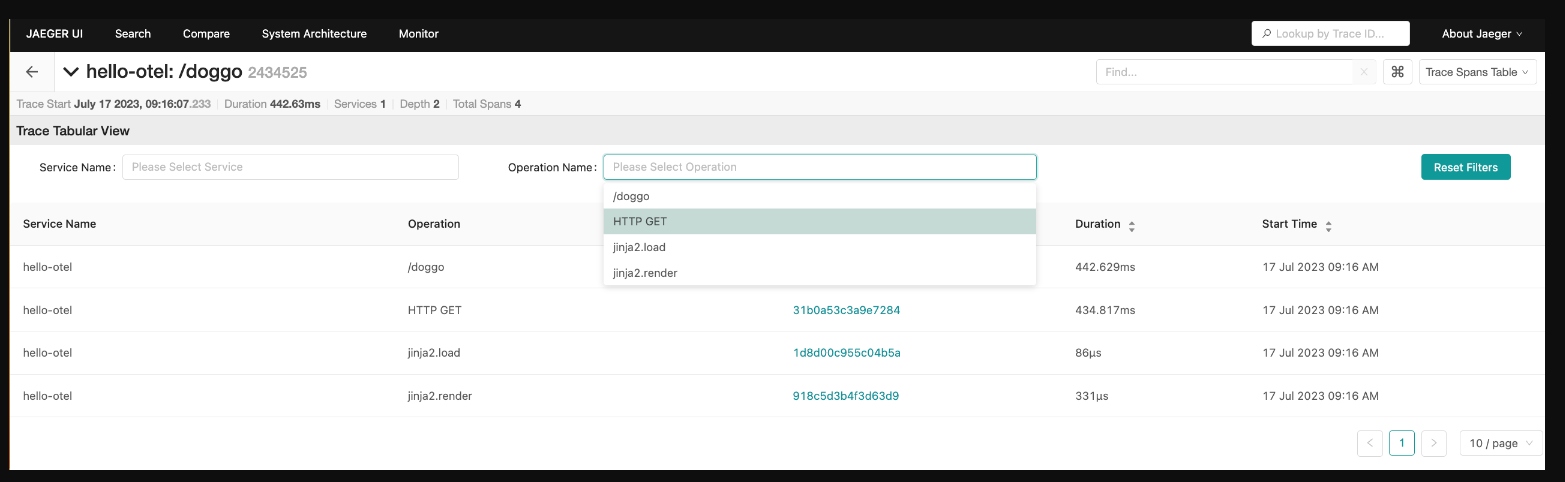
A traces flamegraph view is another way to visualize the trace waterfall. As you explore the spans, you can right-click to collapse unnecessary details, copy the function name to use in another query, or highlight similar spans within the trace:
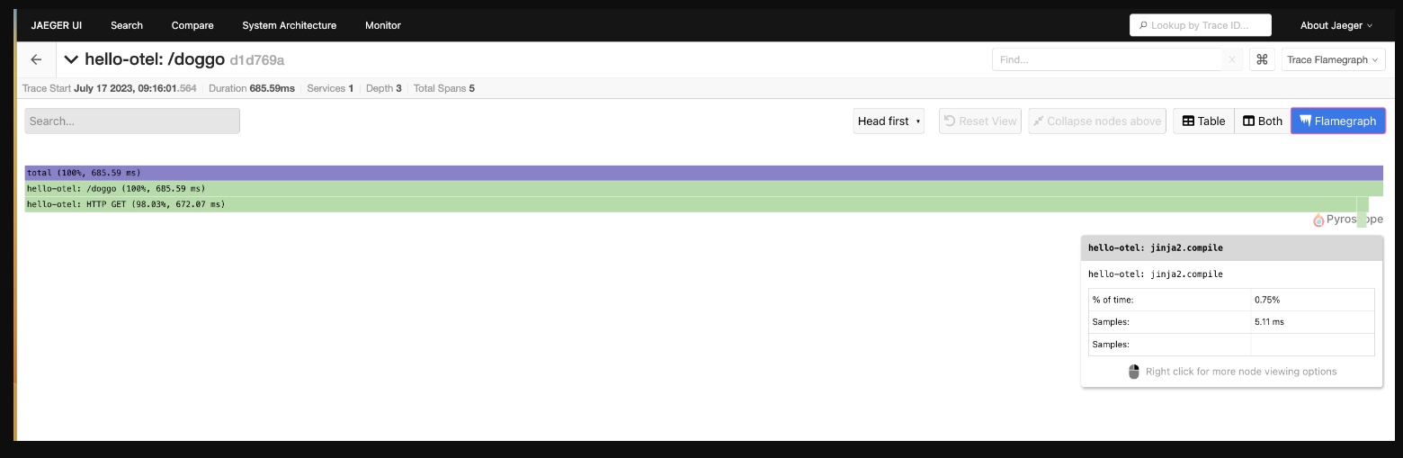
Now let's try a more advanced use case where we compare several traces for change over time.
Advanced Searches
When new bugs stick their head up or unexpected behavior happens in your systems, your investigation typically is trying to answer questions like:
- What changed?
- How does this compare to normal?
This is where trace comparison shines. Use this to compare two or more traces to quickly identify which spans are present or occur more frequently in only one of the traces. Below we are starting to ask ourselves, why did one request to our /doggo application take 685ms and another only 281ms?
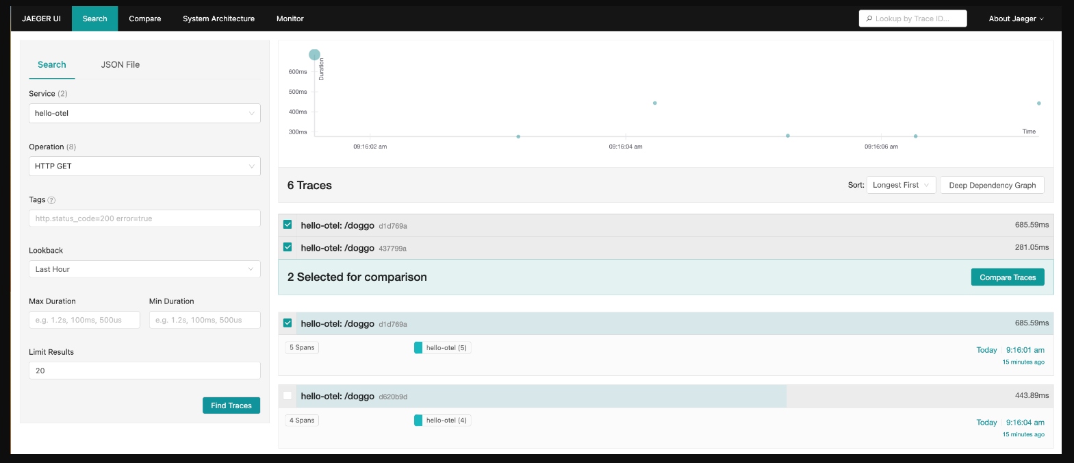
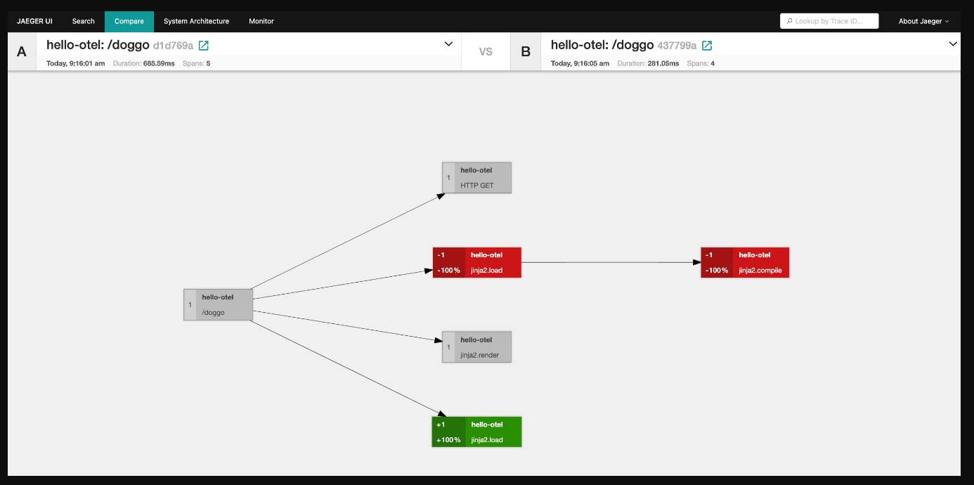
By selecting the two traces and clicking on compare traces, we can see a visual graph representation with color coding modeled after code diffs:
- Grey - Nodes in both Trace A and Trace B
- Red - Nodes only in Trace A
- Green - For nodes only in Trace B
As we have discovered, trace data powers both high-level insights into relationships between services and low-level insights. It would be overwhelming to show all of that information in one view and it's the ability to jump between trace comparisons, span queries, individual attributes on method calls, and topology maps that make trace data flexible and powerful.
These examples use code from a Python application that you can explore in the provided hands-on workshop.
What's Next?
This article detailed a lot of the usage of Jaeger to help developers when visually exploring their telemetry data. In our next article, we will dive into manually instrumenting metadata in our tracing spans for our application.
Published at DZone with permission of Eric D. Schabell. See the original article here.
Opinions expressed by DZone contributors are their own.
Comments