From Static to Interactive: Exploring Python's Finest Data Visualization Tools
In this article, take a detailed look at three popular Python libraries for data visualization: Matplotlib, Seaborn, and Plotly.
Join the DZone community and get the full member experience.
Join For FreeData visualization plays a fundamental role in understanding and communicating the insights we derive from our data when we analyze them.
When it comes to data analysis, Python is one of the most used programming languages for a simple reason: it’s versatile and has several libraries for creating plots, giving us the possibility to choose the one that best suits our needs.
In this article, we’ll talk about three popular Pythonic data visualization libraries: Matplotlib, Seaborn, and Plotly. We’ll explore their characteristics, emphasize their differences, and show practical code examples on how to use them.
Matplotlib
Matplotlib is one of the oldest and most widely used data visualization libraries. It provides a wide range of methods for creating plots, giving us the possibility to visualize data ranging from scatterplots to complicated visualizations.
It’s an extremely flexible library, allowing us to customize every aspect of our graphs. Also, despite having a low-level interface, Matplotlib is the foundation for other visualization libraries, like Seaborn.
Anyway, although Matplotlib gives us complete control over our charts, its Achilles’ heel is that it may take a lot of code to produce the results we need. In particular, if we’re interested in presenting aesthetically beautiful plots.
Examples Using Matplotlib
Let’s see some plots we can create with Matplotlib, with code examples.
Scatterplots With Matplotlib
One of the very basic graphs we may be interested in when analyzing data is a scatterplot because this may give us a sense of how the data is distributed.
To create a scatterplot with Matplotlib we can use the method scatter(). Let’s see how to use it:
import matplotlib.pyplot as plt
import random

# Generate data
num_points = 50
x = [random.random() for _ in range(num_points)]
y = [random.random() for _ in range(num_points)]

# Create a scatter plot
plt.scatter(x, y)

# Labeling the plot
plt.xlabel('X-axis') # x-axis label
plt.ylabel('Y-axis') # y-axis label
plt.title('Scatter Plot with Random Data') # plot title

# Show the plot
plt.show()
And here’s the result: 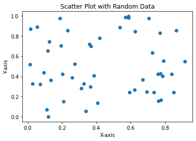
As we can see, we can fully customize our plots by adding:
- X and y axes labels with the methods
plt.xlabel()andplt.ylabel() - A title to the plot with the method
plt.title()
Lineplots With Matplotlib
Another type of plot that is very used is the “line plot” which, as the words say, creates a line plot of the variables.
Here’s how we can create one:
import matplotlib.pyplot as plt

# Create variables
x = [1, 2, 3, 4, 5]
y = [2, 4, 6, 8, 10]

# Create the line plot
plt.plot(x, y, color='gold', linewidth=2)

# Label the plot
plt.xlabel('X-axis')
plt.ylabel('Y-axis')
plt.title('Line Plot')

# Show grid
plt.grid(True)

# Show plot
plt.show()
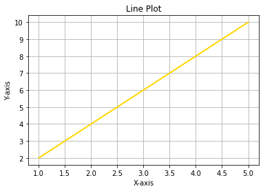
So, with plt.plot(x, y, color='gold', linewidth=2) we can create a line plot displaying a line:
- Colored in golden, passing the parameter
color='gold' - With a width of 2 points, passing the parameter
linewidth=2
In these cases, it may also be useful to add a grid by typing plt.grid(True) to improve our visualization experience.
Barplots With Matplotlib
Barplots are another popular kind of plot we may need as they are useful to compare values.
To plot a barplot, we can use the method plt.bar() as follows:
import matplotlib.pyplot as plt

# Create values and categories to plot
categories = ['A', 'B', 'C', 'D']
values = [25, 50, 75, 100]

# Create the bar plot
plt.bar(categories, values, color='blue', alpha=0.75)

# Label the plot
plt.xlabel('Categories')
plt.ylabel('Values')
plt.title('Bar Plot')

# Show the plot
plt.show()
And we get:
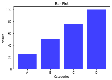
So even here we have full control of the parameters, specifying the color of the bars and their alpha parameter (this is a parameter that, somehow, manages how dark the color we’ve chosen should be).
Comparing Variables With Matplotlib
A useful and interesting feature of Matplotlib is that we can use it to compare variables. For example, suppose we want to compare a sin() and cos() functions:
import matplotlib.pyplot as plt
import numpy as np

# Generate data
x = np.linspace(0, 10, 100)
y1 = np.sin(x) # sin function
y2 = np.cos(x) # cos function

# Create the plot
plt.plot(x, y1, label='Sin(x)')
plt.plot(x, y2, label='Cos(x)')

# Set labels and title
plt.xlabel('X-axis')
plt.ylabel('Y-axis')
plt.title('Plot of Sin(x) and Cos(x)')

# Add legend
plt.legend()

# Display the plot
plt.show()
And we get:
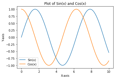
So, here we can also see that we can even add a legend for a better understanding of the plot with the method plt.legend(), improving our visualization experience.
Plotting Linear Regression Lines With Matplotlib
Another interesting feature of Matplotlib is the possibility to use it for “machine learning purposes” such as, for example, displaying a linear regression line. Let’s see how to do so:
import matplotlib.pyplot as plt
import numpy as np

# Generate linearly dependent data
np.random.seed(42)
x = np.linspace(0, 10, 50)
y = 2 * x + np.random.normal(0, 1, 50)

# Perform linear regression
coefficients = np.polyfit(x, y, 1)
m, b = coefficients

# Create the plot
plt.scatter(x, y, color='blue', label='Data')
plt.plot(x, m * x + b, color='red', label='Linear Regression')

# Set labels and title
plt.xlabel('X-axis')
plt.ylabel('Y-axis')
plt.title('Linear Regression Plot')
# Add a legend
plt.legend()

# Display the plot
plt.show()
And we get:
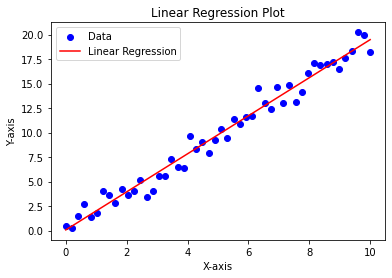
So, here we’ve created linearly dependent data, fitted with a line with np.polyfit(), and displayed the data and the fitted regression line.
Seaborn
Seaborn is a library built on top of Matplotlib which has a high-level interface that is specialized in offering us beautiful statistical visualizations. It simplifies the process of creating complex plots by providing ready-to-use functions for tasks like scatter plots, bar plots, heatmaps, and many more.
Seaborn focuses on enhancing the visual appeal and readability of plots, making it the perfect choice for exploratory data analysis and presenting results.
Examples Using Seaborn
Let’s see some code examples using Seaborn. We’ll also make some comparisons with the results obtained with Matplotlib, where possible.
Scatterplots With Seaborn
Let’s create a scatterplot with Seaborn and compare it with the one we’ve created in Matplotlib:
import seaborn as sns
import matplotlib.pyplot as plt
import random

# Generate random data
num_points = 100
x = [random.random() for _ in range(num_points)]
y = [random.random() for _ in range(num_points)]

# Create scatterplot
sns.scatterplot(x, y)

# Set labels and title
plt.xlabel('X-axis')
plt.ylabel('Y-axis')
plt.title('Scatterplot with Random Data')

# Show the plot
plt.show()
And we get:
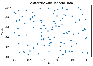
The first thing we can notice is the fact that, as we’ve said, Seaborn is built on top of Matplotlib. In fact, as the code shows, we used some Matplotlib code to create the plot. Also, the graphical part is not too different from the one we obtained in Matplotlib. So, let’s see some other possibilities.
Barplots With Seaborn
Let’s create a barplot with Seaborn:
import seaborn as sns
import matplotlib.pyplot as plt

# Sample data
categories = ['A', 'B', 'C', 'D']
values = [10, 25, 15, 30]

# Set a shiny color palette
shiny_colors = ['#FFC300', '#FF5733', '#C70039', '#900C3F']

# Create a barplot with shiny colors
sns.barplot(x=categories, y=values, palette=shiny_colors)

# Set labels and title
plt.xlabel('Categories')
plt.ylabel('Values')
plt.title('Shiny Barplot')

# Show the plot
plt.show()
And we get:

So, here we’ve seen another customization. In fact, we’ve declared the colors we wanted with the variable shiny_colors and passed it to the method sns.barplot() in the palette parameter to apply it.
Plotting Heatmaps With Seaborn
Another typical plot we can create with Seaborn is a heatmap, which is a representation of data where the values are shown within a matrix as colors. This kind of visualization typically allows us to explore patterns, correlations, and distributions in the data.
Here’s how we can create one, using the “flights” dataset provided by Seaborn itself:
import seaborn as sns

# Load the “flights” dataset
flights = sns.load_dataset("flights")
flights = flights.pivot("month", "year", "passengers")

# Create the heatmap
sns.heatmap(flights, annot=True, fmt="d", cmap="YlGnBu")

# Show the plot
plt.show()
And we get:
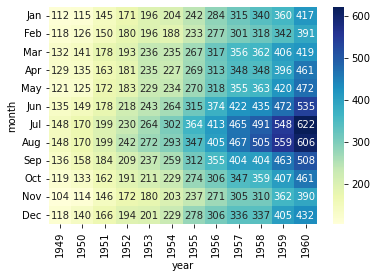
So, here we can see how a heatmap helps us better visualize the data, giving us the possibility to immediately find the highest values (606 and 622) and to see to which features they are related (1960, July, and August).
Showing Seaborn Superpowers
The superpowers of Seaborn are related to the fact that is built on top of Matplotlib, so we can achieve beautiful results with low code.
Also, Seaborn has a vast tutorial section on its website where we can see its superpowers. It’s also equipped with some datasets so that we can plot and analyze them, to improve our skills with it.
For example, suppose we want to analyze the data related to the tips left to waiters at the restaurant. We can compare the tips at dinner and at lunch, and we can see if the customers were smokers or not.
The dataset called “Tips” is provided by Seaborn, and it can be used to make practice with it. Here’s how we can do so. (Note: the following code is taken from the Seaborn tutorials web page, see here for reference):
# Import seaborn
import seaborn as sns

# Apply the default theme
sns.set_theme()

# Load the “tips” dataset
tips = sns.load_dataset("tips")

# Create the visualization
sns.relplot(
    data=tips,
    x="total_bill", y="tip", col="time",
    hue="smoker", style="smoker", size="size",
)
And we get:
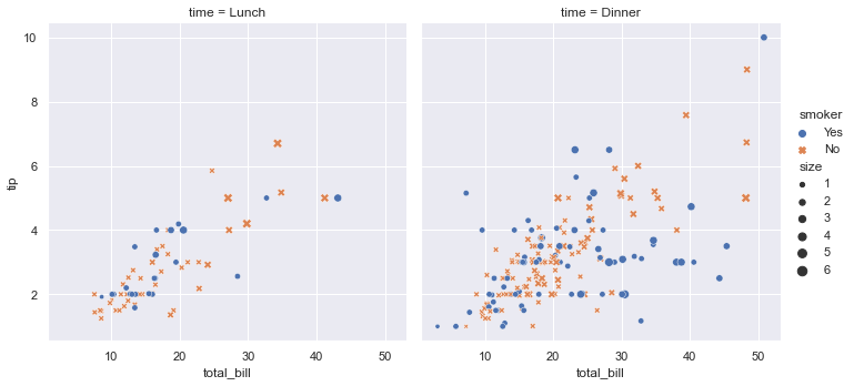
So, with just one line of code, we get a beautiful and meaningful plot that shows us exactly what we wanted.
Plotly
Plotly is a versatile library that provides interactive visualizations. It offers a range of chart types, including line charts, scatter plots, bar plots, and many more.
Plotly excels in creating interactive plots with hover effects, zooming, and panning capabilities, making it ideal for building interactive dashboards and web applications.
Additionally, Plotly provides an online platform for sharing and collaborating on visualizations.
Examples Using Plotly
Let’s make some examples of how to use Plotly. The power of this library is to create interactive plots.
But first of all, you may need to install Plotly. You can do it via the terminal like so:
$ pip install plotlyScatterplots With Plotly
First of all, let’s create a scatterplot with Plotly using the module plotly.graph_objects:
import plotly.graph_objects as go
import numpy as np

# Generate random data
np.random.seed(0)
x = np.random.rand(100)
y = np.random.rand(100)

# Create a scatter plot
fig = go.Figure(data=go.Scatter(x=x, y=y, mode='markers'))

# Add labels and title
fig.update_layout(
    title='Scatter with random data',
    xaxis_title='X-axis',
    yaxis_title='Y-axis'
)

# Show the plot
fig.show()
And we get:
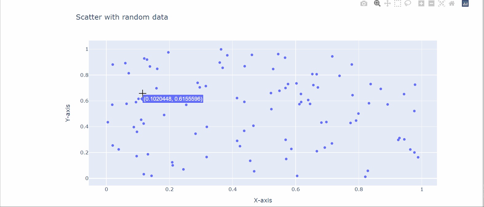
The first thing we can notice is that for labeling the axes and the title, Plotly requires just one line of code, as opposed to Matplotlib.
Also, we can see how graphically clear is the plot, providing the grid without explicitly coding it, as opposed to Matplotlib and Seaborn.
We can, then, be pleased by its interactivity as it:
- Shows us the values of x and y when we move the cursor on a spot.
- Provides some features in the top-right corner to zoom, save the image, and perform other actions.
Bubble Plots With Plotly
A practical case where we may need an interactive plot more than in other types of plots is bubble plots, especially if bubbles intersect.
To make such a plot will use the module plotly.express provided by the Plotly library like so:
import plotly.express as px
import numpy as np

# Generate random data
np.random.seed(0)
x = np.random.rand(50)
y = np.random.rand(50)
sizes = np.random.rand(50) * 30  # Random sizes for the bubbles

# Create a bubble plot using Plotly express
fig = px.scatter(x=x, y=y, size=sizes, color=sizes,
                 size_max=30, color_continuous_scale='Viridis')

# Add labels and title
fig.update_layout(
    title='Bubble Plot Example',
    xaxis_title='X-axis',
    yaxis_title='Y-axis'
)

# Show the plot
fig.show()
And we get:
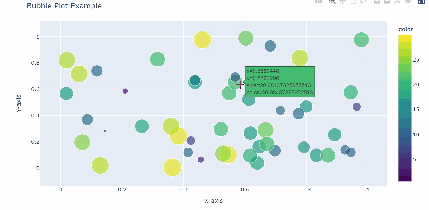
So, in such cases, we can really appreciate the interactive features provided by Plotly.
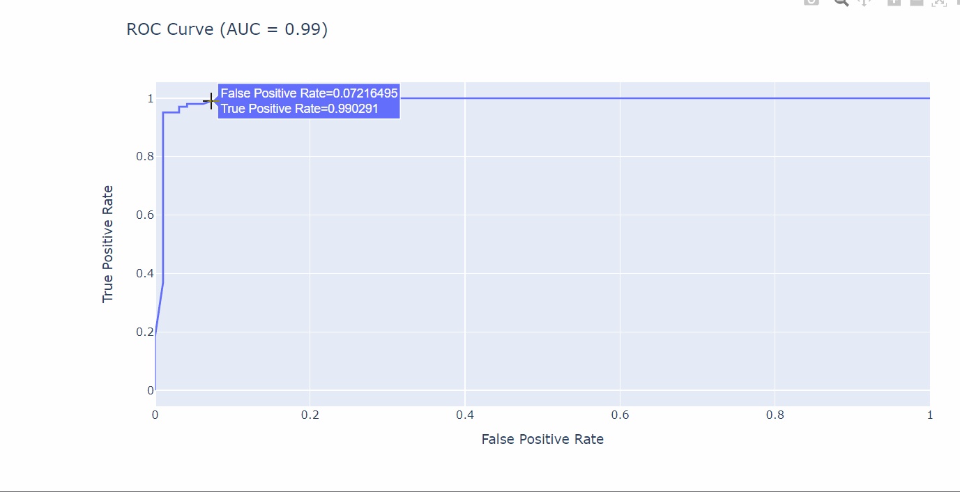
Interactive Plots for Machine Learning With Plotly
If you’re familiar with machine learning, you may benefit from the interactivity that Plotly gives us in machine learning plots.
For example, we can fit the train set with a Random Forest classifier and create an interactive AUC/ROC curve using Plotly. Let’s see how:
import numpy as np
import pandas as pd
from sklearn.datasets import make_classification
from sklearn.model_selection import train_test_split
from sklearn.ensemble import RandomForestClassifier
from sklearn.preprocessing import StandardScaler
from sklearn.metrics import roc_curve, roc_auc_score
import plotly.express as px

# Generate a dataset for classification
X, y = make_classification(n_samples=1000, n_features=10, n_informative=5, random_state=0)

# Scale the features using StandardScaler
scaler = StandardScaler()
X_scaled = scaler.fit_transform(X)

# Split the data into train and test sets
X_train, X_test, y_train, y_test = train_test_split(X_scaled, y, test_size=0.2, random_state=0)

# Fit train set with a Random Forest Classifier
rf_classifier = RandomForestClassifier(random_state=0)
rf_classifier.fit(X_train, y_train)

# Get the predicted probabilities for the positive class (class 1)
y_pred_proba = rf_classifier.predict_proba(X_test)[:, 1]

# Compute the ROC curve values
fpr, tpr, thresholds = roc_curve(y_test, y_pred_proba)

# Compute the AUC score
auc_score = roc_auc_score(y_test, y_pred_proba)

# Create an ROC curve using Plotly Express
roc_df = pd.DataFrame({'False Positive Rate': fpr, 'True Positive Rate': tpr})
fig = px.line(roc_df, x='False Positive Rate', y='True Positive Rate', title=f'ROC Curve (AUC = {auc_score:.2f})')

# Show plot
fig.show()
And we get:
Conclusions
In this article, we’ve seen an overview of some plots we can create with the three most used Python libraries for graphical representations: Matplotlib, Seaborn, and Plotly.
Although there is no absolute right or wrong, we can synthesize their usage like so:
- Matplolib generally requires a lot of code to create aesthetically beautiful plots, so it’s more suitable in cases where we need fast and raw plots that give a sense of the data and its distribution.
- Seaborn provides beautiful aesthetically statistical plots, so it’s particularly suitable for the data exploration phase. Also, it requires little code to create complex visualization, so it can be suitable even to present data.
- Plotly creates interactive plots with little lines of code, so it’s particularly suitable for presenting data, or for the exploratory phase where its interactivity feature helps us better understand the data. For example, in the case of a bubble plot if the bubbles intersect themselves.
Opinions expressed by DZone contributors are their own.
Comments