DZone
Thanks for visiting DZone today,
Edit Profile
  • Manage Email Subscriptions
  • How to Post to DZone
  • Article Submission Guidelines
Sign Out View Profile
  • Post an Article
  • Manage My Drafts
Over 2 million developers have joined DZone.
Log In / Join
Refcards Trend Reports
Events Video Library
Refcards
Trend Reports

Events

View Events Video Library

Related

  • Enhancing Business Decision-Making Through Advanced Data Visualization Techniques
  • Linting Excellence: How Black, isort, and Ruff Elevate Python Code Quality
  • Norm of a One-Dimensional Tensor in Python Libraries
  • Improving Sentiment Score Accuracy With FinBERT and Embracing SOLID Principles

Trending

  • How to Implement AI Agents in Rails With RubyLLM
  • Deployment Lessons You Only Learn the Hard Way
  • Best Practices for Evaluating LLMs and RAG Systems
  • The Missing `bandit` for AI Agents: How I Built a Static Analyzer for Prompt Injection
  1. DZone
  2. Data Engineering
  3. Data
  4. Mystery Curve

Mystery Curve

By 
John Cook user avatar
John Cook
·
Jun. 28, 15 · Interview
Likes (1)
Comment
Save
Tweet
Share
4.4K Views

Join the DZone community and get the full member experience.

Join For Free

this afternoon i got a review copy of the book creating symmetry: the artful mathematics of wallpaper patterns . here’s a striking curves from near the beginning of the book, one that the author calls the “mystery curve.”

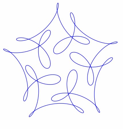
the curve is the plot of exp( it ) – exp(6 it )/2 + i exp(-14 it )/3 with t running from 0 to 2π.

here’s python code to draw the curve.

import matplotlib.pyplot as plt
from numpy import pi, exp, real, imag, linspace
 
def f(t):
    return exp(1j*t) - exp(6j*t)/2 + 1j*exp(-14j*t)/3
 
t = linspace(0, 2*pi, 1000)
 
plt.plot(real(f(t)), imag(f(t)))
 
# these two lines make the aspect ratio square
fig = plt.gcf()
fig.gca().set_aspect('equal')
 
plt.show()

maybe there’s a more direct way to plot curves in the complex plane rather than taking real and imaginary parts.

updated code for the aspect ratio per janne’s suggestion in the comments.

related posts :

several people have been making fun visualizations that generalize the example above.

brent yorgey has written two posts, one choosing frequencies randomly and another that animates the path of a particle along the curve and shows how the frequency components each contribute to the motion.

mike croucher developed a jupyter notebook that lets you vary the frequency components with sliders.

john golden created visualizations in geogerba here and here .

jennifer silverman showed how these curves are related to decorative patterns that popular in the 1960’s. she also created a coloring book and a video .

dan anderson accused me of nerd sniping him and created this visualization .

jupyter notebook code style Visualization (graphics) Book POST (HTTP) Python (language) Aspect (computer programming) NERD (sabermetrics)

Opinions expressed by DZone contributors are their own.

Related

  • Enhancing Business Decision-Making Through Advanced Data Visualization Techniques
  • Linting Excellence: How Black, isort, and Ruff Elevate Python Code Quality
  • Norm of a One-Dimensional Tensor in Python Libraries
  • Improving Sentiment Score Accuracy With FinBERT and Embracing SOLID Principles

Partner Resources

×

Comments

The likes didn't load as expected. Please refresh the page and try again.

  • RSS
  • X
  • Facebook

ABOUT US

  • About DZone
  • Support and feedback
  • Community research

ADVERTISE

  • Advertise with DZone

CONTRIBUTE ON DZONE

  • Article Submission Guidelines
  • Become a Contributor
  • Core Program
  • Visit the Writers' Zone

LEGAL

  • Terms of Service
  • Privacy Policy

CONTACT US

  • 3343 Perimeter Hill Drive
  • Suite 215
  • Nashville, TN 37211
  • [email protected]

Let's be friends:

  • RSS
  • X
  • Facebook