Open Dashboard and Visualization Workshop: Advanced Perses Dashboard
Continue hands-on with the Perses project and build out the basic dashboard by adding a couple of new gauges and a row for several new time series charts.
Join the DZone community and get the full member experience.
Join For FreeBack in December of 2022, I started a series taking you on a tour of the Perses project. These articles covered this fairly new open dashboard and visualization project targeting cloud-native environments. I used a getting started workshop to guide you through this series and to provide a hands-on experience for those new to visualizing observability data.
In a previous article, you began creating your first-ever basic Perses dashboard and I provided links to the actual online workshop content.
In this article, you'll expand on the previous basic dashboard and continue visualizing data resulting in a more advanced dashboard.
Let's keep the dashboard building rolling, shall we?
In this lab you're going to continue hands-on with this project and build out the basic dashboard by adding a couple of new gauges, adding a second row for several new time series charts. It's deep into the more advanced panels and layout tweaks you're going to learn along the way.
You can find the free workshop here online:
Now let's get after it and start expanding our first attempt into a more advanced Perses dashboard. Note this article is only a short summary, so please see the complete lab found online as lab 6 here to work through creating this advanced dashboard yourself:
The following is a short overview of what is in this specific lab of the Perses workshop.
An Advanced Dashboard
This lab will leverage the pre-installed WorkshopProject dashboard called MyFirstDashboard and build off of the work done in previous labs. If you are not able to, or interested in, completing the previous labs we offer a shortcut using the Perses command line tooling and API to get you started. Either way, you should be starting this lab with a dashboard looking like this:
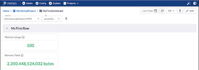
The first part of the advanced dashboard lab is to expand the first row with two new gauge panels that display the same information but in a more visual way. The first gauge is to track the total memory available and looks like this:

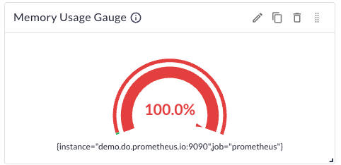
Its companion gauge is going to track the total memory usage for your systems and is created just like the previous one using the pop-up UI editors for these panel components, where you can add details, insert a PromQL query, and adjust settings such as color and displayed numerical types:
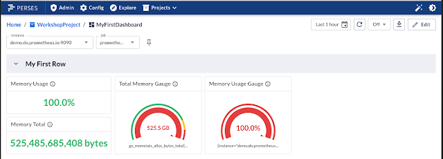
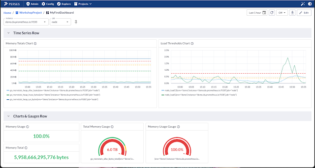
After working through these two new gauges, adding them to the dashboard, and configuring their size and layout positions relative to the existing panels, your dashboard project will look like this:
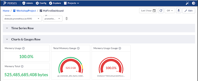
Before moving on, you'll rename this row to reflect the information panels, getting this ready for your on-call teammates who will be using this dashboard as a landing page should any alerts go off. You'll also add a new row for some more advanced queries to be represented as time series charts tracking system loads on the various nodes. The dashboard will end up looking like this at that point:
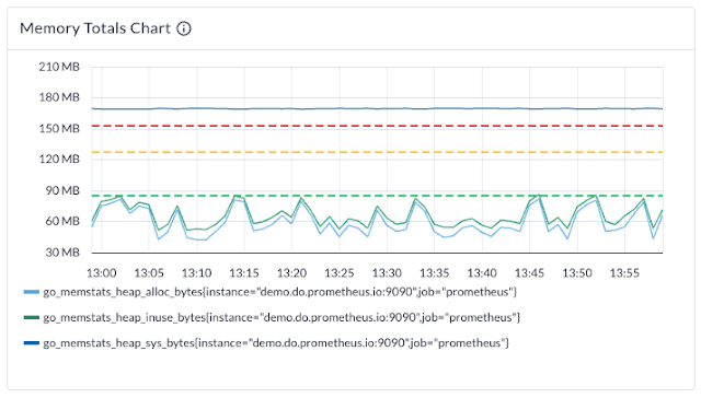
Now using the same memory queries that have been targeting the Prometheus job, you are going to create your first time series chart laying out the measured memory usage over time (time series data) with the same UI featuring the ability to add details, multiple queries as you need one per line shown, and settings adjustments as needed to add thresholds. When done, it's going to look like this:
Before you can continue to the last time series chart which will be tracking the load on each of the nodes specified in your system, you'll need to adjust the instance and job variables using the drop-down variable lists you created in earlier labs:

Up to now, you've been using the instance where you found all of the data collected for the Prometheus job; but with the variables now pointing to the node job, you see that all the previously created panels continue to work (this instance includes all of the same data, plus more collected on the nodes). Now you can add the time series chart for tracking the load over time on two of your nodes and produce this:
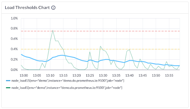
The threshold for loads is the most important part of this when your on-call teammates get called up: they will want to see what the load has been and when it passes certain peak thresholds as part of their triaging. The final results of your advanced dashboard look like this:
There are a few other things you explore in this lab that are not touched on here, but this lab leaves you closer to a fully functional dashboard for your on-call teammates with Perses.
More To Come
Next up, I'll continue working with you through the Perses project and expanding on the above-created advanced dashboard by adding even more functionality to ensure you have an advanced++ end result. Stay tuned for more insights into real practical experience as my cloud native o11y journey continues.
Published at DZone with permission of Eric D. Schabell, DZone MVB. See the original article here.
Opinions expressed by DZone contributors are their own.

Comments