Autocorrelation in Time Series Data
Explore autocorrelation in time series data and see why it matters.
Join the DZone community and get the full member experience.
Join For FreeWhy Time Series Data Is Unique
A time series is a series of data points indexed in time. The fact that time series data is ordered makes it unique in the data space because it often displays serial dependence. Serial dependence occurs when the value of a datapoint at one time is statistically dependent on another datapoint in another time. However, this attribute of time series data violates one of the fundamental assumptions of many statistical analyses — that data is statistically independent.
What Is Autocorrelation?
Autocorrelation is a type of serial dependence. Specifically, autocorrelation is when a time series is linearly related to a lagged version of itself. By contrast, correlation is simply when two independent variables are linearly related.
Why Autocorrelation Matters
Often, one of the first steps in any data analysis is performing regression analysis. However, one of the assumptions of regression analysis is that the data has no autocorrelation. This can be frustrating because if you try to do a regression analysis on data with autocorrelation, then your analysis will be misleading.
Additionally, some time series forecasting methods (specifically regression modeling) rely on the assumption that there isn’t any autocorrelation in the residuals (the difference between the fitted model and the data). People often use the residuals to assess whether their model is a good fit while ignoring that assumption that the residuals have no autocorrelation (or that the errors are independent and identically distributed or i.i.d). This mistake can mislead people into believing that their model is a good fit when in fact it isn’t. I highly recommend reading this article about How (not) to use Machine Learning for time series forecasting: Avoiding the pitfalls in which the author demonstrates how the increasingly popular LSTM (Long Short Term Memory) Network can appear to be an excellent univariate time series predictor, when in reality it’s just overfitting the data. He goes further to explain how this misconception is the result of accuracy metrics failing due to the presence of autocorrelation.
Finally, perhaps the most compelling aspect of autocorrelation analysis is how it can help us uncover hidden patterns in our data and help us select the correct forecasting methods. Specifically, we can use it to help identify seasonality and trend in our time series data. Additionally, analyzing the autocorrelation function (ACF) and partial autocorrelation function (PACF) in conjunction is necessary for selecting the appropriate ARIMA model for your time series prediction.
How to Determine if Your Time Series Data Has Autocorrelation
For this exercise, I’m using InfluxDB and the InfluxDB Python CL. I am using available data from the National Oceanic and Atmospheric Administration’s (NOAA) Center for Operational Oceanographic Products and Services. Specifically, I will be looking at the water levels and water temperatures of a river in Santa Monica.
Dataset:
curl https://s3.amazonaws.com/noaa.water-database/NOAA_data.txt -o NOAA_data.txt
influx -import -path=NOAA_data.txt -precision=s -database=NOAA_water_database
This analysis and code is included in a jupyter notebook in this repo.
First, I import all of my dependencies.
import pandas as pd
import numpy as np
import matplotlib
import matplotlib.pyplot as plt
from influxdb import InfluxDBClient
from statsmodels.graphics.tsaplots import plot_pacf
from statsmodels.graphics.tsaplots import plot_acf
from scipy.stats import linregress
Next, I connect to the client, query my water temperature data, and plot it.
client = InfluxDBClient(host='localhost', port=8086)
h2O = client.query('SELECT mean("degrees") AS "h2O_temp" FROM "NOAA_water_database"."autogen"."h2o_temperature"  GROUP BY time(12h) LIMIT 60')
h2O_points = [p for p in h2O.get_points()]
h2O_df = pd.DataFrame(h2O_points)
h2O_df['time_step'] = range(0,len(h2O_df['time']))
h2O_df.plot(kind='line',x='time_step',y='h2O_temp')
plt.show()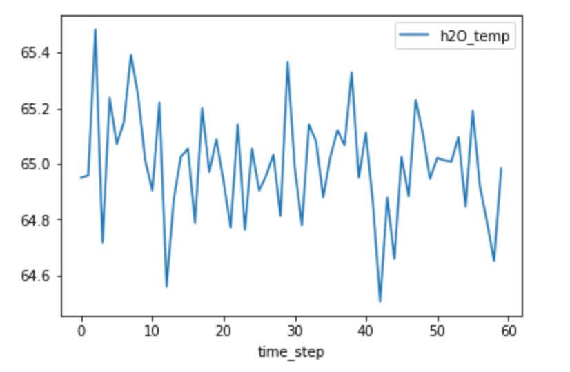
Fig 1. H2O temperature vs. timestep
From looking at the plot above, it’s not obviously apparent whether or not our data will have any autocorrelation. For example, I can’t detect the presence of seasonality, which would yield high autocorrelation.
I can calculate the autocorrelation with Pandas.Sereis.autocorr() function which returns the value of the Pearson correlation coefficient. The Pearson correlation coefficient is a measure of the linear correlation between two variables. The Pearson correlation coefficient has a value between -1 and 1, where 0 is no linear correlation, >0 is a positive correlation, and <0 is a negative correlation. Positive correlation is when two variables change in tandem while a negative correlation coefficient means that the variables change inversely. I compare the data with a lag=1 (or data(t) vs. data(t-1)) and a lag=2 (or data(t) vs. data(t-2).
shift_1 = h2O_df['h2O_temp'].autocorr(lag=1)
print(shift_1)
-0.07205847740103073
0.17849760131784975
These values are very close to 0, which indicates that there is little to no correlation. However, calculating individual autocorrelation values might not tell the whole story. There might not be any correlation at lag=1, but maybe there is a correlation at lag=15. It’s a good idea to make an autocorrelation plot to compare the values of the autocorrelation function (AFC) against different lag sizes. It’s also important to note that the AFC becomes more unreliable as you increase your lag value. This is because you will compare fewer and fewer observations as you increase the lag value. A general guideline is that the total number of observations (T) should be at least 50, and the greatest lag value (k) should be less than or equal to T/k. Since I have a total of 60 observations, I will only consider the first 20 values of the AFC.
plot_acf(h2O_df['h2O_temp'], lags=20)
plt.show()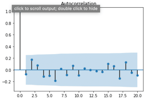
Fig 2. Autocorrelation plot for H2O temperatures
From this plot, we see that values for the ACF are within 95 percent confidence interval (represented by the solid gray line) for lags > 0, which verifies that our data doesn’t have any autocorrelation. At first, I found this result surprising, because usually the air temperature on one day is highly correlated with the temperature the day before. I assumed the same would be true about water temperature. This result reminded me that streams and rivers don’t have the same system behavior as air. I’m no hydrologist, but I know spring-fed streams or snowmelt can often be the same temperature year-round. Perhaps they exhibit a stationary temperature profile day to day where the mean, variance, and autocorrelation are all constant (where autocorrelation is = 0).
Uncovering Seasonality With Autocorrelation in Time Series Data
The ACF can also be used to uncover and verify seasonality in time series data. Let’s take a look at the water levels from the same dataset.
client = InfluxDBClient(host='localhost', port=8086)
h2O_level = client.query('SELECT "water_level" FROM "NOAA_water_database"."autogen"."h2o_feet" WHERE "location"=\'santa_monica\' AND time >= \'2015-08-22 22:12:00\' AND time <= \'2015-08-28 03:00:00\'')
h2O_level_points = [p for p in h2O_level.get_points()]
h2O_level_df = pd.DataFrame(h2O_level_points)
h2O_level_df['time_step'] = range(0,len(h2O_level_df['time']))
h2O_level_df.plot(kind='line',x='time_step',y='water_level')
plt.show()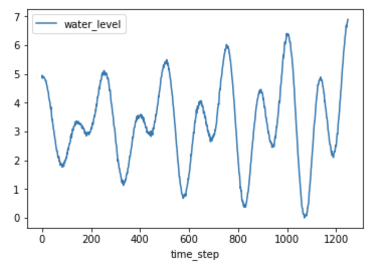
Fig 3. H2O level vs. timestep
Just by plotting the data, it’s fairly obvious that seasonality probably exists, evident by the predictable pattern in the data. Let’s verify this assumption by plotting the ACF.
plot_acf(h2O_level_df['water_level'], lags=400)
plt.show()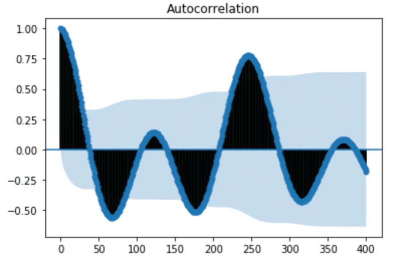
Fig. 4: Autocorrelation plot for H2O levels
From the ACF plot above, we can see that our seasonal period consists of roughly 246 timesteps (where the ACF has the second largest positive peak). While it was easily apparent from plotting time series in Figure 3 that the water level data has seasonality, that isn’t always the case. In Seasonal ARIMA with Python, author Sean Abu shows how he must add a seasonal component to his ARIMA method in order to account for seasonality in his dataset. I appreciated his dataset selection because I can’t detect any autocorrelation in the following figure. It’s a great example of how using ACF can help uncover hidden trends in the data.
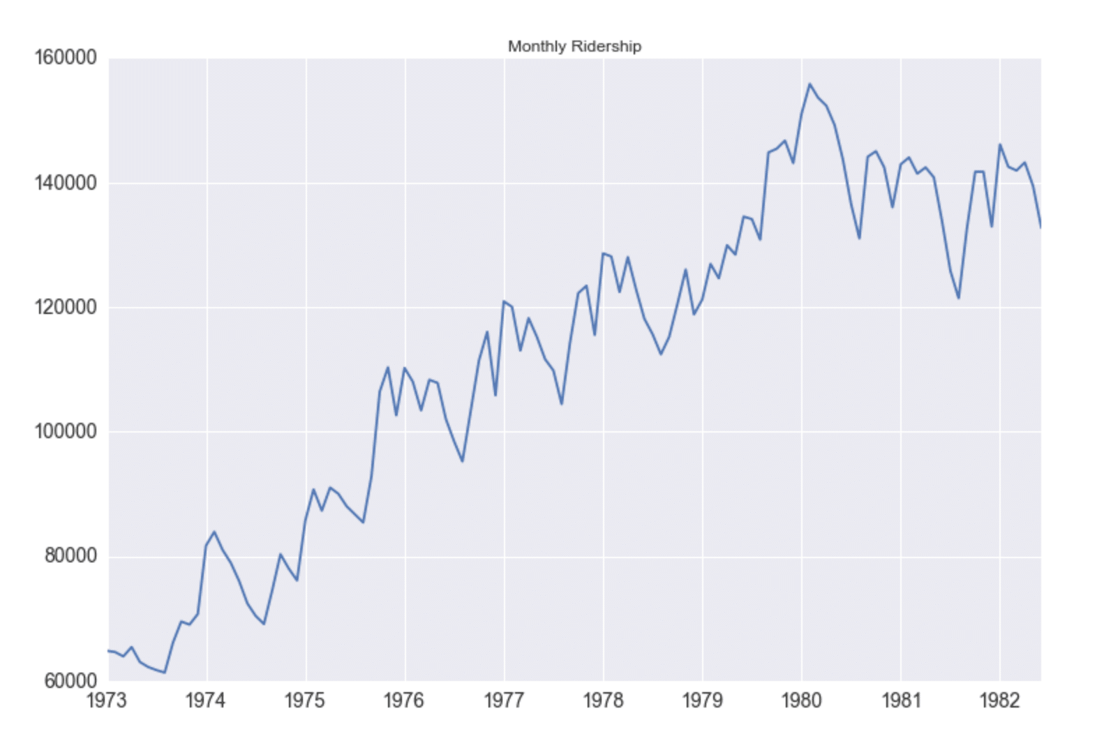
Fig. 5: Monthly Ridership vs. Year. Source: Seasonal ARIMA with Python
Examining Trend With Autocorrelation in Time Series Data
In order to take a look at the trend of time series data, we first need to remove the seasonality. Lagged differencing is a simple transformation method that can be used to remove the seasonal component of the series. A lagged difference is defined by:
difference(t) = observation(t) – observation(t-interval)2,
where interval is the period. To calculate the lagged difference in the water level data, I used the following function:
def difference(dataset, interval):
    diff = list()
    for i in range(interval, len(dataset)):
        value = dataset[i] - dataset[i - interval]
        diff.append(value)
    return pd.DataFrame(diff, columns = ["water_level_diff"])
h2O_level_diff = difference(h2O_level_df['water_level'], 246)
h2O_level_diff['time_step'] = range(0,len(h2O_level_diff['water_level_diff']))
h2O_level_diff.plot(kind='line',x='time_step',y='water_level_diff')
plt.show()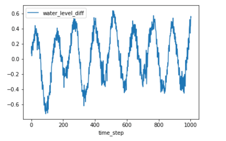
Fig. 6: Lagged difference for H2O levels
We can now plot the ACF again.
plot_acf(h2O_level_diff['water_level_diff'], lags=300)
plt.show()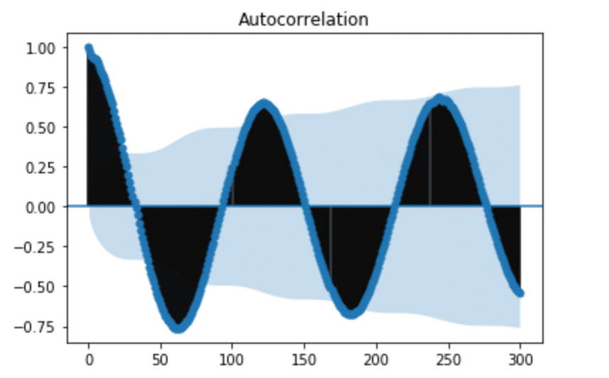
Fig. 7: ACF of lagged difference for H2O levels
It might seem that we still have seasonality in our lagged difference. However, if we pay attention to the y-axis in Figure 5, we can see that the range is very small and all the values are close to 0. This informs us that we successfully removed the seasonality, but there is a polynomial trend. I used seasonal_decompose to verify this.
from statsmodels.tsa.seasonal import seasonal_decompose
from matplotlib import pyplot
result = seasonal_decompose(h2O['water_level'], model='additive', freq=250)
result.plot()
pyplot.show()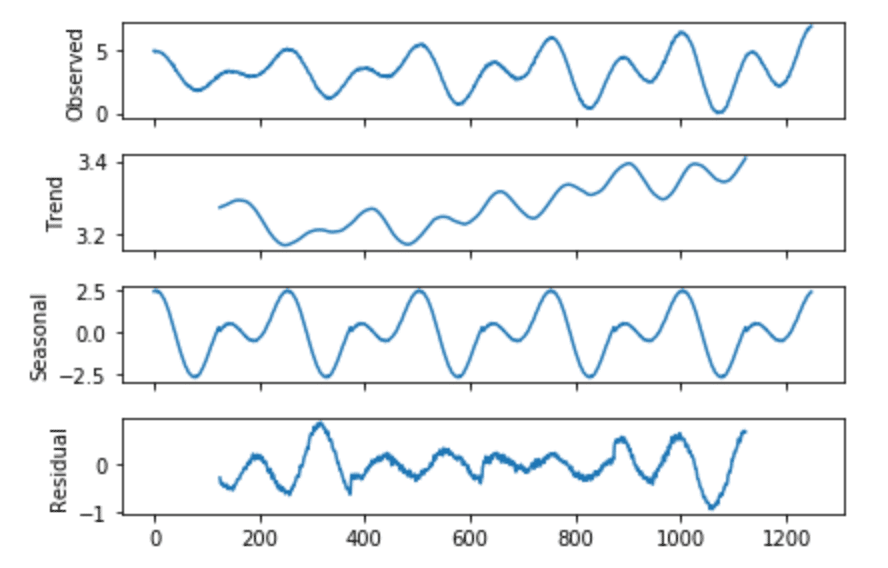
Fig. 8. Seasonal Decomposition of H2O levels
Conclusion
Autocorrelation is important because it can help us uncover patterns in our data, successfully select the best prediction model, and correctly evaluate the effectiveness of our model. I hope this introduction to autocorrelation is useful to you.
References
- Time Series Analysis and Forecasting by Example, Søren Bisgaard and Murat Kulachi
- How to Remove Trends and Seasonality with a Difference Transform in Python
Resources
- Season ARIMA with Python: Time Series Forecasting
- Time Series in Python Part 2: Dealing with seasonal data
- How to Decompose Time Series Data into Trend and Seasonality
- How (not) to use Machine Learning for time series forecasting: Avoiding the pitfalls
- Gentle Introduction to Autocorrelation A Gentle Introduction to Autocorrelation and Partial Autocorrelation
- Time Series Introduction
- Time Series Concepts
- Stationarity
- Time Series Forecast Case Study with Python: Monthly Armed Robberies in Boston
- How to Create an ARIMA model for Time Series Forecasting in Python
- Interpret the partial autocorrelation function (PACF)
- Assumptions of Linear Regression
Published at DZone with permission of Anais Dotis-Georgiou. See the original article here.
Opinions expressed by DZone contributors are their own.
Comments